Pages

Saturday, 30 April 2016

SB2: PREDATOR artwork creation & re-creation...

After more or less bringing the Robocop design to close, i focused back onto getting the final artwork made and arranged for the Predator poster - something i i foolishly thought would be pretty straight forward, as i just needed to follow the formula i used for the previous poster. Not so. I've given myself too many options again, and trying to apply similar, minimal aesthetics from the futuristic Robocop artwork just isn't working with The Predator and his 'present day' surroundings. The 'floating body parts' collage type approach wasn't working either, so i reworked it to fit the same basic layout i applied to the final Robocop poster. If i stick to that then even if the line work varies in levels of detail across each design then at least people will be able to see a connection between the compositions and the film titles/credits will be in the same place . 


Also another element that will hopefully make them appear like more of a set is the inclusion of a 'grid' in the background. In the Robocop poster the square grid refers to his digital sighting that you see being installed during the film, as a P.O.V shot. The grid here appears in the form of a mesh/net-like pattern.The mesh is part of its attire, which apparently is what gives the predator the ability to become invisible. The net could also refer to a section of the film where it is briefly captured - it easily escapes however and continues to wreak merry hell.


BELOW: from pencil line work to vector generating & compositional tryouts.


Thursday, 28 April 2016

Applied Illustration SB2: THE LOST BOYS - poster development


FILM POSTER 3: THE LOST BOYS (1987)
Dir: Joel Schumacher. 
Starring: Kiether Sutherland, Corey Feldman, Corey Haim, Jason Patric


After becoming beyond frustrated with ploughing so many hours getting nowhere with the Predator poster, gave myself a break - by starting from scratch on ThE LoSt BoYs poster design, where it really hit me that i don't know what I'm doing anymore with these, yet i continued to sit in front of the computer for hours on end, in the hope of producing something i'm satisfied with.


POSSIBLE COMPOSITION FILM ELEMENTS TO BE INCLUDED:

• David,  leader of the Lost Boys.(as seen on the majority of the films promotional material)
• Chinese takeaway box of rice/maggots or noodles/worms
• The Santa Carla broadwalk, featuring Rollercoaster & fairground silhouettes 
• 'Welcome to Santa Carla' painted sign typeface.
• Deer & antelope skulls
• Santa Carla rail bridge, that the lost boys hang off during the film.
• Candles
•Wooden stake, garlic, holy water
• 'Death by Stereo' - one the one liners from the film
• Bottle of Blood

• Full moon


After spending a good while collecting suitable reference images to mould into the final design, my earlier worries about basing it around a film with main character who doesn't have as strong physical appearance as a Predator or a Robot cop are beginning to be realised somewhat . But as i've spent the majority of the module developing the aesthetics of the other two posters i'll have to stick it out and try and make it fit in the series with what little time i have left. I though once i'd nailed the production process in the first poster design, the others would be pretty straight forward, but it hasn't really turned out that way, as some design processes just don't transfer across to other subject matters as seamlessly as i'd ideally of liked. Or maybe they do, and it's just a case of me thinking about it too much and making issues for myself that aren't really there.


Current mock up. Got the grid involved in the background- this time in the form of the wooden struts from the rollercoaster and fairground rides found on Santa Carla broadwalk - where you first meet the gang of vampires at the opening of the film.

I planned ahead and found a typeface match. A bit of tinkering in Illustrator with the kerning & letter sizes, and bobs your uncle - replica Lost Boys movie poster typeface. Now, i just need poster to go with it! 


Wednesday, 27 April 2016

SB2: Robocop Development & Completion (dare i say it?)

Finally able to wrap this one up, i think. Despite the initial plans to have 'this' & 'that' featured in the composition, i took the decision to strip it all back, and keep it as clean & clinical looking as possible -  keeping Robocop as the predominant feature, with zero clutter. Even omitted the two cars from the film's end chase scene as i i felt they never really sat right with he rest of the image. Having not much going on it often felt like it was incomplete, and i spent a long while producing a number of only slight variations, which mainly involved altering the amount of colour that was added to Robocop's body, textures and lighting. Also reworked the film title typeface to closer match that of the end credits of the film,(apart from the colour) rather the metallic type face from the beginning of the movie, as i felt it looked a bit clunky. 


Not sure how i feel about the final results at this point. It might just be that I've been looking at it too long and need to come back to it & make a fair assessment. But i think I've managed to put my own stamp on it, without producing something too similar to examples i'd seen whilst researching artwork for the film, which has been my main goal throughout this project.

Friday, 22 April 2016

Applied Illustration SB2: PREDATOR poster development


FILM POSTER 2 - PREDATOR (1987)
Dir. John McTiernan. Starring: Arnold Schwarzenegger


BELOW: design process, from reference image trawl (only a few examples shown) 
through to layout scamps, and more developed mock ups.


With the basic composition for the posters already partially decided on (title character coming in from left, with film elements strategically placed to compliment that main character. Film title & credits in bottom left-hand corner) i worked on sketches in the similar vein. Also, with the feedback on the collages i'd previously done in mind, i set about trying to apply that concept with Predator film elements. I have my doubts about whether the neon colour scheme really works with the jungle-based imagery or not.

POSSIBLE FILM ARTIFACTS TO FEATURE IN COMPOSITION:

• The Predator (Masked/Unmasked)
• 'Dutch' ( Schwarzenegger's character)
• Laser sighting (triangle or dots)
• Glowing green blood/Red blood splats
• Jungle plants and leaves.
• Predator weaponry ( spear, retracting wrist baldes, self-destruction arm gauntlet)
• Predator attire (body armour, mesh outfit, animal skull necklace )
• Human Skull and spinal column
• a CHOPPPAAAH!!!!


Already, before the sketch stage I'm having design decision obstacles, that i can't imagine many other people having issues with. Initial 'brainmetling' decision; With the mask or without the mask, which followes endless to-ing and fro-ing between PRO mask and ANTI-mask rationalising.Eg:

 WITH MASK -  Retains the aire of mystery that the character evokes in the film, until he finally removes it towards the end.

WITHOUT MASK - you can see full horror of his mandibled, alien face, more interesting than a metal mask?

WITH MASK - if i wanted to feature his laser sighting 'dots'  in the image, then it would make sense to have him with his mask on, as that's where laser is generated from.

...it goes on, and that was just a debate in my own mind (and my brother) about what bloody hat he should be wearing! Other questions included; 

• Should Arnold be in it? 
• What weapon should the Predator be using? 
• How retracted should the blades in his gauntlet be? 
• If i wanted to feature his self-detonator instead, i would need to flip the mage as he wears it on his left arm, but then that would throw the composition out. 
• Should i use red, 'human' blood on the leaves or florescent green Predator blood? 


God i'm boring. In some ways I'm think I'm subconsciously (although very consciously) trying to cover all bases so any film nerds out there, potentially looking at the poster can't pick any holes possible 'inaccuracies'. Ridiculous thought process, and a large reason why my production process gets so slowed down; SELF DOUBT and CONTASTLY WANTING TO PLEASE OTHERS.

As i was trying to keep the imagery for each of the posters similar enough so they work together as a set, i also made mock-ups in keeping with the previous Robocop ' floating body part collages', just to get an idea if it would work as well with the Predator character and his limbs, weaponry and habitat. Even if the imagery in the 3 posters ends up looking quite different (in terms of the amount of  detail i use), then at least i'll be sticking to the basic composition layout throughout, which i always break down into shapes whilst sketching initial roughs (see below).


Below: 'Floating Predator' collage options.


Wednesday, 20 April 2016

Applied Illustration - Peer Review 19.4.16

Coming into/out of the latest peer review, i realise I've been so caught up in the final appearance of the poster designs (well, currently only one design so far) that i'd totally forgotten to think about a range of products that the designs would be used on, which is the aim of of the whole project! Apart from the obvious 'Mondo' poster solution and advertising posters for 30th anniversary screenings at various 'old' cinemas, i wasn't too sure what other products would be suitable to whack images of 1980's film characters on to. 


The peer review came in handy on that front; Ltd Edition T-shirts, metal dvd cases, tote bags were also suggested as a possible range. I'd also toyed with the idea of making presentation poster tubes and tags to accompany the posters, for delivery purposes and to enhance their collect-ability in general. I'm going to have to get a wriggle on if I'm to have enough time to create all the whistles and bells to accompany the final posters. On paper, making 3 posters should've been done already, but as always I've been guilty of hideously over thinking what I'm doing,trying to consider too many possible final outcomes, rather than just going with my instincts and it's really starting to scupper the progress & enjoyment i should have whilst doing this. I mean, I'm getting to draw Robocop & Predator all day, what could be better?!

I am stil also dilly-dallying over the 3rd film poster i need to design. Initially it was The Lost Boys - but as my other designs feature strong looking characters (alien hunter and a cyborg copper) it was suggested that maybe a good-looking bloke with a ridiculous platinum blonde mullet might be a weak link.


Hellraiser had also been on my shortlist, and has a strong looking main character, PinHead, that could depict - the problem is, i can't bring myself to watch the film.I'm not a massive fan of the 'Body-Horror' genre of film, and I've only made it through the first 3 mins of the opening credits ,of which features hooks and lumps of flesh. I may just have to read about it? 


Bad Taste ('Troma' style Z-movie, Peter Jackson'a first directorial outing,as well as doing pretty much everything else to with the production of the film) is another title I've overlooked because of the same reason. Iconic main character,but the actual film is too grim to sit through again. I think i'll stick with Lost Boys and try and make it work, mean he main character is/and does turn into a vampire during the film so i'll draw him him vampire mode. There are several other moments in the cult which the film is still well remembered for,amongst fans and geeks at least.


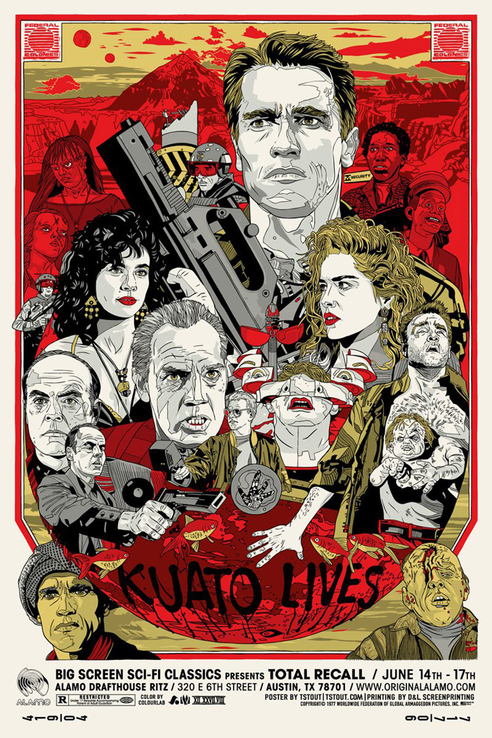
The Running Man - Arnold at his catch phrasing peak,although one of my favourite films of all time, there's just too much that i'd want to include on this one, and i'm trying my hardest to not do a mega detailed,full-to-the-brim Tyler Stout-esque design (see below) -  as much as i admire them.


What ever i do, i was strongly advised to keep it in the adult sci-fi/horror range & to ignore any urges to go down the fantasy, family film route - so that rules out other personal faves The Princess Bride, Batteries not Included and Harry & The Hendersons which, incidentally, stars 7' 2" Kevin Peter Hall who also played the 'Predator'. Random and useless 80's trivia machine, that's me.

Where was i..?

Sunday, 10 April 2016

RESPONSIVE - OUIL503 Summative Evaluation


This module has involved a number of different methods that i have developed upon; Working as part of a team, responding to specific/unspecific briefs, working on multiple briefs simultaneously and time management of those particular briefs.

Having a client brief with specific guidelines to stick to is fairly familiar territory for me to be in, so i already had a fair bit of past experience in dissecting briefs and working out what the client is looking asking  for. The design challenges (from d&ad & ycn) were a fair bit more in depth than i'm used to though and these were a good learning experience - making sure i thoroughly read all the small print and lists of deliverables.

Working with a group of other practitioners from other fields is a new experience for me, collaborating full-stop isn't something I've had the chance to do up until now. I'm not too sure i'll be rushing to do it again in a hurry whilst at uni, certainly not in a group with 2 other illustrators, but as far as working together with an animator goes it was an interesting experience. Having more than one brain on the job in hand let to the development of more ideas than i could've come up with if i was working on my own. There was also a certain amount of animation knowledge i was able to pick up from him as well. Obviously if i hadn't of been as fortunate with my selected team members then my evaluation of it may have been lot different. As well as having the collaborative brief to work on, there was the matter taking on the individual briefs. I found i wasn't great at splitting my time equally between both individual & group work, and the rest of my other module work, and left myself a bit short on time when it came to submitting work. Not to say i missed any deadlines, rather that the final results may not have been all i'd hoped they'd be, due to having to rush towards the end. Also, seeing that the deadline is a month or so away, there was tendency to think i had way more time than i had, so on that front i could've designated my time more evenly and more immediately.

If I'm honest with myselfI've not made this module the most exciting or have taken many opportunities to excite myself with the images i have been making (viewers of my work for this module may disagree?). Of course that factor is ultimately down to me and the choices of briefs i decided to take on. Not a whole lot of the work i produced involved much of an analogue element, apart from the initial rough sketches or storyboarding - beyond that it was all digital rendering or vector work based on the original hand-drawn concepts. However,If i'm bored with website icon design then i shouldn't really take on a web icon design commission,duuh. But at the same time, you have to pay the bills, and i was paid for a number of these projects. On the whole, it was back into the reliable,unimaginative, 'get-it-done' mode as usual for me. I probably need to accept that I'm not one of these great, 'hands-on', messy, mark-making, analogue craftsman and i should just focus on my strengths - which appear to lie within the digital, on-screen realms.That said, the collaborative animation task did suit my way of working and given further opportunities i would like to improve on my animation skills in the future.


I've tried a number of different creative mediums, and made the most of the uni facilities as much as possible. Wether it be animation, screen print, illustration or digital design,I hope i wouldn't be accused of just sticking to what i know too much. I'm still all about about learning as many varied creative processes as i can, even if the results aren't always to my satisfaction. Quality of the finished, submitted work however has remained at a high standard for individual projects - with the collaborative project there's only so much input i can have without getting to the point where I'm taking over, and becoming a 'quality-control freak'. Admittedly the quality of the group brief work was lower than i would've liked - but you have to take into consideration that everyone has different ways of working, and varying levels of experience with different mediums, it's not always possible to produce work that to the levels that i'd expect to achieve. Not wanting to 'take over' within a group dynamic is something you can either see as a being a good, considerate team member characteristic  or as someone who isn't driven enough ,or willing to break some balls to get results.That's all very well, but I'm firmly in the 'treat people nice, to retain a pleasant working environment' camp. Massive fence-sitter. The general presentation of final submission/presentation boards etc is always very important to me aswell and the introduction of ISSU presentation boards has made this process, albeit rather repetitive, a lot more effective.

As far as future development goes, i think my decision making in regards to brief choices and the way i want to execute them still needs a hell of a lot of work. By the time I've made a decision on which tasks i want to take on, the decision on how to execute it has usually already been made for me,by father time-  and i have to do it in the least time consuming method. Also, in hindsight i wish i hadn't  bothered with such an open brief as Secret 7, and instead attempted one of the YCN projects. Being open i thought it would give me a chance to experiment with different mediums in order to help develop my own specific 'voice' but instead it left me with too many options to think about , that i couldn't get down on paper and i automatically went back into my digital comfort zone. Also i've become very disillusioned and frustrated with the  'call for artists'  type events. I'd much rather of tacked a 'real' brief that would've been judged by industry experts and not by a bunch of exhibition organisers who make a decision on your work based purely if that individual likes it or not - rather than on concept, craftsmanship or execution. Looking through the YCN 2015/16 Annual at all the past design work has really driven me to want to feature in a future edition of it - I know I have the technical ability, I just need to get some decent ideas to build it on.

I will also look to manage my time more evenly in the future - even if it's on module work that i really don't want to do. I need to get going sooner also, as I'm finding i didn't really get much momentum on some of these projects until i could see the deadline looming overhead. Not that i produce better work under pressure, i don't think i do, far from it - it's just that it doesn't seem real until i can sense the very real possibility of missing a deadline. 

As much as i want make myself as versatile as possible for future employers and commissions, i seriously feel I may be thinking too hard to be proficient in too many fields, and I'm beating myself up when i can't achieve the desired results i'd set out to make. This again may go back to me needing to focus on what I'm already good at rather than trying to master new techniques. I need to find this mythical, 'ideal production process' - that is both time effective and that produces results that i can i look back on with satisfaction. Nothing I've produced in this whole module really falls into that category.


Peer Crit - Robocop poster development (cont)...


Amongst all the hand drawn design approach work i also had a play around with some minimal photo collage compositions, incorporating 80's colour schemes and paint brush marks/speckles. This has given me further decision problems,as i kind of like what I've done! It's certainly different to any of the alternative film poster designs I've come across, and it's also been appealing to those people who haven't even seen the film. They like it purely because of the way the photo elements work with each other on the page, and the neon colours contrasting with the black grungy background. The colour scheme really has gone down well it seems more than i expected it to.


During the class crit, it was suggested by tutors that i should actually stick with the hand drawn direction i originally started out with, and that although very striking and attractive to look at, with a suitable aesthetic - the photo collage is something that "anyone could've come along and done on photoshop". Which is a fair point, but i could easily argue that point by saying "Go look at Jackson Pollock or Joe Cruz's work"(I'm sure there a many more examples) A monkey could've done what Pollock was doing with his paint drips and splats - but the fact is, no-one had done. Another suggestion was to just try and combine the handrawn parts with the composition and colour schemes of the collage, which was the next step of my experimentation and development in order to finalise the design process of the poster  (see above), and indeed the other 2 posters as swell, which i've yet to get working on.

Wednesday, 6 April 2016

Responsive - Module Presentation boards


ILLUSTRATION FRIDAY


LUMINARI TECHNOLOGIES


TEAM IMMORTALS OCR


ON PAPER


LIVELYHOOD


SECRET 7"


------------------------------------------------------------------------------------------------------------


Collaborative D&AD brief: 
SHUTTERSTOCK