Pages

Showing posts with label Greetings From.... Show all posts

Saturday, 21 March 2015

Visual Communication Brief 2 - ' Greetings From…' (PT3)

 Onto the Macs and into Illustrator i go. Even though i had sketched out the animal shapes on paper i was still spending a lot of time, not designing on-screen, but tweaking a lot and striving to make the the few shapes i was using fit together as smoothly as possible. The pathfinder tool was invaluable for me here, in order to achieve those tricky, wobble-free curves and interlocking blocks of colour.


FINAL POSTCARD IMAGES


Mexico - Mexico City -
Lubber Grasshopper
Canada - Ottowa - Beaver


Democratic Republic of Congo -
Kinshasa - Okapi
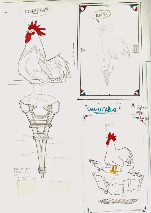
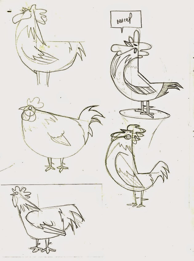
France - Paris - Gallic Rooster


Peer feedback


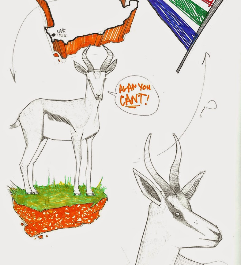
After getting feedback from the rest of the class i was pleased to hear positive vibes concerning the 'upside down' layout and use of the colours and flag accents on the borders, which is a confidence boost for me as i always worry that i tend to lack in the ideas departament. Also the animal figures  and developments of the little world they they inhabit was praised.

PERSONAL PLUS POINTS:

+ Stepped slightly away from my normal production process comfort zone.

+ I'm glad i made the late decision to have a change of production style, it was made it more of a challenge.

+ Ditched (had a break from) the black line work! In fact looking at them now i don't think i used black AT ALL in them. Is still a struggle for me to let it go, but it did call me to think about how i was composing these pieces and switch off my Illustrator vector auto-pilot, for a bit!

+ The majority of the work time was spent researching before i even picked up a pencil, so i educated myself on the subject beforehand. This could be seen as a minus point tho..?

+ i noticed an impovement in my development sketches, and I'm finding drawing and re-drawing is becoming more natural and less of a battle.

+ Less was more. Didn't overcomplicate my images.


PERSONAL MINUS POINTS:

- Underestimated the business of the print room, so didn't have the finished card printed versions for deadline day

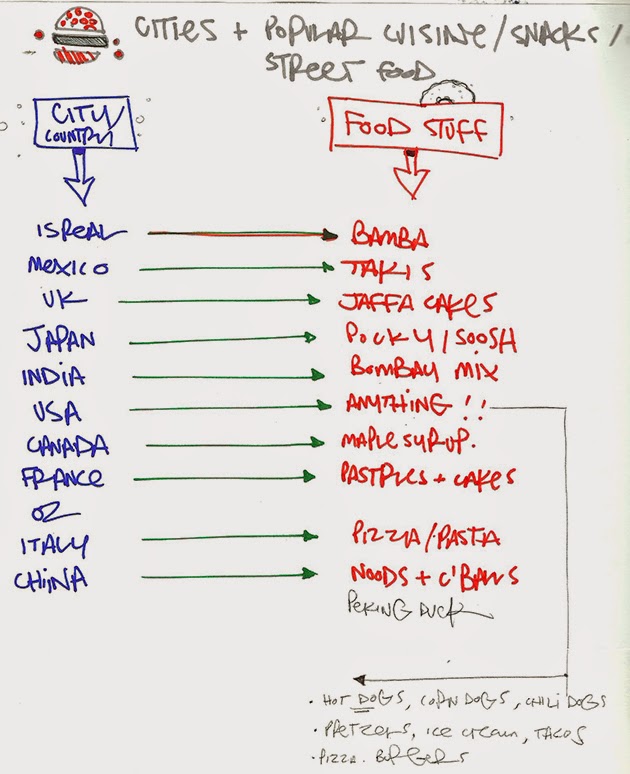
- Could have produced more sketches on my other possible subjects, street food & movie heroes and villains.

- Decisiveness still an issue, finding other peoples input a great help though.

- Even thought the flip-around design proved to be successful, i didn't really have any others to back it up, so i still need to be more exhaustive with my ideas.

- Wish i could've done more than 4 as i was enjoying building outline-less lands for these little critters to stand about in.


Saturday, 7 March 2015

Visual Communication Brief 2 - ' Greetings From…' (PT2)

After all the the in-depth animal research i though i'd better actually do some scamping, as this was a short brief  ! It had taken me long enough decide how to whittle down the animals and countries into piles of 'too obvious' and 'pretty unheard of' - but at least i finally had solid direction to experiment with.


Okapi - Congo

Springbok - S.Africa

Gallic Rooster (jazzy chicken) - France 


I was still umming & ahhring about the street food theme but there were 3 factors which helped me to decide to focus on the national animals. 


1. It's been done, lots. Well the ideas i'd come up with have been anyway. As much as i enjoy drawing donut & hotdog men, and i do, i wasn't sure where i could take it. plus i wanted to make something a bit more interesting to look at.

2. I'd heard a few other in the class were working on a similar theme, so even though it would've been good to compare outcomes on the same subject matter i wanted to do something that i'd never throught of doing before.

3. Time was disappearing fast and i just needed to make a bloody decision and plough my energy into that choice!


India - King Cobra

China - Panda (unofficial)

My thinking was to try and corporate the national animal with a synonymous landmark,possibly with the map shape involved (a bit cliche) and also use accents of the countries flag colours. Again maybe the obvious option, but was looking and more subtle and interesting ways of using them to bring it together. I was also ware that this could be making things a bit busy?

Canada - Beaver


'Flip-able' playing card style composition, 
with flag accents in the corners. 


At this point i felt although my concepts were working the way i going to execute them could be different. Matt pointed me in the direction of  'I want my hat back' by Jon Klassen and the way he uses fairly simple shapes in the way he creates his animal characters, which i was thinking should be something i should try out, as currently i was looking to produce the final artwork in the same process i usually would. Making it simple and bold was how i'd originally set out, but had gradually made things more and more complicated,as per.  


Bear, who wants his hat back. I think? 
I didn't get around to read it.Bit wordy for me.


So back to the drawing board, a bit of a gamble to make a U-turn so near the brief deadline, granted. As most of the class were fearing having to 'go vector' to create their postcards, i wasn't feeling the pressure with that aspect as i knew i could knock out my finals with no real technical problems - the pressure i feel is making final decisions about what designs to pursue and wether the ideas are even strong enough to use. Another question was "How simple DO i make it..?" Above are some quick experiments using the most basic of shapes, which goes against my regular production process. But was fin challenge to see if i could make a recognisable living creature out of 3 semi circles. 


I did however stick with a concept i came up with in my earlier sketches. Having a rotatable composition, a bit like a playing card i felt would make the viewing more interesting and it would be alternative way of featuring a selected landmark.Also its keeps things uncluttered. Also, as i was simplifying the animals i would also need to find a way of simplifying the city's notable feature so it would still be recognisable. 


Saturday, 21 February 2015

Visual Communication Brief 2 - ' Greetings From...'

After being set the newest task, to produce 4 postcards based on famous cities (real or fictitious) and knowing it would have to be vector based,i set about researching into existing practitioners and examples of shape-based or vector work. In a way i've started at the end.I'm already considering carefully how the final images may be constructed,possible issues and layout before i've even had an idea about what to produce from what city.Probably not very orthodox i know? 

As vectors and working in Adobe Illustrator are very familiar to me and often the core part of my heavy linework-based productions i wanted to look into other,simpler ways of conveying the same message that a complex image would, as Noma Bar and Stan Chow do.If i could manage this then it would also speed up my output time, providing that my concepts were strong enough - which at this point hasn't always been the case.


Drew Roper


This one (above) by Alan Fletcher is amazing! Something i'd actually pay money for a print for and i rarely buy art. It's the sexiest thing I've come across in a while and there's almost nothing to it. Super graphic but I imagine there must be a fair bit of sketch/development work behind this, but the final result cant've taken longer than 10mins (2mins if it was done on a computer) I can only dream of being able to take 2mins to produce a final piece and then move on with my life.


Stan Chow


Noma Bar

Michael Nÿkamp


This was followed by a good old research & list making session to try and form some initial ideas & concepts, which i'll try and avoid the most obvious countries, landmarks or subject matters.Though granted, not everyone knows the landmarks or national dish of countries  like Afghanistan or the Democratic Republic of Congo? I say "not everyone" - i mean, NO-ONE.

But by christ i'll teach them!


INITIAL THEMES

I have a fondness for old action films ( an some not so so old and of varying quality) so thought'd be fun to make a few of them my subject matter. Quickly had doubts about this as i felt id only be drawing pictures similar to how they were depicted on screen and wouldn't really be bringing anything defferent to it.Plus I'm not a comic book artist of any sort so felt id dragged into those realms. A quick veto i realise.


World street foods & snacks

I had researched into some of the quirky snacks from around the world, to see if there was enough visually interesting products to work with?! Also looked into the various street food that the globe has to offer.Was find that the darwable stuff from all from the U.S though. I for some reason i was already set on drawing hot dogs.


National Animals

After looking into Chinese food, i though about pandas, which lead me to investigate the national animals of the world. Didn't realise so many random countries A: existed and B: had a national beastie. Admittedly the more interesting animals were representing more unfamiliar nations, really unfamiliar, but i though that might make things interesting, and a bit educational- and really didn't want to just draw british bulldogs or bald eagles.

These pics don't really show it but i spend FOREVER looking into this subject, probably too long - as i was looking up the animal, then looking into the related country, then the capital city of that country, and then the motos, and the flags and then recognisable landmarks it goes on… as i said probably too long reading and not enough drawing.