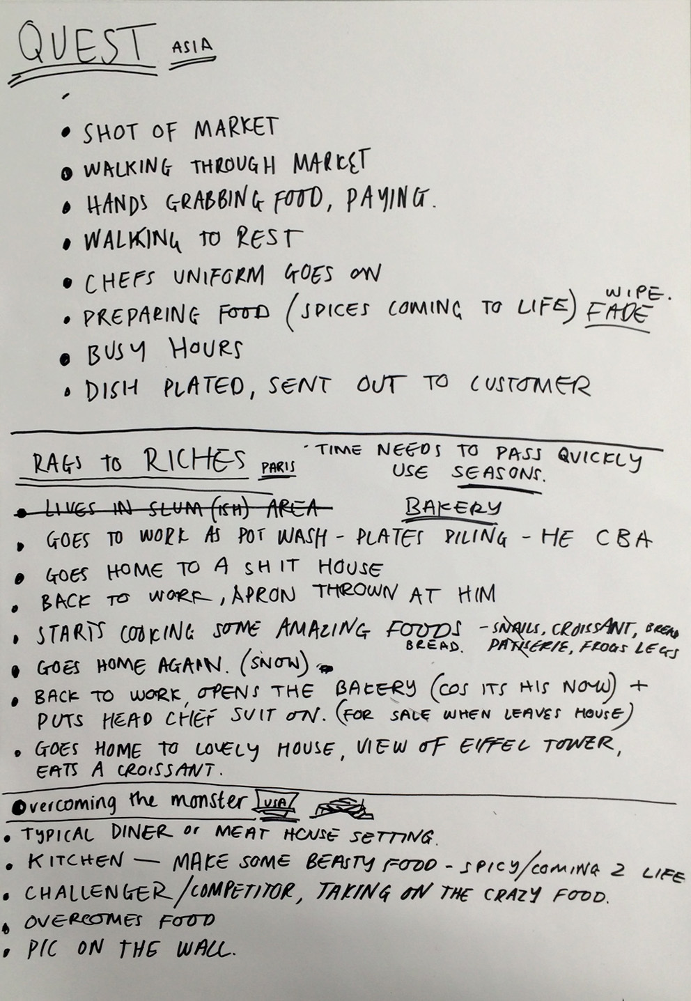
Into the last few days before submission and things are still on course to be all done & dusted in good time without a mega last minute panic. So far.
Animation on the final story is all but completed, ready for the addition of sound fx and then that's that. There have been a few revisions that have happened with this one. After Joe sent over the footage for me to add audio to i felt there were parts that could be altered a little in order to make it a bit more interesting to watch. He'd done a great job making the baker boy walk, but the trouble was you could hardly see him as he was way in the distance - which gave the surroundings a good sense of scale in some scenes, but felt it was a bit repetitive to have it look the same in all the walking scenes, and when i mentioned it he felt the same, which has been the case on the majority of the project - a welcome situation ,both having the same sort of creative visions.
Draft version of 'Rags to Riches'
Draft footage still.
So i proposed a change to the composition in a couple of scenes - instead of the baker just walking in the distance, he would also walk past close-up. Also added some colour with the trees and autumn leaves blowing around him as he trudges along the street. This way you can also see Tilly's characters expression.
Proposed revision
Revised proposed revision
Joe hit me back with the modified version and it looks spot on, the leaves blowing past are a great touch swell. Not only that, but he'd changed the opening scene so he was walking across screen IN THE RAIN! it was crazy when he showed me, looked so convincing - he assured me it was a relatively simple procedure, but really effective non-the-less. It goes to show that working with others is handy for triggering off new ideas. From the empty looking scene we had to begin with, to now having trees, wind, leaves, new perspectives and now RAIN!
Rain footage. (can't really see it too well in a freeze frame)
Initial bakery drawing i was given to colour.
Final bakery interior - 'rustic' rendering
ABOVE:Refined, re-sized baker character ready for animating.
The baker character from Tilly's initial design had a bit of a make-over aswell. I was handed him to colour in, as it was currently a simple black & white outline made with shapes in A.I (pictured on the left hand side). Although the foundations for him were fine i just felt with some line weight variation and some refining of his body parts it would make it look less W.I.P. Plus Tilly had already mentioned she wasn't getting on with Illustrator and so seemed ok with some modification. But as i said, i didn't really change the appearance of her design, just enhanced it. Even the simple changing of the stroke lines from black to grey helped. For the 'reaching out' version of the character, there wasn't an initial design made for him, but the beauty of illustrator is that you can shuffle shapes around so quickly, alter them and boom-bam you've got the same character doing a whole new stance. Other little touches like adding rubber gloves,aprons, and a variation in facial expressions, also the addition of subtle textures later on all helped to bring it together.As with my drawings i separated his limbs to make them move independently from his body if required. So again,with another set of eyes and hands on the project it can help elevate what we're doing a more professional level.God that sounded so corporate.
-----------------------------------------------------------------------------------------------------------------------
OTHER EXTRAS
Alterations made to the menu scene.
I modified the menu so i could moved it up & down.
'Chubbs' now peers out from behind the menu and smiles.
-----------------------------------------------------------------------------------------------------------------------
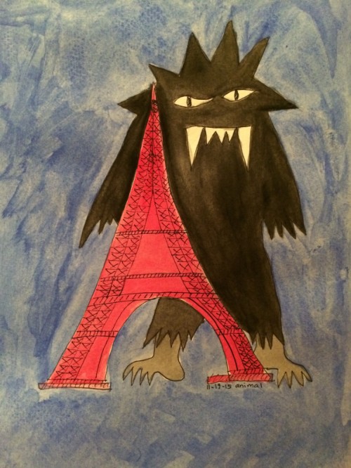
'Wall of famers'
'Wall of Famers' added to the first shot of the diner interior.
'Wall of Fame' entrants added to the photo frames in the final scene.
-----------------------------------------------------------------------------------------------------------------------
Texture & lighting added to this scene, just to give the backdrop a
bit of 'drama' & make it not so flat.
-----------------------------------------------------------------------------------------------------------------------