Pages

Showing posts with label OUIL403 Visual Skills Studio Brief 1. Show all posts

Sunday, 26 October 2014

Studio Brief One - INITIALLY

DEADLINE DAY

After a hectic week of trying to get all my A-Z done & dusted it was time to show & tell. I had mixed feelings about the final outcome. I felt I'd executed it to the best of my abilities and think it's visually interesting, which I'd always aimed for - but looking at other students efforts felt maybe should've had a stronger or clearer concept? Also maybe a title might've been a bit helpful,but thought 'naaaaah' i shouldn't be 'sign-posting' what the work is supposed to be, and instead let people try and work it out for themselves.


Night shift


We all made feedback sheets and stuck them up for people to add their comments 
and thoughts on visuals (left) and ideas (right) On the whole pretty encouraging.

Wednesday, 22 October 2014

Studio Brief One - INITIALLY

WEEK TWO

The class got into small groups to review and crit each others development of our A-Z poster project. The brief was to have had 260 (give or take) sketches of possible themes - i was painfully under that number of sketches at this point as id had a: spent too long doing my sketches and b: had still been struggling to think of enough interesting themes of my life. I had also already got quite a firm idea of how i wanted it to look, so was finding it hard to churn out loads and loads of rough designs for something i was never going to use.
So i presented my thin but well thought out sketchbook, which i would still add to, but also had a good starting point for my final poster.


SELF-EVALUATION

I feel a mixture of disappointment that i haven't produce a great volume of design possibilities but also quite positive that the subject i've chosen to produce for my final piece is a strong concept and will be visually stimulating.My sketchbook could've/should've been a lot more organised, i just hadn't realised that i would be showing it to others in the class and was only really set out in a way that i could understand.

After getting feedback it was suggested that i try and fuse the two themes of films and sweets of my childhood together. Although a good enough idea, i wouldn't have the time to tackle anything as complex as that. The idea of keeping things minimal and contrasty was also praised so i intend to carry on along those lines. Striking, bold, uncomplicated, and a piece of work that would hopefully make people want to look at.

I plan to generate the final images in a grid formation and as clean and tidy as possible, most probably using black fine liners and markers. I realise some of the letters may need some sort of shading so i may introduce a light ink wash for some greys, but am quite keen to keep things as crisp as possible so may keep it strictly block black and white.I now just need to finalise my final 26 images, maybe have a practice run and to start mapping out my A1 page.


Mapped out layout for final A1 poster


Studio Brief One - INITIALLY

This two week brief was to produce an A1, 26 image, monochrome A-Z typology poster of ourselves,based on ideas and themes developed during our studio sessions. The first mission was to come up with 10 possible themes &  produce 26 rough designs for each theme ,260 images in total.Which, is a lot. Especially when i was struggling to come up with 10 themes relating to myself that i thought would work as poster, or that i could think of a possible image for each letter of the alphabet for!


WEEK ONE:

Initial ideas included Countries I've yet to explore (all of them), Childhood lunchbox, Album covers, WWF wrestling legends, Computer games from my youth, and Birds. Not wanting to go too personal but to give people something they could also maybe relate to aswell when looking at the poster i started to work on the theme of films/tv/computer games of my youth, which i realised was loooong time before most the class were even born..!


I established quite early on in my concept sketches that i really didn't want to simply draw 26 detailed, accurate illustrations of people, characters or objects - I wanted to strip the 'subjects' down to almost computer icon or logo-like simplicity, not only to make the poster more visually engaging, but also to cope with the time constraints placed upon us.


A & B
Child's Play & Day of the Dead


Elephant Man & E.T

Friday the 13th - The Fly - Highlander - Halloween


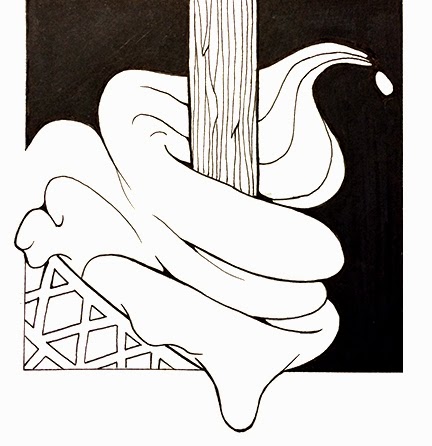
After getting the main gist of how this theme would look in the final poster, i moved on to the theme of 'sweet youth', which is a collection of confectionary that you could've (and still could) found me with my paws in when i was still in short trousers. Again, simplifying them as much as possible, keeping only the recognisable shapes or patterns.