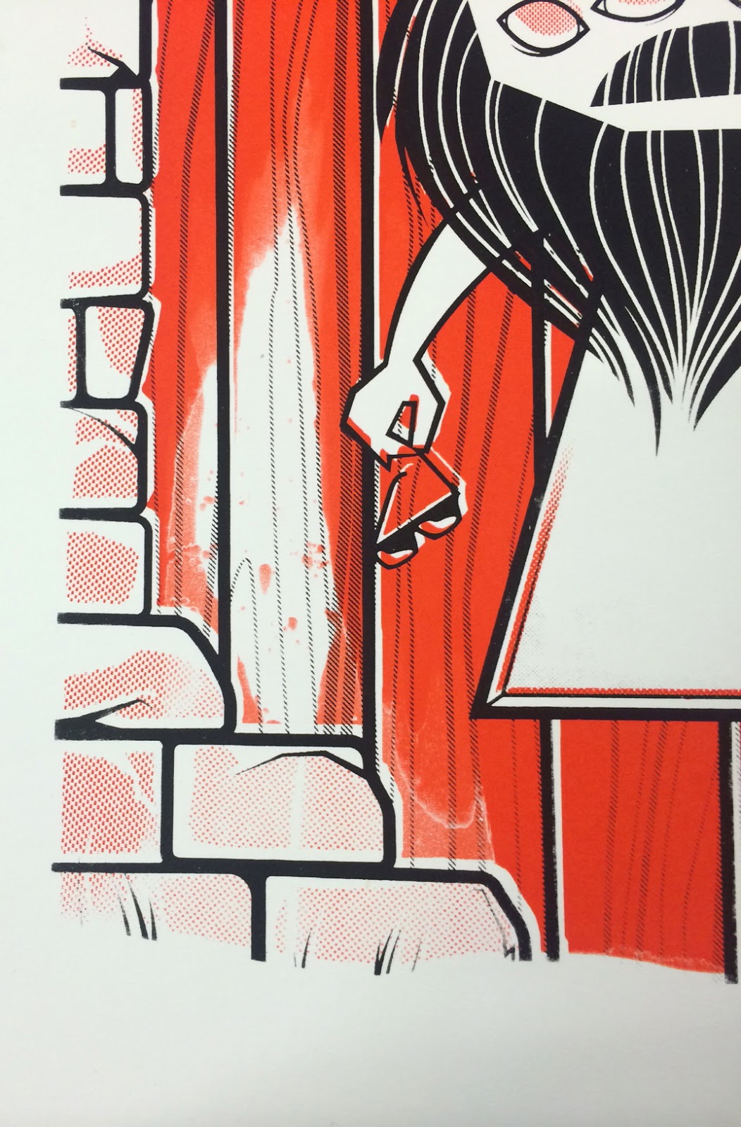
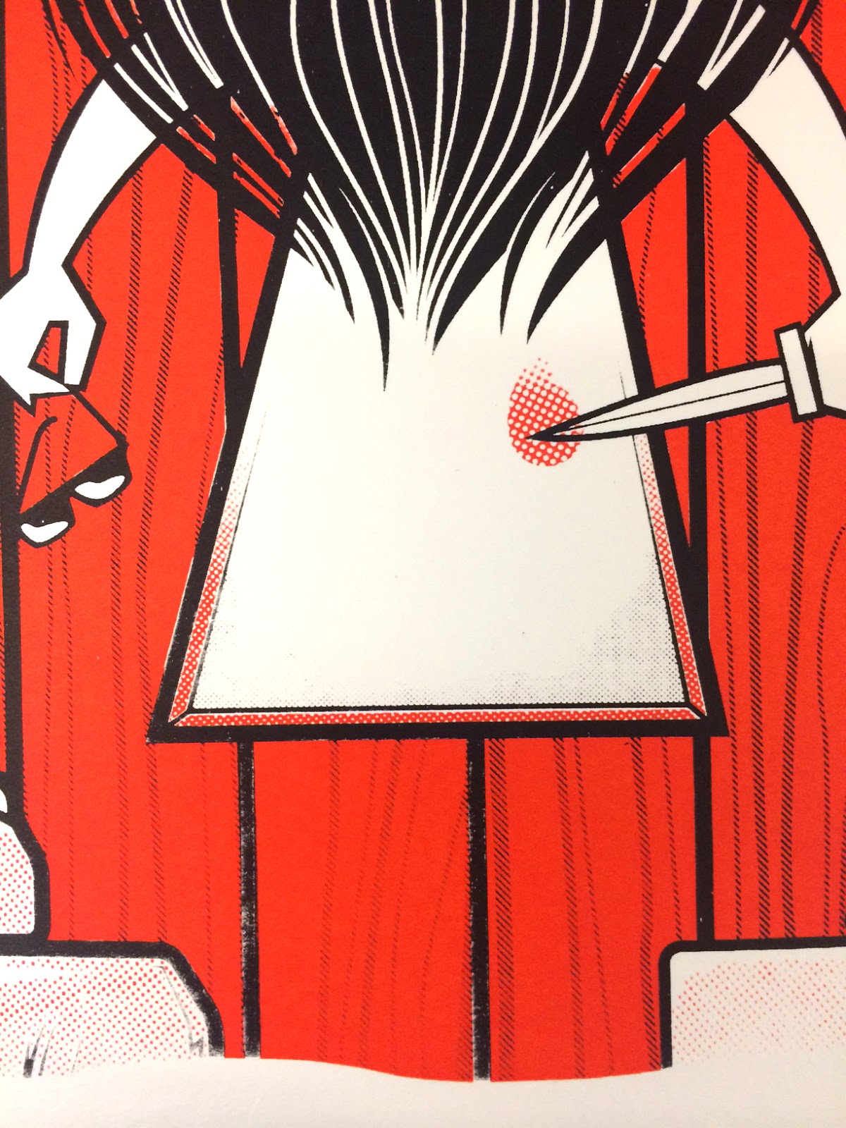
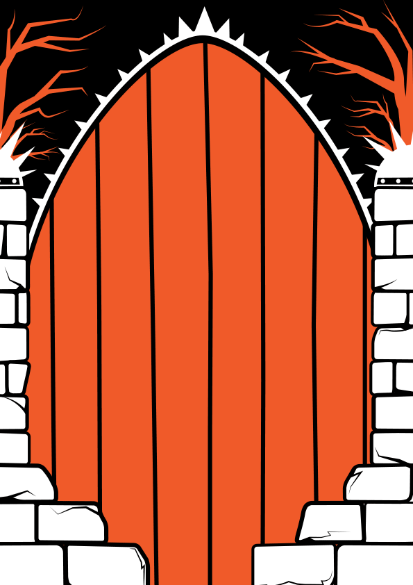
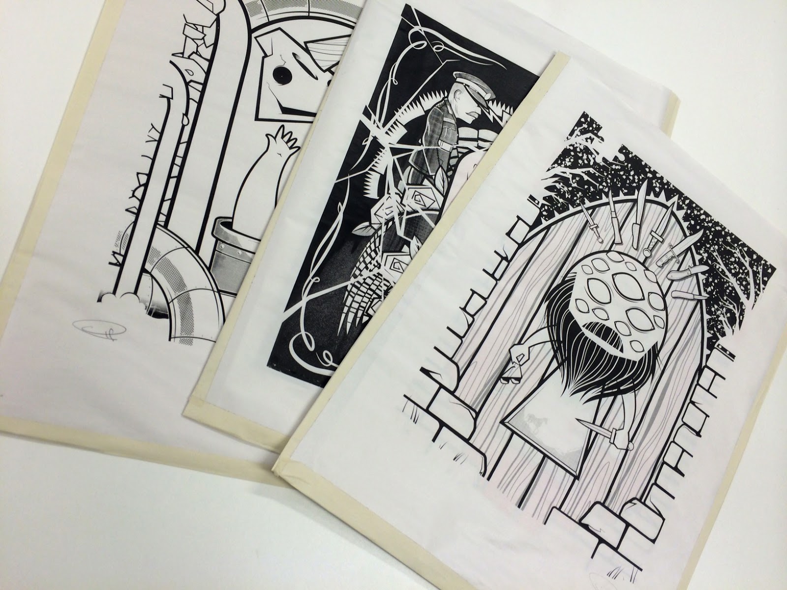
Pages

Showing posts with label OUIL504 SB2. Show all posts

Tuesday, 19 January 2016

About the Author - Day 674

Printed Image
T H E   E N D

As i had a 'few' newsprint tests knocking about i made sleeves out of them for 
each print, to give them a bit of protection.Also gives it that extra, personal,
 hand-made touch. Signed for good measure, its piece of art in itself!


Strengths: 

+ My persistence in trying to achieve the best rests possible with an analogue printing techniques despite only being a novice at it. Plenty of times i felt like it had beaten me and i want to throw it all in the bin, but my desire to make prints as high quality and professional looking as they did in my head spurred me on.

+ My thorough development of concept sketches before attempting any final drafts. Although i was a slow start i did eventually enjoy the repetitive sketching and tweaking of the same elements in order to fins a way of making the whole composition work well together.


+ Finding a middle(ish) ground of using Digital and Hand-drawn imagery. Starting of as doodles and developed roughs then into the digital realm for polishing, composing and making print ready -  then back to analogue for the final product. When the screen printing wasn't going so well, where i once would've fallen back on my digital know-how to make things things right i stuck it out and tackled the problem with my real-life hands and mind.

+ Due to going back to the 'drawing board' a few times i've created 3 separate images that finally work well as a set.


Again, on closer inspection, these photos are abysmal. 
Apologies, on behalf of Apple, and myself.


Weaknesses: 

- I was pretty slow out of the blocks with the initial researching of the author, and also formulating any ideas or sketch work. My dislike/poor reading ability more than likely effected the final outcome, as if i'd read more of Murakami's titles then i would had more material to work with. Not that I'm unhappy with the content of the final outcomes.

- Lino cutting is something that was new to me on this project ,and something i enjoyed doing. I would've liked to have experimented with it a bit more given another opportunity as it may have helped me simplify some of my work with the technical restrictions it has - but the imagery i had been making didn't really suit the lino cutting methods, and i probably wouldn't have had enough time to get good at it and adapt, only to decide that i didn't like what i was producing.

- After the initial sketchbook media experimentation the colour all but disappeared from my development work. Maybe i could have tried some different techniques, but then again, if id decided on my printing method, and colours then there'd be no real point to trying out loads of paints or crayons etc in my sketchbook work

- Getting every aspect of the final screen prints to go right all together. Good screen exposures, even paint coverage, accurate registration never seemed to happen as a team.

-  If i hadn't changed my mind about my imagery so much then i could have easily made 5 prints instead of 3. Although it was a mental and physical battle enough to get these 3 bastards done if I'm honest!

- This project has taken over everything (and I've let it),  as i just wanted to make something to the levels i expect of myself. However this has lead me to neglect a lot of the work on the other modules. Delegating my time evenly is a big issue for me, more so as I'm having to try and my delegate time to doing things i really, really don't want to do.(no names given)


Final Thoughts:
Although quite happy with the final prints and what I've learnt, i do have the nagging feeling that i could've made them just a bitter better and 'sellable' and that one final go in the studio and i could nail it. Alas, I'm out of time. But ill take what I've learnt onto future screen printing outings, no fear.


-----------------------------------------------------------------------------------------------------------


FINAL PEER REVIEW

After having the final mega peer crit, i do feel a lot happier with myself and with my final prints, and its left me thinking that maybe I'm being too hard on myself and too negative. I'm so wrapped up in considering what clients/onlookers will perceive as 'perfect' or professionally acceptable looking work, that i forget to actually step away and get the view of an onlooker.Fresh eyes looking at my work haven't noticed the streaks and imperfections, and mis-registrations that have been nagging away at me. They welcome it, and wonder what I'm making a fuss about. Just because a bit of paint has printed out exactly how i envisioned doesn't mean i should be labelling them up a 'REJECTS'. I feel bad for those prints now, i might go and re-word the labels. I need to constantly remind myself that people aren't always looking for flawless art (unless they really are looking for it). 


-----------------------------------------------------------------------------------------------------------


Moving Image
T H E   E N D


    DownTheTubes(FIN) from IanF on Vimeo.


Strengths:

+ When we were first set the task of making an animated sting to accompany our author prints i straight away knew i wanted to make a 'living' world out of my static print designs - and i feel I've done what i set out to achieve with this.

+ My first outing on After Effects and I'm fairly pleased with the results and what I've managed to learn, through the AE class sessions, and off my own back by watching lots of youtube tutorials on the basics (and the not-so basics) of using the program.

+ I've pushed my self to making something a bit more complex than maybe i should of, as someone with no prior knowledge of After Effects. But i felt i had a clear image in mind of what i wanted to try an accomplish and knew it'd take a little bit extra to see through.

+ The movements & transitions in the animation are largely how i had planned them to be, without having to compromise or go for a simpler option. If i came across something that was stunting my progress i'd seek out online help or specific tutorials until i was back on track. Frustrating at many times, but I'm now the wiser for it.

+ I feel the music works well with the moving imagery, as do the layers of sound effects & background noises that are also going on in there. I took into consideration the audio levels, increasing and decreasing at appropriate times to coincide with specific image movements.


Weaknesses:

- I couldn't really do a whole lot of work on the sting until after my printed work had been designed, which wasn't until a coupe of weeks shy of the deadline. I'd considered composition and transitions and what i envisioned it all to look like, but without getting them out of my head and making them into lots of story boards.  

- The story boards i did make were probably a bit too detailed and complicated to follow,or even execute with my skill level on AE.But they did lead me to trying out other options that were within my reach.

- I wanted to make a sting based around all 3 of my final images, but left myself a bit short of time to really experiment with that idea. Also, realistically 15 seconds wouldn't have been long enough for me to fit in everything that was required.

- My documentation about creative stages leading up to the finished product could've been more in depth. I didn't really do a whole lot of test versions, i just worked away on the main sting, solving problems and adding new features here and there until i got to the point where it was how i wanted it. The screenshot taking slipped my mind when i got into 'the zone'.


Final Thoughts:
The introduction to After Effects and what it can do (even at Entry Level) has been one of the highlights of my course experience so far. Just hope i can make the most of what I've learnt and build on my knowledge with projects in the future. Even though the main bulk of the sting work didn't happen until towards the end of the module i don't feel like it's been rushed or the final product has been affected by lack of time spent on it or on development. I'd say the only thing that's held me back is my skill level. The ideas in my head and storyboards were far grander (and grander than they really needed to be probably)  so i had to reign it in a bit. But would've loved to make it extra 30 seconds longer - and i may even do that in any spare time i get, so i don't end up forgetting everything I've learnt,


Animated Sting - FINAL TWEAKS

I thought i'd finished, and i pretty much was, but as long as there is time then i'll always be tempted to improve what I've done, if i can. Here be the final, final version. 


I went back in to separate and alter the arms and some of the skull movements and they were a bit stiff. Still not sure about the hands moving about, but i could be here all year trying to make them look natural. Started to play about with the 'Wiggle' tool, but that'll have to wait for another time to get my head around that feature properly. Found a couple more sound fx to fill things out a bit, and thats your lot. Pretty happy with my first attempt at animation. After showing the sting in the peer crit and having a short chat with Ben, he reckons this is something i should be looking to do a lot more in the future.
I'll definitely try wherever i can!

Monday, 18 January 2016

'All Eyes & Beard' Mk3 - Screen printing

My feelings towards screen printing seems to be changing on a daily basis - i want to love it, but it keeps screwing me over for no apparent reason. Today we're back to frustration and annoyance, but at the same time I've got to the point where i finally stopped caring (well not totally, just a little bit). Because its seems no matter how much you try and prepare everything for screen printing, there's aways something that goes pear-shaped, and today was no different. If it's not one thing it's another, and I'm not entirely sure it was all down to me this time? 

But again, I've reached a deflated, unsatisfactory finale where i just want to get this done and dusted and from what I've been told by tutors, I'll get awarded more marks for making a right hash of my prints than if they come out absolutely perfect?! So i should be getting 100% i reckon
The omens were there from step one to be honest. I had to expose & clean the screen twice as it just wasn't coming out as clear as i wanted/needed and it even with this screen exposure that i actually used it still had 'misty' areas of emulsion that weren't coming off even after power washing it. I have infinity patience, but i was getting annoyed.


Can somebody please tell why the pull onto Kodatrace comes out absolutely flawless, like so, so clean - I'm mean look at them, they're awesome! But as soon as you want to print it onto paper it can look so average,and often does. I should really ask someone about that. Not that it matters, i can't hand in a sheet of plastic.


For once the application of the 1st colour layer was my nemesis today, and i can't work out why.Love the colour though, which again, was a modification of someones leftover paint, to which i added some yellow to.Trawling through the leftovers is always fun. I found it tricky to apply enough pressure down the centre of the design (where the block colour was) as well as down the sides where the halftones brick were. The paint also seemed usually slippery, so i really couldn't get much pressure onto the screen as it was slipping down too fast. This lead to patchy, at times invisible halftones, but weirdly they would be pale at the top but would come back stinger towards the bottom. Also, the block colour was coming out once and even, but the halftones on the eyeballs, which was in the same place.

Why god, whyyy?


It didn't make sense. I even forgot to take photos i was so tired of it all, which would've shown what I'm on about much better. I tried putting pressure more on the ends of the squeegee, i tries doing it in two pulls (side by side) then i eve tried doing it horizontally. Nothing seemed to improve it. Even the testers on newsprint weren't coming out as great as they usually do. I hadn't totally lost interest in making a sole quality print so i ran to get some more decent paper, knowing there was a pretty good chance of the paint drying onto the screen by the time i'd got the paper and cut it to size..and it had indeed. Sooo, a full clean and wait to dry again was done in pursuit of some top quality final prints. There must've been some part of me that gave a shit still, clearly.

(Deliberate offset version)
Faint Halftone in eyes


Halftone inside keyhole virtually missing ,
although this did give it the appearance of the unicorn being in
the mist, in the distance.On some of the prints anyway!


The reprints came out a bit better, but the printing of the halftones continued to be a bit inconsistent and pale. Plus the misty screen exposure was making the trees look patchy.
The black on the other hand was a almost a dream to work with.The trapping was making things easier to line up, not perfectly mind, but better than when i first started the project. One major downside was, again, halftones not coming out strong enough, or AT ALL?! The unicorn in the keyhole is all but invisible on the majority of the prints, i couldn't get my head around why? But like i said, one day the alignment goes well and the pulling or exposures dont, and vice-versa. Don't seem to be able to win with this screen printing lark. 


---------------------------------------------------------------------------------------------------------------------------------


Turns out, that as my prints were left in various drying racks as they were all pretty full, i'd forgotten to print black onto 3 of my better orange prints. Part of me just said sod it , I'll make do - the other part of me said "agh, what if i pull a perfect print?" So as it would just be an in&out  job i went a finished the last 3 prints, and they came out pretty damn ok. Why can't it come together all at once, on the same day?! Anyway, that i believe concludes my screen printing odessy for this module.Despite the setbacks and many, many sheets of prints which I'm struggling to find a use for I'm keen to keep it a regular thing and part of my practice.

I say that now - as soon as something goes wrong next time, ill be running straight for the digital print dungeon no doubt!


Animated Sting - alternate version/ re-work

As much as i want to keep going back and adding more stuff to it, i think it might pretty much be there.


After finding the relevant sound fx on youttube, i would convert them into mp3 files via youtube-mp3.org, and import them into Ae. If they were on the long side, or had lots of noises on one track, i would also take them into WavePad, and chop them into smaller pieces.This is also handy way to file the sounds for future use, if i should ever need a the calls of elk in the future.

The Royksopp song 'What else is there' that i used in the background. I had this as my choice for accompanying music from quite early on after it came up on my iTunes randomly. It hadn't popped up for a good while & I'd forgotten i'd had it, but it fits in really well with the mood I'm trying to set in the animation. Murakami refers a lot to Jazz music in hi novels, and feel that would've been the obvious choice to go with - and having been listening to jazz playlists for a while now and seeing if anything would be suitable for this sting, I've become a bit bored with a lot of it. Jazz is quite an 'old' sounding style of music, and my imagery is a bit more futuristic looking so I'm not sure the two would really make a good pairing.


Additional bells and whistles included on this version are the BBC Four logo, to make it look like the ident or intro to a Murakami based programme. The animation style is probably more suited to E4, but you'd never getting anything that cultural being shown on E4. Also knocked up a little animated signature at the end, so anyone whole doesn't know what the sting is all about (i.e; everyone),  will eventually find out, after 13 seconds.

Original photo of Murakami signed book page


Isolated signature

Isolated mask of signature in PNG format. 


Using Ae's stroke facilities i was able to animate the stroke to simulate live handwriting 


Even though theres a lack physical drawn storyboards, i like to think that my initial storyboards were so thorough that they covered every possible movement that my existing Ae skill level would allow. Looking back at the original ideas you can see how many of them appeared in my tests and indeed final version of the sting, more or less how i had sketched them out. 


With the sound Fx sourced from YouTube, and background music from Royksopp, it compliments the floatiness quite well. Not sure about some of the skull movements towards the end, seem a bit stiff and unnatural.Wish i'd made the hands 'reach' a bit more realistic somehow.

                   
                                                      DownTheTubes from IanF on Vimeo.

I am still really tempted to make a sting for each print, but knowing how frustrating some of this one was to make (punching walls and head butting desks level frustrating) i might quit while I'm just about ahead.


Wednesday, 13 January 2016

Animated sting - Rework and tests

As i wanted to go for a slightly simpler, less busy animation solution, i started work on bringing my 'Down the Tubes' design to life, the same way i has done with the Whisky Business test stings. 


In Photoshop,cutting out the main elements i want to animate,
so I'm then able to move them around independently. 
Then i import the file into After Effects and start making some magic happen.


Experiments with the floating skull and horn
                        
tube bits test 2 from IanF on Vimeo.


Basic waterfall movements 
    
  WaterfallTest from IanF on Vimeo.


  waterfall test from IanF on Vimeo.


Basic frame movements and further waterfall tests


The waterfall ripples are moving correctly but i needed them to appear to go behind the pipe, rather than in front, as shown above, This was proving to be a major hurdle in getting the desired results, as the method i was initially using, with a layer mask, wasn't locked and was moving all over the screen. Hard to demonstrate with a screen shot.


The answer to my problems was 'Alpha Matte', which I've learnt is a key feature when it comes to compositing. Basically you draw the shape of area you want remain visible, on a separate layer directly about the animated layer. Select  Apha Matte in the drop dow menu next to the layer name, and bob's your uncle. A locked layer mask. The water ripples would now appear to disappear behind the various tubes.


The solution to this major pain in my ass was remarkably simple to remedy, but as a rookie still feeling his  way around the new (to me) program it took a good while, and lots of headbanging tables to get there.But felt like a massive breakthrough when i did manage to nail it. The test above shows the new results, plus an intro fade-in and pan down. Just need to introduce the rest of the elements into the middle of the shot.  Have also changed the shade of turquoise to better match that of my screen prints.

'All Eyes & Beard' - Re-think & re-work

To my 3rd and final print, and back to the first design i created on this project. I had left this one for a while to concentrate on the other designs, and also because comments in a peer crit a while back indicated that i could do with developing this one bit more. At the time i was a bit put out as i'd got the final imgery ready to the point where i was going to take it to screen print & didn't really want to go back on myself re-doing it all. But after not looking at it for a while i can see that they were probably right. So i went about changing the features of the 'Gatekeeper' character so they didn't reassemble "eggs and chips"anymore. Wanted to try and some larger areas of orange in there too as the black was overpowering the image at the moment, and with my history of pulling black the more i could reduce it the better.

Original proposed "EGGS & CHIPS"design

Taking things back to a previous development sketchbook doodle.
New modified sketch, featuring newly designed, more realistic eyes & beard

Although i d initially set out o make quite an abstract image,i was aware of making something that looked too realistic and literal so tried to kep things quite shaped-based without using lots of small details.


Photoshop mocks with 3 various beard options


(Further development in Photoshop & then Illustrator)
                   
After making some quick beard sketches, took them into Illustrator to fit them onto the existing 'Gatekeeper' keyhole/silhouette shape. I'd made his body the shape of a keyhole as a whole reference to him being the gatekeeper and the only person qualified to open th gat to the Town, but realise it might not be so obvious with the arms being out on there, but the arms holding the flaming knife and sun glasses is also a reference to a particular scene in the book, so everything featured in the composition is there for a reason, some more obvious than others. Well, i suppose if you haven't actually read the book, then none of them are obvious, so i guess it does really matter what i put in the picture?

The issu publication above bones on to show the other other various elements i added along the way - The new beard, which is now purely shapes with no black outlines, which will add some bigger colour to the proceedings.The cracked ground through the other side of the keyhole, the unicorn silhouette, texture masks to simulate the big wooden planks of an old door. The textures were the last thing i had to make a decision on, i.e.: wether to keep them on there or not. I say this as although it does break up the big area of flat black in the background, it has been made from a photograph, something which isn't present in any of the other designs. So there's an danger that it will look a bit odd & won't really work together as a series?


Final revised image ready to print.

In the end i held off from printing today,as i'm not convinced there's enough happening on this design. Compared to the other two images its seems a bit empty and underdeveloped and I'm not that happy with it. I printed it out at a3 to get and idea of how it would look at full size, and put it next to the other existing prints, and it just doesnt feel like its part of a set. But at the same time i really just want to get this last print out of the way and crack on with finishing the sting and the rest of the blog work needed for the deadline next week.


'All Eyes & Beard' Mk3 - Re-think & re-work

Typical me, leave it late in the day to go back to the drawing board more-or-less with this design. Still keeping the main Gatekeeper character as the main focus, but i needed to make a little environment for him to sit in, to make it more in keeping with the look of the other two prints. So i spent some time busting out some new scamps trying to come up with some new compositions.I added various elements related to story of the Gatekeeper, including the giant gate & wall that surround the town that he resides in, and a set of knives that he spends all his spare time sharpening. Another last minute addition was the missing jigsaw piece in the sky which refers to a sentence of the book that i pulled out way back in the early days which goes "a puzzle piece of sky cuts through the tree tops...". 


After settling on the basic layout, it all got taken into illustrator again, and tinkered to death.

Had some more fun with the old halftones once again, making bit of shading to the wall 
stones, and using a lined halftone to make the grain in the wooden door. Made sure to add trapping to the orange layer as it was a success with the previous print.


It took of bit of work to get it to the point where i was happy with how it was looking,but i think i now fits in better with the other two design and works well as a set. Not feeling too aprehensious about going to print now, after working through some major technical issues feel i can turn this one around in reasonable time - unless there IS something else that could jump up and throw me off course in the print room?!