
Showing posts with label Applied Illustration. Show all posts
Showing posts with label Applied Illustration. Show all posts
Monday, 9 May 2016
OUIL505 - Summative Evaluation
On paper, there should've been absolutely no chance of me not enjoying what i was doing in this module, because i more-or-less controlled the brief's content. I was able to give myself the task of making a collection of designs, based slap-bang within my field of interest (classic 80's cult films,what else), in any method of my choosing, then apply these images to products making 'virtual merch' - which is something i'm familiar with and love doing.
But i finish the module with a massive sense of underachievement & disappointment in my own efforts and the relatively meagre offerings i have, considering the amount of time I've been working on it. I've only completed 2/3rd's of my task.
My image research skills have probably peaked during this module,with the majority of the time spent either looking for existing examples of artist works to inspire me or to make sure i don't end up making something that looks the same as those examples i found. Making something original looking was what i was striving for, and to create something that had my 'tone', if i could actually settle on what my 'tone' actually looks like. The constant image searching and referencing is something that i've wanted to cut out of my practice as it's so time consuming, and hampered any real spontaneity i might've had, because i'd always have to check what i was drawing was 'true to life' (As true as a cyborg cop or a 7ft man-hunting alien can be).
I'm still making sure i don't try and execute any final artwork (analogue or digital) without having thoroughly developed my sketches- but towards the end of the project did find myself slipping into old habits when designing too much on screen & 'on the fly'. The digital aspect of my practice, although yielding visually satisfying results, is eating up so much of my time its untrue, but i can't see any other way around it. I have some insatiable need to create razor sharp graphics that i could blow up and put on the side of a building without losing any image quality, no matter how many hours i lose or how much other work gets pushed to the side because of it I've found in recent weeks there literally isn't enough hours in the day to get done what i need. Bottom line, I'm just too slow & indecisive- I'm constantly doubting what I'm producing,and rarely have any confidence in the final results.
It's not all doom & gloom - i'm still enjoying the process inbetween the endless image sifting and the vector indecision hell. I've been freely filling up sketchbooks with layout ideas etc and any chance i get to use a real-life pen or pencil is a relief. I've just become fearful of making 'finished' work because i know once i start it won't be able to wrap it up until I'm totally satisfied with it, or i run out of time before submission (usually the latter). CUE all night mouse clicking sessions.
After drag gin myself through 2 of my 3 alternative movie poster designs it struck me that i wasn't going to complete my own self initiated brief & how i'd lost total focus on what this module is about - the application of illustration on the 'outside world'. It wasn't so much about producing excellent looking work, but abut how you apply it, and i hadn't applied it anywhere yet, or even really considered my product range at any length.
Due to the particular digital techniques i regularly choose to produce my work with, large scale prints, movie posters, billboards and the sides of buildings are well suited canvases for the designs i created, which i demonstrated in my mocks. The PSD 'auto mock-ups' from sites like Graphic Burger are amazingly useful, and i can't get my head around how they are created - but i did also try and source my own product images to apply my imagery to, namely the giant horizontal billboards and building exteriors. I wasn't content to just do a basic mock-up- i wanted to ad my own elements to the backdrops of the templates in order to make them more realistic & appear to be a genuine range of purchasable products.In fact, most my product designs came from me extracting elements from the poster artwork in order to create something new. Even though i'd heavily overlooked this aspect of he module until the closing stages, it was the most enjoyable part. for me- making my art 'real'
Going forward then,i need to go backward.Stop over-thinking,which I'm sure i put in every evaluation i write these days. I'm turing seemingly enjoyable tasks, that i want to do, into long drawn-out affairs by failing to make simple straight-forward decisions about my practice and i who exactly i should be trying to please with it.
Final artwork & product range
After finally finishing both RoboCop & Predator poster designs, i found myself with two major issues;
1: I still had another design to do, that was only in the early stages of development.
2: I had totally lost my focus on what this module is all about; Applied Illustration, and had failed to look into a suitable range of product to mock-up with movie poster imagery.
Knowing full-well how long producing another poster design to full vector completion would take i've had to accept failure on the 3 poster design brief, as i've somehow managed to run out of time to execute them all to a good standard. As not to spend the remainder of my time before submission trying to get The Lost Boys poster finished (which i may not have even succeeded in) and in turn run out of time to produce the series of mockups, and put together the A2 boards and project report, I decided not to half-arse it, and to focus my time on producing a quality set of images for the designs i have managed to complete. It's really ,really frustrating that I've let this happen,as producing 3 poster designs shouldn't be such a major task - especially posters of films that i chose myself! Yet again my indecisiveness has stalled my output, and ultimately effected my final submission.

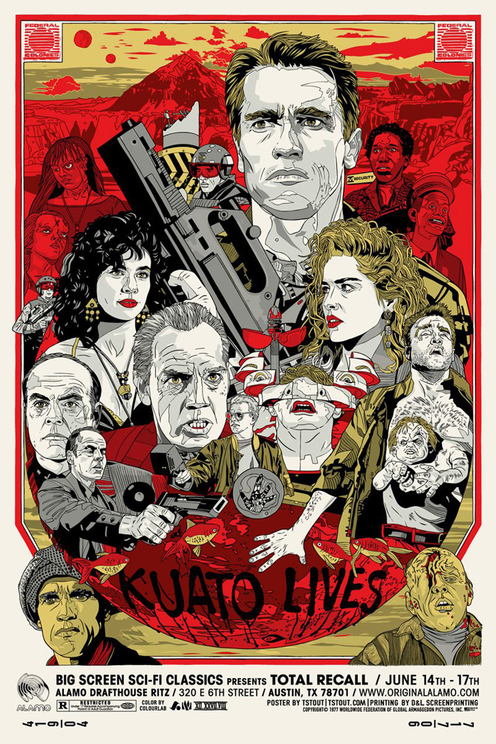
ROBOCOP • 30th Anniversary Merch range
Even though i maybe a design short, i haven't simply gone for the easy option with the mock-ups & stuck the rectangular image onto every object under the sun - I've generated new imagery by pulling various elements and layers from my PSD artwork files and created packaging and branding for accompanying products including records sleeves, paper bags and swing tags.I also went back and made 2 other colour variants of the poster design.

As with the Robocop merch range, i have taken elements from the original artwork and re-worked them to create branded packaging. The ltd edition vinyl design is one I'm pretty happy with, and wish it was a real product! Pressing the soundtrack onto a coloured record is also the sort of thing that makes special edition items more collectable. In this case i made the vinyl 'glow in the dark' - a reference to the Predator's blood, which is florescent green. Again, i went back in and made 2 more colour variants of the poster, should anyone not fancy the green version.

Looking back a the start of the project, i had intended it to be based on 'Object and Environment' - but as i come to the end of the module, my final solutions are leaning
more to the 'Product & Packging' category.

PREDATOR • 30TH ANNIVERSARY Merch range
As with the Robocop merch range, i have taken elements from the original artwork and re-worked them to create branded packaging. The ltd edition vinyl design is one I'm pretty happy with, and wish it was a real product! Pressing the soundtrack onto a coloured record is also the sort of thing that makes special edition items more collectable. In this case i made the vinyl 'glow in the dark' - a reference to the Predator's blood, which is florescent green. Again, i went back in and made 2 more colour variants of the poster, should anyone not fancy the green version.

more to the 'Product & Packging' category.
Friday, 6 May 2016
Mega peer & group crit
There was lots i could/will improve upon with the final design boards. I had run into some real problems with my Ai artwork files - for some reason they've become 'unreable' and crash Illustrator on the college Macs when i try and open them. Sometimes they don't, but mostly they do. Mostly. So the product mock-up boards were done quite hastily after a long night re-doing artwork. Obviously for the full submission i'll be including more info & my name/logo etc - these were just done to show what the the posters will look like & what they'd be used on. Mostly.


Initial , basic design range mock-ups. Had to make a 'white' version for use on tote bags, t-shirts & basically anything with a white surface so that it doesn't just look like I've plonked a big rectangle photo onto a bag without any consideration about how the real product would look. For the film posters i used the Duke of York's Picture House as a reference, as it's a really, really old cinema in Brighton that is known for screening retro classics and back-to-back trilogy nights. Hyde Park picture house is another similar example i could also use.

I've been told to "GO BIGGER IAN", by some kind, anonymous classmate. I don't know what they mean. How big do i need to go.Bigger than huge apparently..?!
Saturday, 30 April 2016
SB2: PREDATOR artwork creation & re-creation...
After more or less bringing the Robocop design to close, i focused back onto getting the final artwork made and arranged for the Predator poster - something i i foolishly thought would be pretty straight forward, as i just needed to follow the formula i used for the previous poster. Not so. I've given myself too many options again, and trying to apply similar, minimal aesthetics from the futuristic Robocop artwork just isn't working with The Predator and his 'present day' surroundings. The 'floating body parts' collage type approach wasn't working either, so i reworked it to fit the same basic layout i applied to the final Robocop poster. If i stick to that then even if the line work varies in levels of detail across each design then at least people will be able to see a connection between the compositions and the film titles/credits will be in the same place .
Also another element that will hopefully make them appear like more of a set is the inclusion of a 'grid' in the background. In the Robocop poster the square grid refers to his digital sighting that you see being installed during the film, as a P.O.V shot. The grid here appears in the form of a mesh/net-like pattern.The mesh is part of its attire, which apparently is what gives the predator the ability to become invisible. The net could also refer to a section of the film where it is briefly captured - it easily escapes however and continues to wreak merry hell.


Also another element that will hopefully make them appear like more of a set is the inclusion of a 'grid' in the background. In the Robocop poster the square grid refers to his digital sighting that you see being installed during the film, as a P.O.V shot. The grid here appears in the form of a mesh/net-like pattern.The mesh is part of its attire, which apparently is what gives the predator the ability to become invisible. The net could also refer to a section of the film where it is briefly captured - it easily escapes however and continues to wreak merry hell.


BELOW: from pencil line work to vector generating & compositional tryouts.
Thursday, 28 April 2016
Applied Illustration SB2: THE LOST BOYS - poster development

FILM POSTER 3: THE LOST BOYS (1987)
Dir: Joel Schumacher.
Starring: Kiether Sutherland, Corey Feldman, Corey Haim, Jason Patric
After becoming beyond frustrated with ploughing so many hours getting nowhere with the Predator poster, gave myself a break - by starting from scratch on ThE LoSt BoYs poster design, where it really hit me that i don't know what I'm doing anymore with these, yet i continued to sit in front of the computer for hours on end, in the hope of producing something i'm satisfied with.
POSSIBLE COMPOSITION FILM ELEMENTS TO BE INCLUDED:
• David, leader of the Lost Boys.(as seen on the majority of the films promotional material)
• Chinese takeaway box of rice/maggots or noodles/worms
• The Santa Carla broadwalk, featuring Rollercoaster & fairground silhouettes
• 'Welcome to Santa Carla' painted sign typeface.
• Deer & antelope skulls
• Santa Carla rail bridge, that the lost boys hang off during the film.
• Candles
•Wooden stake, garlic, holy water
• 'Death by Stereo' - one the one liners from the film
• Bottle of Blood
• Full moon
After spending a good while collecting suitable reference images to mould into the final design, my earlier worries about basing it around a film with main character who doesn't have as strong physical appearance as a Predator or a Robot cop are beginning to be realised somewhat . But as i've spent the majority of the module developing the aesthetics of the other two posters i'll have to stick it out and try and make it fit in the series with what little time i have left. I though once i'd nailed the production process in the first poster design, the others would be pretty straight forward, but it hasn't really turned out that way, as some design processes just don't transfer across to other subject matters as seamlessly as i'd ideally of liked. Or maybe they do, and it's just a case of me thinking about it too much and making issues for myself that aren't really there.

Current mock up. Got the grid involved in the background- this time in the form of the wooden struts from the rollercoaster and fairground rides found on Santa Carla broadwalk - where you first meet the gang of vampires at the opening of the film.

I planned ahead and found a typeface match. A bit of tinkering in Illustrator with the kerning & letter sizes, and bobs your uncle - replica Lost Boys movie poster typeface. Now, i just need poster to go with it!
Wednesday, 27 April 2016
SB2: Robocop Development & Completion (dare i say it?)
Finally able to wrap this one up, i think. Despite the initial plans to have 'this' & 'that' featured in the composition, i took the decision to strip it all back, and keep it as clean & clinical looking as possible - keeping Robocop as the predominant feature, with zero clutter. Even omitted the two cars from the film's end chase scene as i i felt they never really sat right with he rest of the image. Having not much going on it often felt like it was incomplete, and i spent a long while producing a number of only slight variations, which mainly involved altering the amount of colour that was added to Robocop's body, textures and lighting. Also reworked the film title typeface to closer match that of the end credits of the film,(apart from the colour) rather the metallic type face from the beginning of the movie, as i felt it looked a bit clunky.


Not sure how i feel about the final results at this point. It might just be that I've been looking at it too long and need to come back to it & make a fair assessment. But i think I've managed to put my own stamp on it, without producing something too similar to examples i'd seen whilst researching artwork for the film, which has been my main goal throughout this project.
Friday, 22 April 2016
Applied Illustration SB2: PREDATOR poster development

Dir. John McTiernan. Starring: Arnold Schwarzenegger
BELOW: design process, from reference image trawl (only a few examples shown)
through to layout scamps, and more developed mock ups.
With the basic composition for the posters already partially decided on (title character coming in from left, with film elements strategically placed to compliment that main character. Film title & credits in bottom left-hand corner) i worked on sketches in the similar vein. Also, with the feedback on the collages i'd previously done in mind, i set about trying to apply that concept with Predator film elements. I have my doubts about whether the neon colour scheme really works with the jungle-based imagery or not.
POSSIBLE FILM ARTIFACTS TO FEATURE IN COMPOSITION:
• The Predator (Masked/Unmasked)
• 'Dutch' ( Schwarzenegger's character)
• Laser sighting (triangle or dots)
• Glowing green blood/Red blood splats
• Jungle plants and leaves.
• Predator weaponry ( spear, retracting wrist baldes, self-destruction arm gauntlet)
• Predator attire (body armour, mesh outfit, animal skull necklace )
• Human Skull and spinal column
• a CHOPPPAAAH!!!!
Already, before the sketch stage I'm having design decision obstacles, that i can't imagine many other people having issues with. Initial 'brainmetling' decision; With the mask or without the mask, which followes endless to-ing and fro-ing between PRO mask and ANTI-mask rationalising.Eg:
WITH MASK - Retains the aire of mystery that the character evokes in the film, until he finally removes it towards the end.
WITHOUT MASK - you can see full horror of his mandibled, alien face, more interesting than a metal mask?
WITH MASK - if i wanted to feature his laser sighting 'dots' in the image, then it would make sense to have him with his mask on, as that's where laser is generated from.
...it goes on, and that was just a debate in my own mind (and my brother) about what bloody hat he should be wearing! Other questions included;
• Should Arnold be in it?
• What weapon should the Predator be using?
• How retracted should the blades in his gauntlet be?
• If i wanted to feature his self-detonator instead, i would need to flip the mage as he wears it on his left arm, but then that would throw the composition out.
• Should i use red, 'human' blood on the leaves or florescent green Predator blood?
God i'm boring. In some ways I'm think I'm subconsciously (although very consciously) trying to cover all bases so any film nerds out there, potentially looking at the poster can't pick any holes possible 'inaccuracies'. Ridiculous thought process, and a large reason why my production process gets so slowed down; SELF DOUBT and CONTASTLY WANTING TO PLEASE OTHERS.
As i was trying to keep the imagery for each of the posters similar enough so they work together as a set, i also made mock-ups in keeping with the previous Robocop ' floating body part collages', just to get an idea if it would work as well with the Predator character and his limbs, weaponry and habitat. Even if the imagery in the 3 posters ends up looking quite different (in terms of the amount of detail i use), then at least i'll be sticking to the basic composition layout throughout, which i always break down into shapes whilst sketching initial roughs (see below).

Below: 'Floating Predator' collage options.


Wednesday, 20 April 2016
Applied Illustration - Peer Review 19.4.16
Coming into/out of the latest peer review, i realise I've been so caught up in the final appearance of the poster designs (well, currently only one design so far) that i'd totally forgotten to think about a range of products that the designs would be used on, which is the aim of of the whole project! Apart from the obvious 'Mondo' poster solution and advertising posters for 30th anniversary screenings at various 'old' cinemas, i wasn't too sure what other products would be suitable to whack images of 1980's film characters on to.

The peer review came in handy on that front; Ltd Edition T-shirts, metal dvd cases, tote bags were also suggested as a possible range. I'd also toyed with the idea of making presentation poster tubes and tags to accompany the posters, for delivery purposes and to enhance their collect-ability in general. I'm going to have to get a wriggle on if I'm to have enough time to create all the whistles and bells to accompany the final posters. On paper, making 3 posters should've been done already, but as always I've been guilty of hideously over thinking what I'm doing,trying to consider too many possible final outcomes, rather than just going with my instincts and it's really starting to scupper the progress & enjoyment i should have whilst doing this. I mean, I'm getting to draw Robocop & Predator all day, what could be better?!
I am stil also dilly-dallying over the 3rd film poster i need to design. Initially it was The Lost Boys - but as my other designs feature strong looking characters (alien hunter and a cyborg copper) it was suggested that maybe a good-looking bloke with a ridiculous platinum blonde mullet might be a weak link.

Hellraiser had also been on my shortlist, and has a strong looking main character, PinHead, that could depict - the problem is, i can't bring myself to watch the film.I'm not a massive fan of the 'Body-Horror' genre of film, and I've only made it through the first 3 mins of the opening credits ,of which features hooks and lumps of flesh. I may just have to read about it?

Bad Taste ('Troma' style Z-movie, Peter Jackson'a first directorial outing,as well as doing pretty much everything else to with the production of the film) is another title I've overlooked because of the same reason. Iconic main character,but the actual film is too grim to sit through again. I think i'll stick with Lost Boys and try and make it work, mean he main character is/and does turn into a vampire during the film so i'll draw him him vampire mode. There are several other moments in the cult which the film is still well remembered for,amongst fans and geeks at least.


The Running Man - Arnold at his catch phrasing peak,although one of my favourite films of all time, there's just too much that i'd want to include on this one, and i'm trying my hardest to not do a mega detailed,full-to-the-brim Tyler Stout-esque design (see below) - as much as i admire them.


Where was i..?
Sunday, 10 April 2016
Peer Crit - Robocop poster development (cont)...
Amongst all the hand drawn design approach work i also had a play around with some minimal photo collage compositions, incorporating 80's colour schemes and paint brush marks/speckles. This has given me further decision problems,as i kind of like what I've done! It's certainly different to any of the alternative film poster designs I've come across, and it's also been appealing to those people who haven't even seen the film. They like it purely because of the way the photo elements work with each other on the page, and the neon colours contrasting with the black grungy background. The colour scheme really has gone down well it seems more than i expected it to.
During the class crit, it was suggested by tutors that i should actually stick with the hand drawn direction i originally started out with, and that although very striking and attractive to look at, with a suitable aesthetic - the photo collage is something that "anyone could've come along and done on photoshop". Which is a fair point, but i could easily argue that point by saying "Go look at Jackson Pollock or Joe Cruz's work"(I'm sure there a many more examples) A monkey could've done what Pollock was doing with his paint drips and splats - but the fact is, no-one had done. Another suggestion was to just try and combine the handrawn parts with the composition and colour schemes of the collage, which was the next step of my experimentation and development in order to finalise the design process of the poster (see above), and indeed the other 2 posters as swell, which i've yet to get working on.
Wednesday, 30 March 2016
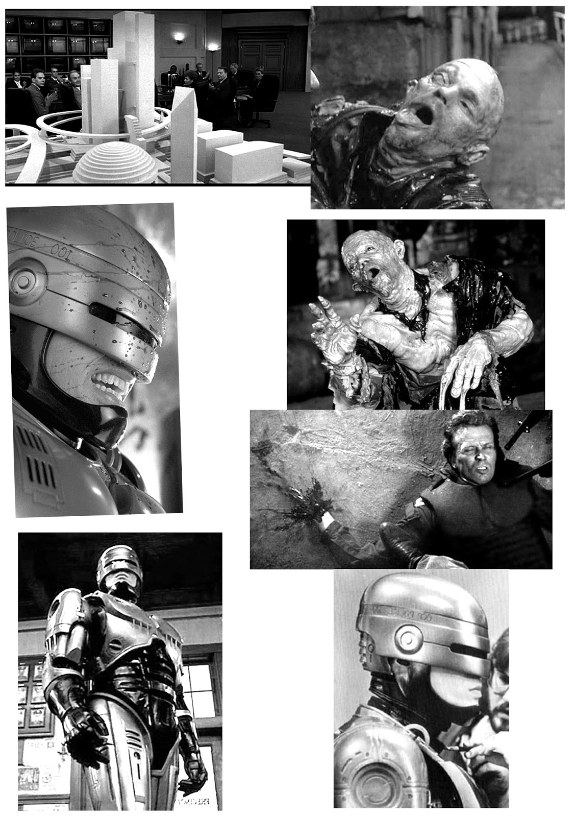
Applied Illustration SB2: ROBOCOP poster development

Dir. Paul Verhoven. Starring Peter Weller, Nancy Allen, Ronny Cox, Kurtwood Smith
Planning for the first design (as it will for all of them) starts with a long old trawl for suitable reference images of characters and iconic moments from the film. Drawing Robocop over and over again has given me the abloty to eventually quicky knock up scamps without the aid of the reference photos. I spent a good couple of hours finding as many as possible in as many different positions ask could - i'm not a concept artist, and drawing accurate anatomy is really not my strong suit, so if I'll be cutting and pasting body parts for a bunch of different images to make one body, in a pose that is roughly what i'm aiming for. I can then sketch that and modify it from there.So even though I'm drawing from reference, I'm drawing from compositions that I've made from scratch, so i don't see it as copying.

Small section of reference images i sourced.
Out of all the reference imagery i collected, i managed to whittle it down to just a few elements that i wanted to include - more often than not film, posters usually feature the main character, with the supporting cast, relevant vehicles,creatures, buildings etc.. in the background in various positions. I don't want to follow that formula quite so much, and am looking to keep the layout quite minimal and un- cluttered.


Example of my own simple cut & paste mocks.
From this point it was just matter of producing lots of sketches until i came up with a composition i felt worked. I will be adding the film title in the same (or very similar) typeface as used for the actual films opening credits, and will be aiming to apply the same layout across all three of the posters - so that they all have a connection to each other and they work as a set of designs. A headache i'm currently having is about how 'illustrated' i should make them - as my sketches have had good feedback, and although i don't want to lose that feel to them, at the same time i feel they look too w.i.p. Also, as the film is set in the future and is based around technology, so cleaning up the linework to give it a more clinical,digital tone may be more suitable.
Tuesday, 15 March 2016
Applied Illustration - Peer review
Coming into the peer review i hadn't made any progress as far as practical work goes- it has just been loads & loads & loads of research into existing products. I've been so preoccupied with trying to come up with something that doesn't resemble anything anyone else has done that I've become too scared to actually start drawing anything, because i can't think of anything new that no-one has already similarly done already. This is becoming a problem across all the modules - iv got new Pro-Markers, Microns, new brush pens, bristol board that have been sitting in my drawers & collecting dust since Christmas because i can't think of anything worthy to use them on.
The peer session was a help though. Fellow group members also agreed that i shouldn't be getting bogged down in trying to make something totally, absolutely original without any inspiration from other artists' efforts, and that i just need to let go of all the research into others' work & start drawing my own!
I explained how i thought my proposal wasn't 'adventurous' enough compared to some of the ideas i'd heard from other students (murals, paper cutting, full-on book cover & illustration design). Again i was assured that it's not always all about being adventurous and making some sort of crazy concept - if cult film poster artwork is the sort of work i want to be doing with my practice, then that's what i should be doing! My research had now gone from cult film posters (that had a link to my time growing up) to cult film short stories/cartoon strips, drawn in a 'children's book illustration' style but depicting adult themes as seen in the chosen films (see examples below, including Mike Mitchell and Luke Mcgarry).
Admittedly, my thinking had gone off on a bit of tangent, and the group feedback was that this new direction was unnecessary and that my initial concept was good enough to go with. As i was struggling to decide on 2 more films to accompany RoboCop, that i have fond memories of watching when i was little, it was suggested that as RoboCop was made in 1987,(which will make it 30years old next year) that i pick two other films from the same year and produce 30th Anniversary prints for them…a master stroke. Really don't know why i didn't think of that - too bogged down trying to think how the artwork shouldn't look?!
So now with a focused idea of what to look into next i can hopefully start making rough sketchbook ideas and i really need to, as time has flown on this one already.
Thursday, 10 March 2016
Applied Illustration - Gig posters
Was thinking away from cult films from my younger days, and considering doing something related to the 80's synth music i'm a big fan of. The likes of Gary Numan, Mirage, John Foxx, Duran Duran, Flock of Seagulls…i could go on. I was pointed in the direction of Gig Posters, which has a massive collection of poster art for all the bands under the sun. The quality varies, as always - but looking at some of them its made think i that maybe i should think about loosening up my process. Randomly same across (Tom O'Connor tipped me off) some gig posters for Craig Charles drawn by Russell Taysom (below) - which are big and bright and not fussed being anatomically correct. They're fun, which is something I'm not getting a much from with my work these days. Having only just thought of making the switch to music themed artwork ill continue to research whats out there to see if it sparks anymore inspiration.


Wednesday, 9 March 2016
Applied Illustration: What's been done already?
With Robocop being a firm film favourite, and one that holds fond memories of being a 10/11 year old, was first 18Certificate flick i ever saw,at a mates house.He'd recorded it off Sky Movies back in the early days when no normal people could afford Sky. I investigated into what sort of existing designs had already been produced in an attempt to avoid inadvertently creating something that looked the same as another artists efforts. After a while of trawling through examples i could tell that this wouldn't be an easy task, as it appears so many people have already made Robocop poster art (commissioned or fan art), in their own particular 'style'.
Looking at them (some rather more accomplish than others) I'm struggling to think of a way that i could bring anything new or different to the existing back catalog of designs.
Looking at them (some rather more accomplish than others) I'm struggling to think of a way that i could bring anything new or different to the existing back catalog of designs.
RoboCop poster art
The more i researched the more i thought, "is this even a proper idea. Is it even an idea?" I'm finding it hard to work out what this module is really about. If we don't physically have to make the end proposed product, then we could propose anything that would be totally unrealistic and unachievable. If it all comes down to concept, (and it usually does) then I'm going to be in trouble again, because i'm not sure making posters for Mondo is a concept - it's just a dream commission.
Friday, 26 February 2016
Applied Illustration - Further poster research
Per chance, prior to my progress tutorial with Ben- myself & Ben had a chat about what i was thinking of doing, and I explained that i'm aiming to base it around Cult Films, namely of the 80's time period, when i was growing up - a subject that he also is pretty nerdy about, which is a rare yet welcoming reaction, considering the age group of my peers, most of them havent even seen Back to the Future! So we sat and compared our lists of top cult/dodgy 80's films, as well as discussing possible directions to take the idea into. Eseentially we had the Progress tutorial there & then, but in my actual tutorial he also suggested looking at the artwork for B-movie posters, also research some Russian & Polish Art - which he said had a tendency to be pretty abstract & striking.Minimal graphic design (past & present) also found its way into there. Also on the research list was 'Fan art', which both we both agreed that i should be wary of, and theres a big difference in fans doing drawings of the films they like and the officially commissioned illustrations.The main difference usually being the the production quality and level of craft. Having looked briefly into Lithoprinting as a process for the final outcome, using restricted colour palettes and a colour pallete relevant to the time period should also be looked into.


Artists featured include: Krzysztof Iwanski, Rosocha Wieslaw, Wasilewski Mieczyslaw & the art of CYRK.
Trawling through Pinterest, Google and the Library i found i load of bold, visually striking poster art from the last century, some very minimal indeed, which i was particularly draw too - it got me thinking about how i could possibly apply some of the 80's film titles i'd grown up watching to these aesthetics and also what sort colour schemes i could play about with. In my mind it's exciting me, but i can't help thinking that i should be making something more adventurous or challenging..?
I'm also thinking that it might just be another one of those ideas that i & i alone would find interesting, and it'l turn into another personal project, with no appeal to anyone else.
i-D mag covers from the 80's
Examples of fan art
 |
| Olly Moss rip-off design |


Questionable (imo) Pulp Ficiton poster.
Subscribe to:
Posts (Atom)