Pages

Showing posts with label Screen print. Show all posts

Sunday, 15 November 2015

Screen Printing - Highs & Lows

As i hadn't been in the print studio for a good while it was good to be talked through the whole process again by Lyndon. Love that guy, and his enthusiasm for all things hand printed! 


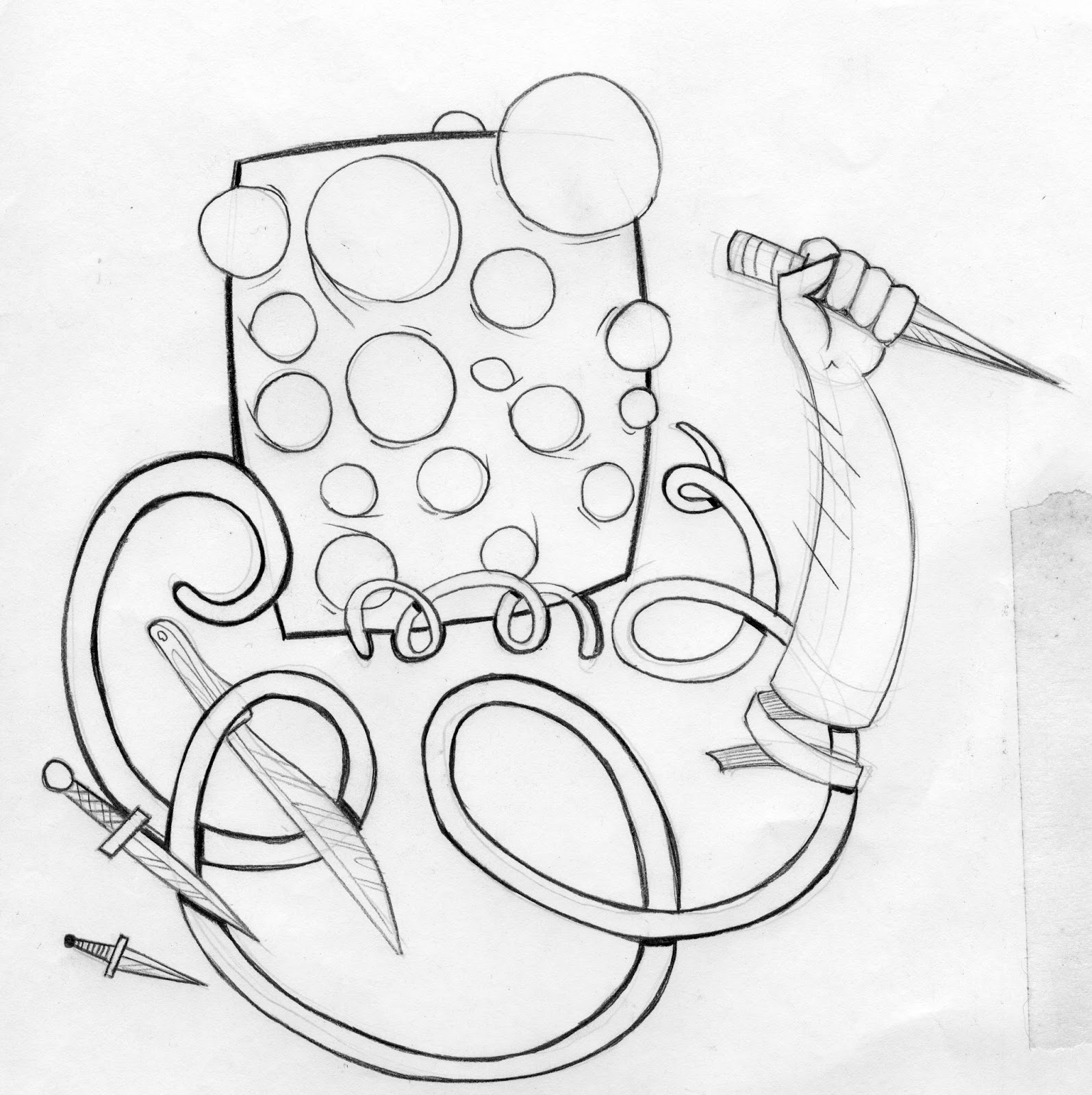
I'd decided to use the 'All beard and eyes' design for todays session - mainly because i wanted to make something different form the lino print session, which i made unicorn skull prints.


As it was a large group again, we paired up with people willing to use similar colour inks - we went through the various steps from preparing the screens with emulsion, exposing the positives, mixing our colours, then a lot of waiting for things to dry etc. I'm always left wondering why we're told to mix up the paints whilst we wait, but don't actually get to use them for another 2 1/2 hours. Surely this allows the paint to start drying up a bit, even though we'd put medium in the paint? Just a general wondering .


I was paying closel attention to all the process steps as i wanted to return on my own to make more screen prints more often, and i know i wouldn't always have a print tech floating about to assist. The 'marigold' layer were all printing out pretty well, it's when it came to putting the black layer over the top is went things went down the toilet. 


I remember having the same problems the last time, which was also whist printing black. For reasons unknown to me then its was coming out streaky and patchy, coverage was poor. Registration had gone well out the window by this point. I thought it was the paint drying up or not enough paint, but turns out i was simply pulling too fast with not enough pressure. Worked this out with about two prints left. So basically my days printing was a write-off, and thats not an exaggeration. They looked terrible. I couldn't even look at them to see just how terrible they were!

But they were. 


These were the best  of a bad bunch. The only ones i'd allow to be photographed. I did refrain from chucking them all in the bin though. I just shoved them in my studio drawer and went home to rethink the way i live my life.


 T H E    R E T U R N 

Determined to put the wrong things right, i used my spare time the next day to return and face my squeegee demons. It would also give me a chance to suss out the general print studio whilst flying solo - and it turns out its so much more enjoyable when you're doing with lots of people around you all trying to so the same thing. Maybe i just got lucky on a quiet day?


As with the day before, all went well up until applying the black layer. Same patchy, blotchy coverage. I really didn't want to carry on making unusable prints but i didn't really have a lot of choice. I stuck it out, thought back to what i was doing wrong yesterday,which was rushing things and being too weak with the pulling, and made sure i went slooow and super strong. Bob's your uncle, massively improved results ensued. If id sorted out the the alignment on these then id have no bones to pick about the final prints.The registration marks were always in the front of my mind from the moment i made the positives, but for some reason they didn't materialised and i thought it'd be straight forward enough to do it by eye. Not so. Really annoyed at myself for not seeing to this, as I'm not sure if they'd really be sellable in this state? I suppose it shows that its been made by a human, for all the analogue purists out there.Plus i guess some people might like the 'off-set' effect. But its something to correct for the next time. 


 I N   S U M M A R Y 

+ Managed to screen print through all the process stages without assistance.

+ Pleased that the background 'texture' effects came out well.

+ Kept a cool head to work through some technical issues 

+ Managed to save a few of the previous days prints(ish) by attempting to print over the linework

+ Was given a killer, print day saving tip : Flood the screen whilst I'm setting up paper for the next print. This means the screen is likely to dry out.

Really enjoyed the working environment, and had made me want to use the facilities as much as possible.

+ Its a process i'd like to use for my final author A3 prints,if i can get some consistency on the paint pulling.I don't want to have to go digital, as it seems like the easy option, even though its guaranteed quality results.


- The omission of registration marks made lining up layers very hard, and has led to wonky colour alignment. Enough to wind me up. 

- Maybe should have used more of the orange colour in the design somewhere. Possibly used another dark colour alternative to black.

- The bitmapping of the eyeballs couldve been a bit more dense. Although i wanted it subtle, some of it is quite hard to make out.

-  Looking back at the prints, somehow i failed to see the main figure is off-centre. Enough to wind me up.

- I'm still not giving myself any room for mistakes or imperfect results. Possibly being a bit hard on myself, this is only my 3rd time screen printing,ever.


Saturday, 14 November 2015

Screen Print session

Id been messing about with a composition involving a sports bag, hand and unicorn skull all in relation to the the Murakami book id been reading/listening to - in fact, id actually finished it! Couldn't tell you what i thought of it, it just ended with me not really being able to tell what the hell it had all been about or what the conclusion was..? I'd taken plenty of interesting sounding excerpts  from it, although having a short discussion about the whole project with Mr O'Connor he suggested that i try and read some other titles or at least read some reviews about them in order to expand my research and possibly find some more material to base my drawings on,as my ideas could be quite limited if i stick to findings from just one novel. That said, its taken me long enough to plough through one book!


I wanted something worth-while to take into the screen printing session. I'd also been meaning to visit more often to get a proper hang of the process and to be able to rock-up and make prints under my own steam, hopefully if all goes well itl encourage me to become a screen print regular. If not, i'll chuck it in the sea, along with my mono-printing escapades. 

Initial sketches and Photoshop collage mocks helped me visualise the general composition. I want to strip down the elements to more basic shapes with not so much detail. Also had a repeating pattern idea to get some interesting shapes involved, so i wasn't just printing big blocks of plain colour.

My 'sketchbook'

For me the Ai drawing board is my sketchbook. i find i can get down my ideas, develop these ideas and create new ones far more fluidly than when i'm sat in front of an actual sketchbook with a pencil. I just can't seem to visualise whats in my head unless I'm pulling it about on screen. I know designing on screen is something that i needed to stop doing, for time saving purposes but its proving more productive than my of the scribblings in my visual journal. Using illustrator is also helping me get an idea of the sort of imagery i would be using when it comes to animating it all in After Effects. Maybe I'm thinking too far ahead, before I've even got a solid (vague even) idea of where I'm going.


'Beast Skull Reach' development

I decided to leave out the sports bag,as it wasn't really fitting in that well, compositionally for the purpose of screen printing. So i took the hands and zig zag/whirlpool/black hole pattern and worked them in with the unicorn skull id used for the mono print. To save time & time and keep a bit of continuity, not that that was  necessary at this point.

Initially working with black white/cream and red. 
Classic japanese colours, possibly the obvious choice but it gives it 
some connection to it's Japanese author after all.


To break up the solid blocks of red and black i added a mixture 
of gradient bitmaps and masked texture layers.


'All Eyes & Beard' development


Based around a passage of descriptive writing from the 'End of the World' part of the novel, i had previously done some quick minimal doodles reflecting  interpretations of the  Gatekeeper character, to whom the writing is describing as being "all eyes & beard". I stuck to really basic shapes as much as possible, not really worrying that they appeared to be random scribbles. I also incorporated some other element of the character also described in the book,as well as connotations to the ending of the world e.g.: crumbling earth or unravelling objects. I am wary that the imagery i use will have to be used in the animation as well, so don't want to make anything to detailed or complex thats going to take lots more AfterEffects know-how than i have. Which isn't much...yet.


As we are only working with two colours getting bitmaps involved is a real effective way to create the illusion of varying opacities whilst using only one colour. Depending on how carried away with you get it can get a bit fiddly. I got carried away with, as i didn't want to use the same dot sizes over the whole image, that would just create the same shade of whatever colour i was to use. So i used different size dots depending on how near or far the object was, or how bright or pale i wanted the object to be.Also went as far as using the marquee tool to cut straight edges into the dots creating the illusion of edges and corners.(see below)


For instance the eye balls have small,spaced out dots, giving a very pale tint. The flame has bigger more condensed dots to achieve a a strong colour. I also faded it out using a gradient mask. Having the flame bitmapped also meant that when the black line work is printed over it the top it would give the effect of the flame being transparent, rather than just a blob of orange. 


As i didn't want the background to be just plain block colour black (or possibly dark purple as an alternative) i gave it a distressed, scuffed wood grain effect in selected areas - not so much that it would impede the main focus of the Gatekeeper, but just to break up the large area of darkness.I also want to see how textured areas would print out, so curiosity and experimentation as well. This was achieved by raiding my extensive bank of textures, modifying the levels and creating masks with them. (thats the short story).


Final print positives. Left, Black. Right colour (red/dark orange/yellow)  


Now to take it to the studio. I know its unrealistic  to expect digital-like results with screen printing, so i shouldn't get so frustrated when i don't get them. Especially as this will only be the third time of actually screen printing anything. I guess if i'm creating digitally and producing with analogue techniques then i should exect some blemishes. I'm just seeing how close to what I've made on screen i can recreate with my hands a squeegee (plus other bits and bobs).