Pages

Showing posts with label OUIL504 SB3. Show all posts

Tuesday, 19 January 2016

OUIL504 - Summative Evaluation


This has been a long old module, during this time i don't think I've really developed a whole load of new practical skills as such (my reading skills or book love definitely hasn't improved) .I've just been doing a small selected number of techniques and doing them over and over until I've become more competent and confident at using them. Namely the screen-printing process, start to finish, unaided. The was always something i wanted to become familiar with and start using regularly in my production practice, since before i started the degree, so I'm happy that've got to the point where i can using the screen print facilities under my own stream and produce work to a good standard.        Theres been a lot of frustrating times getting to that point but, I've come out of it wit another skill under my belt, and eager to do more in the future, providing I'm able to carry on making enough work to be able to print it. Developing my compositions to their fullest before attempting to make the final draft is ale something I've also learnt to appreciate and work on.Lots of scamp making has been the key, although not a new skill i have found myself doing it more naturally, and have been enjoying drawing the same thing over and over over a bit more than last year. My work has definitely seen the benefits of this, i feel.
   On the digital side, After Effects has been a real eye-opener, although i haven't allowed myself as much time to get fully acquainted with it as i would've of liked. The options on there are are pretty endless, which is a danger for someone like me who doesn't always make a plan of action and can't make a decision to save his life, but being able to bring my drawings to life (on an albeit basic level) is something thats really excited me in this module, more so than the actual illustration side of it at times.I found myself having to reign it in with my animated sting, as there was so much i want to do with it. but against time and skill restrictions i thought it best to not over complicate things. I do hope to get  a chance to carry on using AE for future work, or to use it as much as possible with any personal work as i'd like to improve a whole lot more,as i could see myself moving into this sort of direction, as far as my work production or even career beyond uni goes.
    I'm still striving to make work that's as clean & clinical as i make on screen, but i think I've simplifying the work i make on screen to facilitate possible analogue printed methods. Having a restriction on colour pallets has helped my development also, and its a challenge i enjoy - to find creative ways to get around only being able to use 2 colours. At the same time i look back and think i might've like to have pursued the hand drawn aesthetic that i originally came into this brief with, and was going to take to the final print stage before having a major rethink about my overall composition appearance. I guess it shows i can be quite flexible between analogue or digital looking work, but having the option of both often gave me headaches in making a choice.
   I did find motivation a bit of a struggle after a month or so of working on the same project day after day - made even harder by the fact that wasn't producing a whole lot that was exciting me.The whole author subject matter was probably a part of this, as authors,stories & reading books just aren't my 'thing'.I found my enthusiasm came back with a few weeks left until deadline day. It just felt like things were coming together, i was getting to make the final pieces, so i could see the fruits of my labor after months of staring at rubbish tests and roughs.I seem to spring into action really late in the day, maybe there was just too much time given to me for this project to think about everything in the world. 
  Over thinking is my biggest weakness, still. Not that i should be not thinking about how to execute my work, but maybe try not to think about every single possible outcome so much and how it would look, or if people will get it, or like, or weather i like or what it could be used for, or if it would sell etc etc… Initially my sketchbook would be a 'bit' more experimental with different mediums, and a lot more colourful - but getting to the point where i knew how i was going to make my images i didn't need to spend time trying out various inks or paints or colours, and more or less all my sketchbook would be pencil scamps. Not that it needs to look bright and interesting for anyone, as its just development, but seeing some of my peers sketchbook work make me think that maybe i could've tried more stuff out before settling on the production process that i chose? 

So going forward from this, i'd say think less is what i need to be doing, i think.


About the Author - Day 674

Printed Image
T H E   E N D

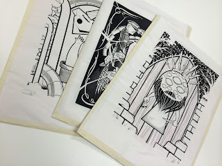
As i had a 'few' newsprint tests knocking about i made sleeves out of them for 
each print, to give them a bit of protection.Also gives it that extra, personal,
 hand-made touch. Signed for good measure, its piece of art in itself!


Strengths: 

+ My persistence in trying to achieve the best rests possible with an analogue printing techniques despite only being a novice at it. Plenty of times i felt like it had beaten me and i want to throw it all in the bin, but my desire to make prints as high quality and professional looking as they did in my head spurred me on.

+ My thorough development of concept sketches before attempting any final drafts. Although i was a slow start i did eventually enjoy the repetitive sketching and tweaking of the same elements in order to fins a way of making the whole composition work well together.


+ Finding a middle(ish) ground of using Digital and Hand-drawn imagery. Starting of as doodles and developed roughs then into the digital realm for polishing, composing and making print ready -  then back to analogue for the final product. When the screen printing wasn't going so well, where i once would've fallen back on my digital know-how to make things things right i stuck it out and tackled the problem with my real-life hands and mind.

+ Due to going back to the 'drawing board' a few times i've created 3 separate images that finally work well as a set.


Again, on closer inspection, these photos are abysmal. 
Apologies, on behalf of Apple, and myself.


Weaknesses: 

- I was pretty slow out of the blocks with the initial researching of the author, and also formulating any ideas or sketch work. My dislike/poor reading ability more than likely effected the final outcome, as if i'd read more of Murakami's titles then i would had more material to work with. Not that I'm unhappy with the content of the final outcomes.

- Lino cutting is something that was new to me on this project ,and something i enjoyed doing. I would've liked to have experimented with it a bit more given another opportunity as it may have helped me simplify some of my work with the technical restrictions it has - but the imagery i had been making didn't really suit the lino cutting methods, and i probably wouldn't have had enough time to get good at it and adapt, only to decide that i didn't like what i was producing.

- After the initial sketchbook media experimentation the colour all but disappeared from my development work. Maybe i could have tried some different techniques, but then again, if id decided on my printing method, and colours then there'd be no real point to trying out loads of paints or crayons etc in my sketchbook work

- Getting every aspect of the final screen prints to go right all together. Good screen exposures, even paint coverage, accurate registration never seemed to happen as a team.

-  If i hadn't changed my mind about my imagery so much then i could have easily made 5 prints instead of 3. Although it was a mental and physical battle enough to get these 3 bastards done if I'm honest!

- This project has taken over everything (and I've let it),  as i just wanted to make something to the levels i expect of myself. However this has lead me to neglect a lot of the work on the other modules. Delegating my time evenly is a big issue for me, more so as I'm having to try and my delegate time to doing things i really, really don't want to do.(no names given)


Final Thoughts:
Although quite happy with the final prints and what I've learnt, i do have the nagging feeling that i could've made them just a bitter better and 'sellable' and that one final go in the studio and i could nail it. Alas, I'm out of time. But ill take what I've learnt onto future screen printing outings, no fear.


-----------------------------------------------------------------------------------------------------------


FINAL PEER REVIEW

After having the final mega peer crit, i do feel a lot happier with myself and with my final prints, and its left me thinking that maybe I'm being too hard on myself and too negative. I'm so wrapped up in considering what clients/onlookers will perceive as 'perfect' or professionally acceptable looking work, that i forget to actually step away and get the view of an onlooker.Fresh eyes looking at my work haven't noticed the streaks and imperfections, and mis-registrations that have been nagging away at me. They welcome it, and wonder what I'm making a fuss about. Just because a bit of paint has printed out exactly how i envisioned doesn't mean i should be labelling them up a 'REJECTS'. I feel bad for those prints now, i might go and re-word the labels. I need to constantly remind myself that people aren't always looking for flawless art (unless they really are looking for it). 


-----------------------------------------------------------------------------------------------------------


Moving Image
T H E   E N D


    DownTheTubes(FIN) from IanF on Vimeo.


Strengths:

+ When we were first set the task of making an animated sting to accompany our author prints i straight away knew i wanted to make a 'living' world out of my static print designs - and i feel I've done what i set out to achieve with this.

+ My first outing on After Effects and I'm fairly pleased with the results and what I've managed to learn, through the AE class sessions, and off my own back by watching lots of youtube tutorials on the basics (and the not-so basics) of using the program.

+ I've pushed my self to making something a bit more complex than maybe i should of, as someone with no prior knowledge of After Effects. But i felt i had a clear image in mind of what i wanted to try an accomplish and knew it'd take a little bit extra to see through.

+ The movements & transitions in the animation are largely how i had planned them to be, without having to compromise or go for a simpler option. If i came across something that was stunting my progress i'd seek out online help or specific tutorials until i was back on track. Frustrating at many times, but I'm now the wiser for it.

+ I feel the music works well with the moving imagery, as do the layers of sound effects & background noises that are also going on in there. I took into consideration the audio levels, increasing and decreasing at appropriate times to coincide with specific image movements.


Weaknesses:

- I couldn't really do a whole lot of work on the sting until after my printed work had been designed, which wasn't until a coupe of weeks shy of the deadline. I'd considered composition and transitions and what i envisioned it all to look like, but without getting them out of my head and making them into lots of story boards.  

- The story boards i did make were probably a bit too detailed and complicated to follow,or even execute with my skill level on AE.But they did lead me to trying out other options that were within my reach.

- I wanted to make a sting based around all 3 of my final images, but left myself a bit short of time to really experiment with that idea. Also, realistically 15 seconds wouldn't have been long enough for me to fit in everything that was required.

- My documentation about creative stages leading up to the finished product could've been more in depth. I didn't really do a whole lot of test versions, i just worked away on the main sting, solving problems and adding new features here and there until i got to the point where it was how i wanted it. The screenshot taking slipped my mind when i got into 'the zone'.


Final Thoughts:
The introduction to After Effects and what it can do (even at Entry Level) has been one of the highlights of my course experience so far. Just hope i can make the most of what I've learnt and build on my knowledge with projects in the future. Even though the main bulk of the sting work didn't happen until towards the end of the module i don't feel like it's been rushed or the final product has been affected by lack of time spent on it or on development. I'd say the only thing that's held me back is my skill level. The ideas in my head and storyboards were far grander (and grander than they really needed to be probably)  so i had to reign it in a bit. But would've loved to make it extra 30 seconds longer - and i may even do that in any spare time i get, so i don't end up forgetting everything I've learnt,


Process & Production - ISSU Progress reel.

I have to say, I'm all lfor making issu presentations, and they look great when the images sizes are all the same size and the document pages turn and look like a real book - but the majority of my photos, screen grabs, scans etc are different sizes so it all looks a bit shoddy when you've full size images next to images which have been shrunk down nto ridiculous proportions so you can't really make out what it is…? Sooo annoying. 
Mental note: make all my images the same size forever, for always from now on, in case i have to make an ISSU publication out of it!

Anyway, here's the main points of the journey of my prints - from sketch to print, to wall.


Printed Picture / Moving Image - FINAL Project Proposals


F I N A L
P R I N T E D    P I C U T R E     P R O D U C T I O N


Not a whole lot changed from both of the initial proposals that i wrote. A lot of the content and concepts i wanted to communicate remained relevant right though to the final product. 


 I INTEND TO PRODUCE…  

A series of 3, 2 colour, A3 screen printed images based on my interpretations of selected pieces of writing and descriptions from the Haruki Murakami novel 'Hard Boiled Wonderland & The end of the World', and also reoccurring themes that run through out Murakami's books.
The colours will be Black on all 3 prints with 3 different colours on each; Red/pink for  'Whisky Business', Turquoise/Teal for 'Down the tubes' and a rich, bright Orange/red for 'All eyes & Beard'.


 THE CONTENT WILL FOCUS ON (identify 3 specific themes, texts or concepts)   

1. Discovery - finding or losing the unicorn skull (depending on how you look at the image)

2. My distorted depictions of characters or events from the book.

3. A 'golden beast'/ unicorn skull features in both parts of the story, so will be featured somewhere in all of the series of prints, some less prominently than in others.


 I WILL BE AIMING TO COMMUNICATE (identify 3 specific messages, ideas, moods etc)   

1. Otherworldness -  the prints will feature a collection of weird looking elements and compositions. 

2. Confusion - a feeling felt by for the majority of the story by both of the two lead 'narrator' characters.

3. Deterioration - The prints will all have a certain amount of distressed textures and paint effects on them, certainly around the edges, which is a sort of metaphor the the world starting to fall apart from the outside.


 TO AUDIENCE OF

1. People familiar/unfamiliar with Murakmi's work.

2. People who enjoy chunky, bright screen prints, with a few blemishes.

3. Anyone appreciates visual metaphors with a touch of surrealism about them.   


---------------------------------------------------------------------------------------------------------------------------------


F I N A L

M O V I N G    P I C U T R E     P R O D U C T I O N


 I INTEND TO PRODUCE…  

A 15 second animated sting, using Adobe After Effects based on my interpretations of writing and characters featured in the Haruki Murakami novel  'Hard Boiled Wonderland & The end of the World', other reoccurring themes from Murakami's work.

It will focus more on the panning, zooming, rotating rather than "animating" what I've drawn as such. Subtle movements will be included as the sting takes a 'journey/adventure' around the elements i've drawn from one of the pre-screen printed designs. 
It will be accompanied with a suitable piece of instrumental music and sound effects to enhance the imagery. As long as i keep a consistent feel between this and the printed work i produce then that'l be a success. 


 THE CONTENT WILL FOCUS ON (identify 3 specific themes, texts or concepts)   

1. Discovery - of  subterranean tunnels/laboratory, and of a groaning unicorn skull. 

2. As with the prints , Surrealism.

3. Mystery - ie: what the hell is going on here?! A feeling that often came to mind when reading this book.


 I WILL BE AIMING TO COMMUNICATE (identify 3 specific messages, ideas, moods etc)   

1. Adventure - as the 'camera' moves from illustration to illustration, giving the viewer little snippets of them all.

2. Confusion - as (to the uninitiated) these pieces are full of (seemingly) random and mashed together people & creatures. Its also something the characters in the novel commonly feel. 

3. Searching/Finding or Losing. The way the 'camera' moves indicates that the viewer is looking though these underground tunnels/tubes.


 TO AUDIENCE OF

1. People familiar/unfamiliar with Murakmi's work.

2. People who enjoy basic , quirky animations with accompanying sound fx.

3. Anyone appreciates visual metaphors with a touch of surrealism about them. Plus there aren't a whole lot of animations based on this guys work, that I've come across.  


Monday, 18 January 2016

Product in Context


My designs were only ever really made for the purpose of being displayed (as was briefed) on a wall, in a frame. The way i composed my images clearly have that in mind, and i made sure all the elements worked together within a 'frame'. After finishing the prints i see they could be used for a number of other printed alternatives, postcards, canvases, tote bags - anything that would would be required to fit within a certain retangular frame. Obviously with sites like Redbubble etc you can go and whack your images on all sorts of random crap, but i don't feel these 3 designs would work well on the majority of these, which i don't see as a bad thing. These have a sole purpose, to decorate someones living room, bedroom, and sure, even their toilets?!


About the Author - ELEVATOR PITCH


My project is a set of 3 screen prints based on the characters and writing of Haruki Murakami from his book 'Hardboiled Wonderland & The end of the world' As i hadn't heard of many of the authors on the list i took a punt with Murakami and the more i researched into his work i found myself more interested in the recurring themes in his books, namely the surrealism and his references to western culture. 
   Everything started out as rough scamps, which i developed and developed, then came back and developed some more before making the final designs as vector, then making them screen-print ready in Photoshop. I chose screen printing as its something i told myself i would try and do as much as possible when i joint the course and have only done it a couple of times up to now, so this was a good chance to get fully versed and lot more experience of it under my belt, as frustrating as the results often turned out to be. 
   I have started to appreciate the look and feel of hand crafted print a lot more than when i started this and definitely feel a greater sense of achievement with my end results.

Wednesday, 25 November 2015

Process & Production - Studio Brief 3: Project Proposal

P R I N T E D    P I C U T R E     P R O D U C T I O N


 I INTEND TO PRODUCE…  

A series of 4, 2 colour, A3 screen printed images based on my interpretations of selected pieces of writing and descriptions from the Haruki Murakami novel 'Hard Boiled Wonderland & The end of the World', and also reoccurring themes that run through out Murakami's books.
The colours (at the moment) will be Black on all all 4 prints with 4 different colours on each print. (e.g.: black/orange, black/pink, black/blue, black/metalic grey) Will depend on the final look and content of each finished image.


 THE CONTENT WILL FOCUS ON (identify 3 specific themes, texts or concepts)   

1. Surrealism - not being worried about things looking as they should

2. My distorted depictions of characters or events from the book.

3. A 'golden beast'/ unicorn skull features in both parts of the story, so will be featured somewhere in all of the series of prints, some less prominently than in others.


 I WILL BE AIMING TO COMMUNICATE (identify 3 specific messages, ideas, moods etc)   

1. Otherworldness -  the prints will feature a collection of weird looking elements and compositions. 

2. Confusion - a feeling felt by for the majority of the story by both of the two lead 'narrator' characters.

3. Deterioration - The prints will all have a certain amount of distressed textures and paint effects on them, certainly around the edges, which is a sort of metaphor the the world starting to fall apart from the outside.


 TO AUDIENCE OF

1. People unfamiliar with Murakmi's work.

2. People unfamiliar with Murakami's work

3. Anyone appreciates visual metaphors with a touch of surrealism about them.   


---------------------------------------------------------------------------------------------------------------------------------


M O V I N G    P I C U T R E     P R O D U C T I O N

Now, as i haven't yet produced any imagery that I've settled on &  want to pursue into the final production stages, getting started on the animation sting stage of the project has been done purely in my head & storyboard of how i imagine i want it to look and move. 
Also,looking at lots existing examples (on vimeo etc),and browsing through a few of the Year 6 efforts from last year has helped me visualise why can be achieved. 

Feeling comfortable with the Photoshop/Illustrator connections to After Effects i'll be tackling this once the printing side of things are done & dusted. As i think leaving the screen printing until near the deadline would put more pressure on me rather than having to suss out any issues concerned with my animated work. If i aim to have the printing (or the majority) done before i leave for home over xmas (I'm not going home straight away, so will hopefully have a nice quiet week in the printing studio to capitalise on?!).


 I INTEND TO PRODUCE…  

A 15 second animated sting, using Adobe After Effects based on my interpretations of writing and characters featured in the Haruki Murakami novel  'Hard Boiled Wonderland & The end of the World', other reoccurring themes from Murakami's work.

It will focus more on the panning, zooming, rotating rather than "animating" what I've drawn as such. Subtle movements will be included as the sting takes a 'journey/adventure' around the elements i've drawn  from all 4 screen printed pieces. 
Now, i don't want my visions to become too grand, as i realise I've very little experience with actually using After Effects, but if get my 'nerd-on' and do plenty of private study time using online tutorials then i may work out how to get some smashed glass or cracking,crumbling earth type effects going on. But again, i don't want to get too carried away with what's desirable and what's realistically achievable at this stage. As long as i keep a consistent feel between this and the printed work i produce then that'l be a success. 

However, "you musn't be afraid to dream a little bigger darling "...


 THE CONTENT WILL FOCUS ON (identify 3 specific themes, texts or concepts)   

1. Hidden meanings.

2. As with the prints (as the sting is just an amalgamation of those), Surrealism.

3. Mystery - ie: what the hell is going on here?! A feeling that often came to mind when reading this book.


 I WILL BE AIMING TO COMMUNICATE (identify 3 specific messages, ideas, moods etc)   

1. Adventure - as the 'camera' moves from illustration to illustration, giving the viewer little snippets of them all.

2. Confusion - as (to the uninitiated) these pieces are full of (seemingly) random and mashed together people & creatures. Its also something the characters in the novel commonly feel. 

3. 


 TO AUDIENCE OF

1. People unfamiliar with Murakmi's work.

2. People unfamiliar with Murakami's work (this book inpartucular).

3. Anyone appreciates visual metaphors with a touch of surrealism about them. Plus there aren't a whole lot of animations based on this guys work, that I've come across.  


Thursday, 29 October 2015

Study Task - Animated Sting Analysis

Thinking about movements and a tone of voice for my animated sting, and these came to mind. Im  a big fan of the end credits of the first Captain America films, which is probably he nerdiest thing anyones ever said. But i am! Visually they look very different but as far as the transitions and movements between frames goes they're very similar. I read up about how they were made here: The First Avenger - Making of   & here  Winter Soldier - Making of


Captain America: The first Avenger by Method Design, 2010.


With the first film, as the majority of it is set in around of WW2 timscale, it incorporates lots of war propaganda poster imagery and sort of merges them in to one long moving image,using often only small object movements, but big camera zooms, spins and pans. They use Maya and more 3D, Film industry based technology to make it all, but hopefully i should be able to achieve a similar kind of effect with After Effects, especially when it comes to smooth panning from one part of my imagery to another. The big fanfare music by Alan Silversti (a big film score hero of mine) also really gives the whole thing an amazingly nostalgic,victorious, uplifting, war-time feel,well as uplifting as War time could be?! Makes my hair stand on end a bit, which is weird,and a bit soppy.Watching and hearing it make me feels like I've overcome a massive obstacle (a bit like a war) and I've come out of the other side alive and well,and as a winner, and all's well with the world. A similar feeling i got when i handed in my essay last year.


Captain America: The Winter Soldier by Sarofsky Corp, 2014.

The credits of the second film are much more clinical, graphic and somewhat influenced by classic film credit animations by Saul Bass (below), in movement and the fact that black,white & red are the only colours used for the whole thing. Which is the same stipulation with our brief.Watching this sequence over and over, and studying the transitions between scenes and how they're all linked together has given me lots to think about and possibly try out with my ouwn sting, although I'm assure its a lot more complicated to achieve than it looks. But the slick graphical shapes would definite suit my style of work.The Henry Jackaman score is also also hugely complimentary with the animation - making the big swoop, zoom, spin movements seem even larger and more powerful. The cracking screen screen part would transfer really well in to my sting also, as I'm thing of incorporating some sort of crumbling/cracking earth imagery to symbolise the end of the world in my prints & animation. Again, something I'm sure will take far more working out than i can fathom. 


-----------------------------------------------------------------------------------------------------------

This third animation is so far removed from the previous examples, but i also really like the mood set in this one by the wobbly drawings, simple movements, cute litre sound effects for each motion, and the way the the narrator's real, pissed-up voice has been synced up over the top of the animation to turn the initial joke into a small story.  It's the little uncomplicated things that i enjoy with this one; the little 'pop' noises that the scenery makes when it appears, the flag constantly flapping gin the background, and the after credits scene, showing the further dimise of the nice nacho guy. 

"Two Chips" / An Animated Short from Adam Patch on Vimeo.


I maybe won't be looking to make anything quite as 'twee' as this (although twee works in this instance) but i'll be looking to incorporate little, simple movements and sound fx to enhance the whole thing. Great concept though,still makes me chuckle every time i watch it -  i must remember to record more drunk convos with my mates, i'd get some 'intersting' material for animations.

----------------------------------------------------------------------------------------------------------

This short 10 second sting fits in an amazing amount of narrative in the short space of time. It's been made using some pretty advanced After Effects techniques by the looks of it, but only using quite simple shape based characters and sea surroundings. The island, sky and plane bursting into flames looks super realistic, so haven't a clue how he managed to make those bits? Also the rain drops falling onto the camera lens is a great touch.


Sting 12 - Dharma from Anthony Hibbert


The friendly looking shark character pops up from the paper-cut looking waves, but the minimal facial movements turn him from cute to sinister as he dives back under water  to get 'something to eat'. The camera movements do a lot of the work here - bobbing in the water, bringing the shark into the frame and them moving beneath the waves for instance. It's all very slick and at the level i'd ideally like to reach, if not by the end this module then somewhere not too far down the line (a bit ambitious maybe?). The additional sound effects help create set the mood aswell, and bring everything together to make a tiny 10second film, and left me wanting to see lots more!  I'm just really looking forward to sourcing loads of sound fx to chop up an lay over my animated drawings. My Music Technology Diploma could finally pay the dividends.