Pages

Showing posts with label Out of Order. Show all posts

Tuesday, 28 February 2017

Out of Order - Signed off & Framed up...


Prints done & signed, and all that was left was to frame it up - along with the rest of the classes work as well, apparently?!  We had nice little production line going; Flannagan cleaning frames, Georgie trimming prints to size and myself framing the buggers up all nice and straight - all ready for getting carted down to CMW for the hang team to take over.


When it came to wapping up my extra prints i really couldn't be bothered with it all. They won't sell,(that's not me being negative) it's really not in keeping with the Colours May Vary aesthetic. Just felt like it kinda got in the way of other things i needed to get on with - especially with the amount of added promo work i was lumbered with, as the majority of people from our promo team have hardly been pulling their weight. I've had more forthcoming assistance from people who aren't even part of the promo team!

Still, i took the opportunity to revamp my business squares for the opening night, should be able to shift a few of those even if no-one's interested in the work I've displayed.

2017 Business card re-rub.


Revised SOI action plan. Another two projects added to the 'see you later' pile.


Friday, 24 February 2017

Out of Order - change of direction ( 3rd time's a charm)

The indecision infliction continues - damn you Ben Jones!


Nothing I've done feels like mine - it's either too fan-art based, or been done before - being pop-culture based this shouldn't be a new revelation really?!

It had reached the point where i was working on 3 photoshop files simultaneously, hopping between them all, working on little bit at a time, trying to assess which one was generating most potential., or that i just liked the best?! Absolutely ridiculous state of affairs!  

With the Zoltar image at Photoshop post-production stages and Subzero being designed more or less on-screen,on the fly (guided by the many scamps) i gave myself a dry slap & went off on a completely random tangent and developed an old design from my a-z sweet project from level4?!

original bubblegum pic

It was already in a square frame, so know it would work compositionally and had always wanted to do something a bit more with it.The exception with this is that it is all of my own making, and representative of the work i have been producing - screen printing principles with solid vectors. It's a lot simpler than the others i'd been working on and may be seen to be taking the easy route?

The original idea behind the A-Z gum design was based on being at school, and finding gum stuck to every surface, and how if you got the stuff stuck on your Kickers jumper, on the soles of your Reebok Classics or the back of your NAFFNAFF puffer jacket - it was game over! So once again, it fits into an 'out of order' theme.


development stages

I developed the chewed up bubble gum from the original design and modified into a stringy, pulled up/off piece of old gum (a 80/90's style juicy fruit) that also resembled a skull.


Final 'Gumbskull' image.


The development stages for this design were a whole lot less painful than previous film-themed concepts; which was down to the fact that there was absolutely no pressure on myself to not produce something that had already been done - as this is my design/character built from scratch. 

No constant referencing to make sure it was an accurate depiction (of some chewed up gum). The only referencing came when i was researching the vintage Juicy Fruit Packet designs - just a small detail, but with that came the colour scheme of the backdrop, which, is the part i was having most trouble settling on.


I've kept the minimal colour palette along with large scale halftones, which is becoming synonymous with my work nowdays.

All in all,  it's the design that took quickest to find a solution to and felt most natural. It has a goofy story behind it connected to childhood memory, so I've still got the nostalgia factor in there, even if it has been far more subtle than if I'd gone through with the Oz/Running Man/ Zoltar themed designs. Most importantly, i didnt lower my final production standards in order to make the deadline.


I wouldn't say its massively marketable,especially at 30x30 & £30, but re-jigged to fit a5 dimensions they might be more appealing at £5 a pop. I'm failry sure no one is really looking to frame up a pic of some grubby regurgitated gum, hence i'll only be making them an edition of 4 (which i still imagine to be taking home with me after March 30th) -  but at least i can sleep easy in the knowledge that i made something unique.

I do intend to plough on with the Running Man concepts (in all that spare time i don't have), purely out of determination to make some work honoring the greatest film ever made, and so that all those roughs don't amount to nothing. 

Thursday, 23 February 2017

Out of Order - change of direction (again)

I think i've lost the plot a bit, and the indecision curse has fully set back in with a vengeance!

In the midst of trying to make the SubZero design work i get another 80's flick stuck in my head- again with an out of order theme that could be applied to it. This time it's  'BIG'; in which a boy goes to a funfair, makes a wish to be big and wakes up as Tom Hanks. Who knew?


Now, this most definitely is in fan art territory - my envisioning of Zoltar, the fairground wish machine (seen in the trailer above).


It's quite an iconic image, if you're of that generation and i shouldn't be too surprised that there are a number of existing designs that look similar to what i've sketched out so far. I mean, how many ways can you draw a Arabic dude's upper torso & head in a glass box? 

Early compositional sketch-up.

Still, i thought i could bring my own individual touch to the proceedings - I also had the urge to produce something that would be largely hand rendered (with fineliners) and would require minimal digital assistance. I even went to the trouble of colouring in a developed sketch to see how it would look, before i went to any effort to produce the full-size 30cmx30cm inks (progress stages below)


Probably not an ideal time to rediscover my love for using Microns, especially as i had less than a day to sort this out!


Wednesday, 22 February 2017

Out of Order - change of direction...

With the Adidas comp brief nailed there's (literally) no time to pause for thought as i had under 48hrs to pull something out of nowhere for this bloody exhibition at CMW - which although i appreciate is a great privilege, at the same time, i can feel myself caring less and and less about the whole thing with each day.Plus there's actually quite a good chance i'll run out of time to make & print something to display at this rate. On that note, enter;

THE RUNNING MAN @ 30


Made 30 years ago, set 30 years into the future (ie; now), The Running Man is another all-time fave film, along with (Robocop & Predator) from the vintage year of 1987! The film features plenty of bad guys all with unique attributes that i've wanted to do some sort of illustrated series on for a while. The whole concept of the Running Man tv show, and the dystopian vision of earth depicted in the film would certainly fit in with the theme of being 'out of order' ,so i thought this could be the ideal opportunity to start the series; with the first stalker to come up against Arnold Schwarzenegger'a Running Man character and unleashing the greatest one-liner in cinematic history...


With the idea already in mind whilst mulling over Wizard of Oz layouts,(which ive now abandoned) i started sketching out how i envisioned the subzero design looking, albeit in a square frame, which has been proving troublesome so far.


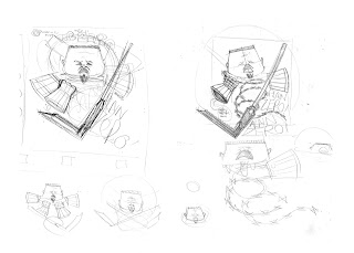
Initial scamps, upon scamps...
upon scamps,

upon scamps.


Not sure how many times i can rough out the same arrangement of objects without getting any nearer to being satisfied with the direction its going in?! Im also worrying thats its too fan arty, with too much referencing (again)..?Not really sure where i'm going with this all now, and its getting a bit close to d-day.

Saturday, 18 February 2017

'Out of Order' - development work, sort of...


In between all the mural designing of the few weeks or so i'd been playing about with a few possible ideas for themes for my exhibition piece. My playing about, i mean thinking about them in my head then getting pulled back onto mural designing ( or blogging). So as far as physical evidence goes, there's not much going on with it to be fair.

I mean, the brief is good because the theme is so open to interpretation - but also that's the thing that's im getting in a rut with; you can attach an out of order concept to anything - THIS COULD BE LITERALLY ANYTHING?!(and therefore very straight forward, right?)


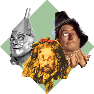
I'd had an initial Wizard of Oz based idea going around my head for a while, as the characters are all missing an emotion/body part (Heart, Brain, Courage) and technically they're "out of order". There you go: CONCEPT! So i went reference image swimming to see if i could spark off any further ideas.


For the sake of saving some time i started making quick PS composition collages using Oz imagery that id manipulated using the Liquify tool in order to change the characters expressions to ones that more suited what i was looking for ie; The tin wanted a heart, he got a heart - but then went a bit wrong, he started loving people a bit too much, became a bit of a pervert. So he's now got a bit of a creepy, leery look to him. 


PS timeline animation i made of the new and lewd TinMan


Cowardly Lion,likewise; got his courage, got his bravery medal - then went ferrel, chewed up his medal and became ultra violent. started chewing up anyone he came across.


Scarecrow, well, he pretty much stays the same - if not a bit less intelligent.


No actual sketches as of yet, as i'm not sure this idea has any legs?

As with the Adidas brief I'm tackling at the moment, i want to try and not rely on reference imagery too much, but also retain a level of accuracy to the film characters. Maybe it shows a lack of imagination - or maybe I'm just a stickler for those small details that nobody else thinks twice about?


Compositionally this is also proving to be a bit of a pain, and im starting to go off the idea. My only other options so far are also based on 80-90's films though, which aren't really going to work with the Square dimensions we have to work with - and that i really am beginning to resent.