
After all the the in-depth animal research i though i'd better actually do some scamping, as this was a short brief ! It had taken me long enough decide how to whittle down the animals and countries into piles of 'too obvious' and 'pretty unheard of' - but at least i finally had solid direction to experiment with.

Okapi - Congo
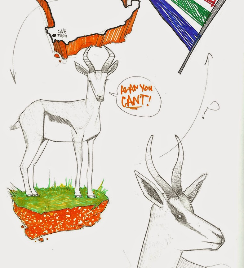
Springbok - S.Africa

Gallic Rooster (jazzy chicken) - France


I was still umming & ahhring about the street food theme but there were 3 factors which helped me to decide to focus on the national animals.
1. It's been done, lots. Well the ideas i'd come up with have been anyway. As much as i enjoy drawing donut & hotdog men, and i do, i wasn't sure where i could take it. plus i wanted to make something a bit more interesting to look at.
2. I'd heard a few other in the class were working on a similar theme, so even though it would've been good to compare outcomes on the same subject matter i wanted to do something that i'd never throught of doing before.
3. Time was disappearing fast and i just needed to make a bloody decision and plough my energy into that choice!

India - King Cobra

China - Panda (unofficial)
My thinking was to try and corporate the national animal with a synonymous landmark,possibly with the map shape involved (a bit cliche) and also use accents of the countries flag colours. Again maybe the obvious option, but was looking and more subtle and interesting ways of using them to bring it together. I was also ware that this could be making things a bit busy?

Canada - Beaver

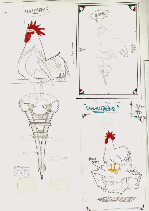
'Flip-able' playing card style composition,
with flag accents in the corners.


Bear, who wants his hat back. I think?
I didn't get around to read it.Bit wordy for me.

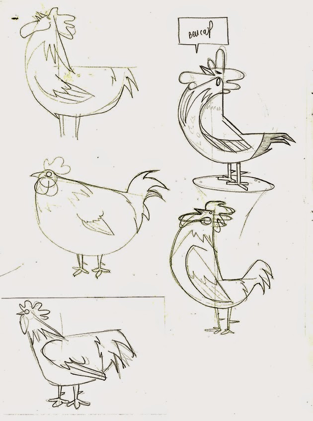


So back to the drawing board, a bit of a gamble to make a U-turn so near the brief deadline, granted. As most of the class were fearing having to 'go vector' to create their postcards, i wasn't feeling the pressure with that aspect as i knew i could knock out my finals with no real technical problems - the pressure i feel is making final decisions about what designs to pursue and wether the ideas are even strong enough to use. Another question was "How simple DO i make it..?" Above are some quick experiments using the most basic of shapes, which goes against my regular production process. But was fin challenge to see if i could make a recognisable living creature out of 3 semi circles.


I did however stick with a concept i came up with in my earlier sketches. Having a rotatable composition, a bit like a playing card i felt would make the viewing more interesting and it would be alternative way of featuring a selected landmark.Also its keeps things uncluttered. Also, as i was simplifying the animals i would also need to find a way of simplifying the city's notable feature so it would still be recognisable.
No comments:
Post a Comment