Pages

Monday, 26 January 2015

Visual Narratives - End of Module Evaluation

 Which practical skills and methodologies have you developed within this module and how effectively do  you think you are employing them within your own practice? 

I am learning to consider a wider range of media for my work to be produced in, even if i don't end up pursuing them for the final piece. I could still be more adventurous when it comes to stepping away from trying to make flawless looking drawings.

 Which principles/theories of image making have you found most valuable  during this module and how  effectively do you think you are employing these within your own practice? 

I have found producing development sketches & refining these most useful in this module, for both the one week book and 'an untold story'. It's shown me a way of no settling for the first  thing i produce, and taught me to go back over it and find other possible ways to solve any compositional,aesthetic or content problems, and how to refine my initial ideas and sketches.

 What strengths can you identify within your submission and how have you capitalised on these? 

I feel i've worked to a frame well and filled the allotted space without things looking too cluttered or empty.Ive kept my levels of craftsmanship to a high level, even when using techniques i've not been familiar with ie; screen printing.I've been happy with how the final books have come out,with my layout and presentation skills benefiting the final results.
I've invested a lot of man hours into producing high quality results - at the expense of some of my other projects, so i could spread the love more evenly, but also shows i'm totally committed to finishing the job for a deadline,no matter how much sleep i lose out on.(the score at the bottom should probably be upgraded to a 5 in that case)


 What areas for further development can you identify within your submission and how will you address  these in the future? 

My idea generating skills need work/help - and also communicating my ideas to others, as i feel the 'untold story' work has taken a lot of explaining, due to the concept being a bit vague. Not to say people haven't enjoyed it once they know what its all about. Also, even though i've made a conscious effort to simplify my output for timescale purposes, and give it a more hand-crafted aesthetic, i could still commit more to analogue techniques rather than using my digital skills as a safety net. Also, after talking to Matt after the final peer review session/presentation he suggested, and i agreed that i need to find a way of channeling the skills i have into producing work with a real message or story, and find what my real tone of voice is. He told me to start making some "really weird stuff", which i'm more than happy to get on board with! 


 In what way has this module introduced to the Ba Hons Illustration programme? 

It has introduced me to a long running project brief that involves a lot of research prior to starting any drawing, which required me to travel and find information out for myself, from members of the public - largely self driven and time managed.Looking back i don't feel 'illustrated' as much as i could've done, mainly secondary reference - but that;s partly down to my choice of subject to work with. Also, finally getting into the screen printing room and print dungeon was really interesting - and will be looking to spend a load more time down there, using some of the different printing media machines they have for future uni & personal projects. The vinyl cutter blew my mind! 


Sunday, 25 January 2015

'Tell an untold Story' - The Visual Journalist PT5

After many, many,many hours and sleepless night shifts woking on this project, i had to wrap it up and get it to print, pronto. I knocked up a last minute cover design - something i'd wanted to put more thought into but had ploughed all my time into the main inside content of 
the book.


Printing process all went smoothly - theres wasn't any complicated fold out sections to worry about - just making sure i cut all the pages out precisely then folded & stapled them straight.
It's the first time i think i've anything physical with my artwork so it's really satisfying to be able to hold it and show people, in real life. Had some last minute branding ideas (10mins before peer presentation) that didn't make it to first press, but am thinking of carrying on the project in any spare time i get, do a new shoe every week or so, build a catalogue, so will use it then.


Original F&F logo sketch (left) - Vector logo development (right)


Final version with typeface 


        FEEDBACK & EVALUATION


I've received some really positive feedback form the class and also from my tutors, which was a great confidence boost, as i hadn't really held out much for the project as a whole and had been down on it from day one. "Screw you Ian" and "You're a dick" is always lovely hear from your peers! Getting feedback from the 2nd year students was also a good experience, and useful hearing their views. The colourful mix of birds, sneakers & (the mucus that binded it all together) FUN FACTS hadn't turned out to be quite the failure i'd thought it might. Hearing that people were enjoying the bold,block colours, graphic style,line work and the idea in general were all things i'd set out to achieve when i came up with the concept - so on that front it's job done.


EVALUATION

WEAKNESS:

• Lack of confidence in my my choice of subject matter lead the project stalling quite a bit.

• I wasn't able to create a story in the traditional narrative sense, which is something that the rest of the class didn't seem have a problem doing.

• Lost motivation for a large part of the project, due to lack of direction/ideas.

• Time management needs to be spread more evenly - was rushing towards the end & there were a  few finishing touches i would've  liked to have completed. A couple of pages had to be sacrificed as i'd run out of time.

• In an effort to speed up my production process i took away a large part of the digital aspect of the way i would usually work - however i over compensated for that by spending too much time trying to make my hand drawn line work look as sharp as it would had t been done on a computer. I later discovered that i'd wasted hours and hours doing it in various fineliners, when in fact my pencil linework, when scanned and tinkered with slightly in Photoshop looked pretty much the same. Annoying.

• My technique and working process 'stiffens up' when it comes to producing the final draft. I made this diagram to explain.The squiggles depict creative flow.


STRENGTH:

• Layout/Composition/Presentation/Attention to detail

• I'm maintaining a level of professionalism with my final submissions

• Squeezing the best out of a possibly limiting concept.

• Working every minute i could on producing a final result i was proud to present.

• Research (secondary) on the final book has been a massive part of the final outcome - almost as much as the actual image making. Which at times became frustrating,as i just wanted to concentrate on the illustrations. I did find myself becoming pretty pedantic, which could be a weakness, depending on how you look at it.

• My involvement with the group has been better in this module - I've been able to assist others with some photoshop/illustrator problems that they had - so my communication with others around me has improved.

• Slowly getting to realise that i don't have to polish everything up to get the results i'm after. But it still feels like I'm cutting corners by not finishing a piece of work to the standard i usually would.It's a bit of a tug-of-war at the moment.


Wednesday, 21 January 2015

'Tell an untold Story' - The Visual Journalist PT4

Feed back from our recent peer review - agreed with it on the whole but had some positive comments regarding the theme of the book. Maybe i'd been a bit too hard on myself.


Some production experiments. Initially i wanted to experiment with acrylic or maybe gouache to achieve blocks of solid colour. I produced my black linework then using a light box produced another sperate layer for just the colour, like you would when screen printing. Hopefully the brush marks on the paint could be seen, giving the sense that it had been done by hand, (which it had). I'd then scan in both linework and the painted colours into Photoshop and match them up.


Digital colouring (left) and scanned acrylic layer (right)

Assessing both results, and taking into account how much longer creating the real painted layer took compared to the digital painting, and seeing how their wasn't a huge difference i opted to colour the rest of the pages in digitally. Time was also getting tight and i hadn't spent a lot of time considering layout or page order, so i decided to paint some patches  of acrylic onto paper and scan that in hi-res and use it for the backdrops.


My book layout would be pretty straight forward. 20cm X 20cm pages, cleanly stapled. I had considered saddle stitching, but felt it didn't really suit the content type. I wanted it to be sturdy and 'brochure-eqsue' you could say,without making it sound boring.


Production process for the final book images- 
from development sketch, to digital to final outcome. 


Some example of other finished pages,ready for print,layout below.


The print layout of the book was something i was worrying massively about, however a very useful chat with Mike (Flower) put my mind at rest, as i was told i didn't have to worry about working out which pages were going to be on the flip-side of each other, or if they had to be printed upside down etc etc… InDesign takes care of it all! That was a massive relief as the deadline was dangerously near.


Tuesday, 13 January 2015

'Tell an untold Story' - The Visual Journalist PT3

Coming back after the xmas break, and i still wasn't sure what i was actually going to pursue for my untold story subject matter - so not a lot of work has been done in this time since my last crit. I was pretty despondent about it and was mildy panicing, that was until our 2nd group crit, this time with Kristyna (Baczynski).

I was a bit embarrassed and coy about explaining my current sketchbook and ideas to the group - but found my class mates and Kristyna were far more positive about the possible outcomes of my colour-coded trainers and birds theme than i was. Which gave me a bit of confidence to really commit to it, even if i felt i might be a bit too 'random' for people to relate to. I just needed to make sure there was some sort vague narrative, or order to it all. Working some text in there too would be important as i didn't want to desensitise the reader with just image, after image, after image.


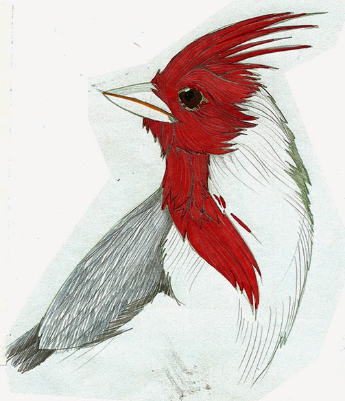
Before i could draw anything the majority of the next couple of days were spend painstakingly trawling the 4 corners of the internet extensively, and i do mean extensively collecting info and researching in to A: classic/iconic trainers B: a collection of various birds that matched the colours of the trainers/vice versa C: facts or stats to accompany both trainers & birds. I realise (if i'd had confidence i my concept) that this would've been perfect xmas holiday work to do, so i would've been ready to go once i got back to uni again.


List of trainers/year - Matching birds - Facts. This process was long.very long, but i felt it was important to get accurate depictions of existing shoes, rather than just make them up in order to match them to the bird's plumage. I learnt a whole load about retro sneakers & the birds of the world thought, which is always useful.


Whittled down item list. I'm aiming to have 16 images for the final book, not including the cover pages.


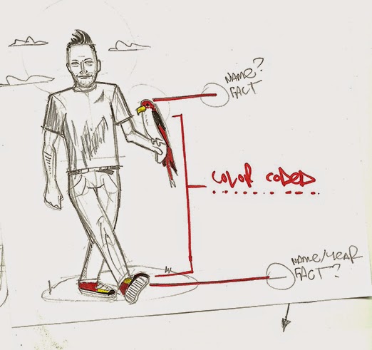
These images sum up what i found quite hard to explain to others. 
People, going about their lives, with a bird of their choice to enhance their outfit. Simple.


It's also maybe a swipe (it definitely is) at some of the ridiculous trends and bandwagon fads that people/hipsters jump on. Someone famous, or their mates start wearing a weird item of clothing in an orthodox way and suddenly everyone in the world is doing the same, not because they like it, but because they believe it fits in with this ideal of being 'cool'. In short, Tv series Nathan Barley satirises exactly what  I'm waffling on about. (see clip below)


Rise of the idiots - Dan Ashcroft


BIRD
 + SHOE


= THIS. A whole new fashion statement


I worked through the final list of 16 shoes & birds and sourced a bank of suitable images of both, in varying poses. I was aware the final images could get boring if i referenced shoes in the all the same positions, so mixed up perspective,sizes and composition as much as possible.


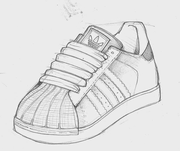
Experimenting with different styles. I was keen to keep a hand-crafted aesthetic as much as possible,but i also didn't simply want to do a 'portrait' of a shoe as such. At the same time i was looking to simplify the elements,make it shape driven so i would be able to render it by hand and hold back on the  'perfect' looking digital production. Time restraints may force me to change my plans though.


More initial sketch work. Too detailed and potrait-like for what i had in mind.


I chose to lose some of the rounded edges, as i had sharp corners and simple shapes of colour in my head.This was an effort to speed up my production process rather than working in a way that I'm used to,which i know to be quite time consuming. 

I will continue to create mocks and play about with my wonky, angled linework in time for the next peer review.