
"TIFF-TIFF & SQUEAKS"
 |
| Character development sketches |
 |
| Finalised line work |
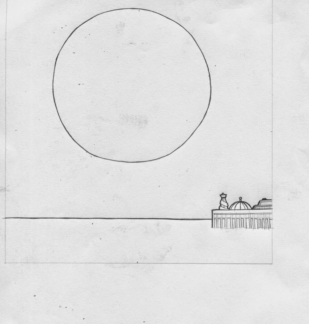 |
| Finalised Backdrop line work |
 |
| Re-drawn & separated body parts and background elements ready for scanning & animating |
Rather than draw lots of the same image but in slightly re-positioned poses i opted to separately draw only the parts that would be moving, so the body wouldn't be shuffling about due to the linework not perfectly matching up. It would also give the gif a 'cut-out', story-book feel to it. I'd planned to make lots of little,subtle movements (leg wiggles,tail waggles etc) within the image, rather than one 'main' feature move.

TEST VERSION
After roughly cutting around the shapes,painting them in Photoshop and composing them on top of each other, duplicating and repositioning where necessary i set about creating the transitions in their little water world. I used the PS guide lines to mark where id moved various objects to ensure the motions would appear to fast or 'jolty'. I got so into it i forgot that this was only a test, and spent a fair bit of time ironing out any problems and thinking of new things to add, so this couldve been my final Gif more-or-less. I do like a rehearsal!
I was torn between leaving the art work scruffy and crudely cut-out and polishing it up, doing full colour more like a cartoon. The test version matched the tone of the story, but i couldn't help wonder what it'd look like if i cleaned it up an repainted it all.So i did it anyway - re-drew all the elements, added a new cats eyes, and pier bit of texture and repeated the methods from the practice run.

Guideline markers

DELUXE VERSION


At the time, i thought the 1st draft gif was better, but after completing the makeover I'm glad i made the deluxe version. I'm happier with the movement of all the elements, and with look of it in general. Don't get me wrong, its mushy as hell i know! Didn't know i had it in me!?
"PAPA WRONG"


Face building in Illustrator

I stuck to using just the shape and pathfinder tools (to slice the shapes in pieces with clean edges)to construct the pizza shapes rather than using the pen tool. This gave everything a
symmetry and equal thickness with no wobbly edges or corners.


As i'd done a lot of development sketches for this guy i pretty knew how i wanted him to look without referring to them, so i created him 'on the fly' in illustrator, adding new details and features as i went along, gradually making him more detailed that i originally intended, but he looks better for it i feel. Adding a big ol' body was quite a late decision as he'd started to take more human form as aposed to being just a floating slice of pizza.


Currently everything had been made soley in
illustrator, but i thought it was looking a bit flat...

I felt it needed a bit of depth and texture so i added the 'inferno'
backdrop, that i d made whilst experimenting with Brusho paints
My homagé to the Ren & Stimpy backdrops,finally!
"CUMULO-NIMBARSE"

WIth the final gif i wanted to keep the look of it quite sketchy, and concentrate on the movement side of things. Also time was a factor and i was running out of it!
It certainly had the most emotion out of the 3 i'd say. It took a fair bit longer than anticipated as i kept thinking of new little expressions or wiggles his his eyes arm or indeed his ballbag could do to make it more amusing and added them to it which meant constant rejigging. I'm particularly happy with the stop-and-scowl and he returns to the underground.
The brief in whole has been a good experience. I probably should maybe have tried a different way of animating my characters, perhaps using a walk cycle - but i know with that technique i would get shaky or wobbly results which i something i was trying to avoid.Its a good lesson in photoshop layer management and good for your patience testing.
No comments:
Post a Comment