Pages

Sunday, 22 March 2015

End of Module Self Evaluation


 Which practical skills and methodologies have you developed within this module and how effectively do you think you are employing them within your own practice? 

I have learnt to speed up my reference drawing time and also that drawing several versions of the same subject (even though i don't particularly enjoy it) has taught me how objects look or move so i am able to draw these things again in the future without having to reference them so heavily. It's also shown me that it's not always so important to draw something exactly how you see, 100% accurate.
Also, looking at other artists work and how they compose their work, and even the techniques and materials they use can be helpful. More recently got to use the screen printing room again, and found myself picking it up a lot better than i had originally done within a large group. In general its encouraged to be more 'crafty'.


 Which principles/ theories of image making have you found most valuable during this module and how effectively do you think you are employing these within your own practice?  

To use different tools other than the safety of pen and pencil, to try and be a bit looser with the way i produce my work. I've tried new techniques to a point, but could still benefit from experimenting more.Also its taught me to consider the composition, line of sight, frame more than i usually would, and i usually consider it a lot. Again, repetitive drawing has impacted on  me within other modules too - i'm finding myself knocking out roughs quickly without thinking too much how neat they look, of objects i wouldn't usually know how to draw, and thinking 'wow i couldn't do that a few months ago'.

 What strengths can you identify within your Visual Language submission & how can you capitalise on these? 

Having had experience with poster/flyer layout in the past i felt my consideration of composition and frame were already quite sound, and i feel I've always been wary of making my images to busy, too bunched up or spaced out.This will have only been improved on through the SB2 classes. Also working with a restricted colour palette i feel I've dealt with quite well, and it's something i enjoyed being challenged with. Final product has also been to a hight standard.

 What areas for development can you identify within your Visual Language submission and how will you address these in the future? 

Analogue-based work. I know what i'm good at so i need to try methods and techniques that I'm not so familiar with. I felt disappointed with my sketchbook work throughout the SB1 part of the module because i wouldn't be producing enough work or that the work i was producing was using techniques that i was already more than proficient at. Everyone was making interesting looking stuff with paints,ink,paper cuts etc, and i was turning up with (what i felt was) soulless,polished digital work with no substance. I also put this largely down to not giving myself enough time to actually have a decent play around with these new methods and materials.

 In what way has this module informed how you deconstruct and analyse artwork (whether your own or that of contemporary practitioners)? 

Looking at other artists work has taught me how to go about making images more interesting to look at without necessarily adding more elements to the picture.Its made looking at art more interesting for me swell, as i now notice the way an artist has used frame, composition, depth, line of sight etc. It's made me think more of it than simply wether it looks attractive or accomplished - I've also started noticing the not so well thought-out compositions. 
The importance of development sketches again has been recognised. It gives me the opportunity to move things about into different arrangements, colours and sizes before committing to anything final or too detailed.


Saturday, 21 March 2015

Visual Communication Brief 2 - ' Greetings From…' (PT3)

 Onto the Macs and into Illustrator i go. Even though i had sketched out the animal shapes on paper i was still spending a lot of time, not designing on-screen, but tweaking a lot and striving to make the the few shapes i was using fit together as smoothly as possible. The pathfinder tool was invaluable for me here, in order to achieve those tricky, wobble-free curves and interlocking blocks of colour.


FINAL POSTCARD IMAGES


Mexico - Mexico City -
Lubber Grasshopper
Canada - Ottowa - Beaver


Democratic Republic of Congo -
Kinshasa - Okapi
France - Paris - Gallic Rooster


Peer feedback


After getting feedback from the rest of the class i was pleased to hear positive vibes concerning the 'upside down' layout and use of the colours and flag accents on the borders, which is a confidence boost for me as i always worry that i tend to lack in the ideas departament. Also the animal figures  and developments of the little world they they inhabit was praised.

PERSONAL PLUS POINTS:

+ Stepped slightly away from my normal production process comfort zone.

+ I'm glad i made the late decision to have a change of production style, it was made it more of a challenge.

+ Ditched (had a break from) the black line work! In fact looking at them now i don't think i used black AT ALL in them. Is still a struggle for me to let it go, but it did call me to think about how i was composing these pieces and switch off my Illustrator vector auto-pilot, for a bit!

+ The majority of the work time was spent researching before i even picked up a pencil, so i educated myself on the subject beforehand. This could be seen as a minus point tho..?

+ i noticed an impovement in my development sketches, and I'm finding drawing and re-drawing is becoming more natural and less of a battle.

+ Less was more. Didn't overcomplicate my images.


PERSONAL MINUS POINTS:

- Underestimated the business of the print room, so didn't have the finished card printed versions for deadline day

- Could have produced more sketches on my other possible subjects, street food & movie heroes and villains.

- Decisiveness still an issue, finding other peoples input a great help though.

- Even thought the flip-around design proved to be successful, i didn't really have any others to back it up, so i still need to be more exhaustive with my ideas.

- Wish i could've done more than 4 as i was enjoying building outline-less lands for these little critters to stand about in.


Friday, 13 March 2015

'Do Something Good' - screen printing task

At the time of me making the scamps for possible print designs for this project i was also producing roughs based around American street food, for my Vis Coms Brief. I knew i wouldn't be using food as the final theme for that project, but i did really fancy drawing a giant monster hot-dog or mutant donut and try fitting it into this particular brief. The two-colour rule was also at the forefront of my mind too, i was always very vary of making something to complex where only two might not be able to d it justice. "Simple,bold, and nothing too fancy" i kept telling myself!


I spent a lot of time just looking at the roughs and trying to work which colours would go where and how i could make the best use of the stock colour. Also, composition was proving to be a bit of a headache as it just kept getting more complex.


In a bid to make the image a bit more simple i knocked up some mock 
featuring anatomy shots i did of my self, and get a better idea of 
the scale of the donut monster compared to the city.

The way i was setting out all my roughs in a box/frame made my mind wander onto the way the Obey Giant poster looks. It made me re-think of heavily cropping a simple looking image rather than using lots of elements and detail that might've got lost during the screen printing process. I then just played with the ideas of doing a cheeky 'rip' of Shepard Fairey design and slogan,which in itself is also a 'rip' of 80's sci-fi film 'They Live'. (see below)


Shepard Faireys iconic design.

Obey is now Dobey, featuring a reworked donut-faced Andre the Giant.


I pulled the sketches into illustrator and used the Fairey design as a rough template, adding my own touches to it, in order to created a drippy sprinkle covered donut man mess. The only original part of the design left was the eyes, and the altered type face. To give the impression of shades i got some halftones involved in the sprinkles, making it a bit more visually interesting, i guess. Also adding shine on the glaze by using slithers of white, which would hopefully make it look a bit less 'flat'. I realise depending on what part of the country you're from the whole "Do-Bey/Dobey" play on words might be a bit confusing. I hadn't totally thought it through, got carried away wight the visuals!


- TO THE PRINT ROOM -


Final result all framed, cheering my room up a bit!

I've discovered the screen printing process is a real roller coaster of emooootions! Due to some issues with my ink starting to dry up and stick to the screen, resulting in the black ink not printing at all well, it looked like the day was a right-off. Which was a shame as the pink layer had gone super smooth, and was really happy with how the colour had come out. Was a bit worried it might come out a bit pale, but alas, it could melt your eyeballs. But thanks to Lyndon (the print tech pro) he salvaged the black layer. It meant a fair bit of waiting around (after having to clean the screens and pull the black ink)and panicking as for some stupid reason,i'd only made 6 prints, but I'm pretty chuffed with the look of the final prints, imperfections 'n all! 

I know part of the brief was to incorporate aspect of the past visual language lessons (line of sight, composition, depth, tone, etc) but i also kept this part of the brief in mind;

Have fun
I did, mostly. The hardest part was the rough design stage.I felt i whole printing process sunk in a whole lot more compared to when we were screen printing in big groups. I went away feeling that when it comes to doing more screen printing in the future that i could handle it without as much guidance. I felt genuinely interested and buzzing about it all, and was already thinking about what i could do next.


Make the work you want to make
I totally did, which may have detracted from the brief somewhat. Although the design did involve frame, composition, tone to a point. My reasons for going down the graphic route was largely to see how i could produce crisp solid shapes and colour using analogue techniques.
If we'd be able to use more colours then i probably gone down the hand drawn monster donut route i started with - as it would given me a bit more to work with as far as the final composition went.


Say something
As far as saying something, i think it's mainly saying 'borrow from other borrowers, but put
your own take and tone onto it'.


Sunday, 8 March 2015

Line of Sight - Transport

I found picking subject for this brief a bit of a challenge as i don't really know what a guy jumping a ramp on his skateboard, or the rear view of a sports car accurately look like without having to heavily reference them - and thats pretty much how the final result turned out. Like a re-worked, digital version of someone else photo. The examples of line of sight in them are a bit blatant, and although i got compliments about the execution of the final product i don't feel there was a whole lot of me put into it. I was set a task, i completed on time, with minimum of creativity.Not giving myself a reasonable amount of time to experiment and try something more analogue was again my downfall. 

Having said that, i set out to produce a heavily shape driven piece, with minimum detail and well thought out colour composition, so maybe the digital route was the most effective to achieve what i had envisioned.


various photos featuring a clear line of sight & focal point


I produced a few  rough layout sketches of the skateboarder. Although i didn't make any coloured mocks, i did mark the scamps up with 'B' 'W' & 'R'  (black,white,red) to indicate which parts would be what colour.


I turned my focus to the photo of the Dodge, as i felt it had a bit more potential.
I planned to use negative space for the smoke, and include only essential details. I added pylons, some landscape shapes and a wall on the side of the road to indicate the vanishing point.

As the original photo was square it felt a bit squashed, so to give the image a longer line of sight and some more breathing space i extended the length of the frame, but not the height as i didnt want too much empty space above or below the car.


I traced my lifework and brought it into Illustrator, as time was running low, otherwise i would have considered painting it - but as there was some thinner linework involved i feel this probably the smart choice. I added lines in the road moving away from the car, and a cropped moon at the far end as another slight focus point and also to balance against the red sky and with the white smoke in the opposite corner. Again, the line of sight isn't very subtle, but i feel the image keeps your eyes moving around it quite well.

Saturday, 7 March 2015

Visual Communication Brief 2 - ' Greetings From…' (PT2)

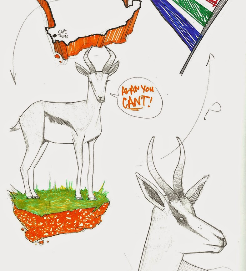
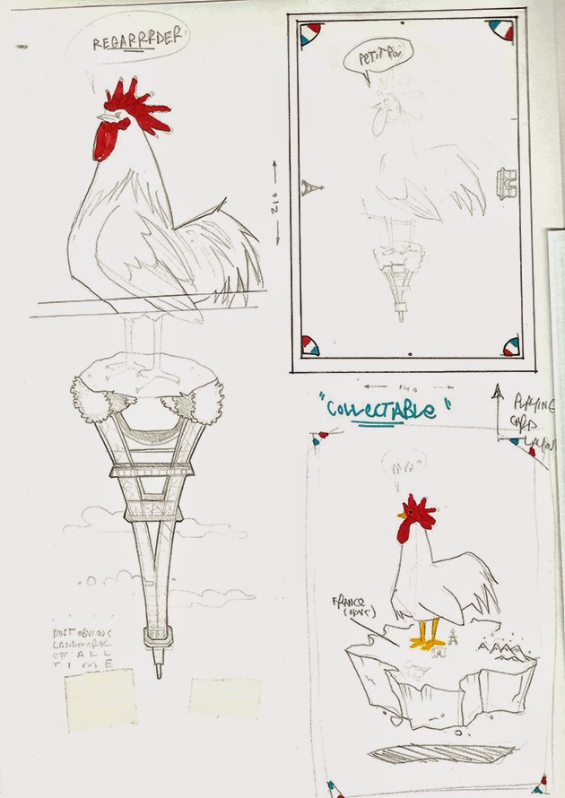
After all the the in-depth animal research i though i'd better actually do some scamping, as this was a short brief  ! It had taken me long enough decide how to whittle down the animals and countries into piles of 'too obvious' and 'pretty unheard of' - but at least i finally had solid direction to experiment with.


Okapi - Congo

Springbok - S.Africa

Gallic Rooster (jazzy chicken) - France 


I was still umming & ahhring about the street food theme but there were 3 factors which helped me to decide to focus on the national animals. 


1. It's been done, lots. Well the ideas i'd come up with have been anyway. As much as i enjoy drawing donut & hotdog men, and i do, i wasn't sure where i could take it. plus i wanted to make something a bit more interesting to look at.

2. I'd heard a few other in the class were working on a similar theme, so even though it would've been good to compare outcomes on the same subject matter i wanted to do something that i'd never throught of doing before.

3. Time was disappearing fast and i just needed to make a bloody decision and plough my energy into that choice!


India - King Cobra

China - Panda (unofficial)

My thinking was to try and corporate the national animal with a synonymous landmark,possibly with the map shape involved (a bit cliche) and also use accents of the countries flag colours. Again maybe the obvious option, but was looking and more subtle and interesting ways of using them to bring it together. I was also ware that this could be making things a bit busy?

Canada - Beaver


'Flip-able' playing card style composition, 
with flag accents in the corners. 


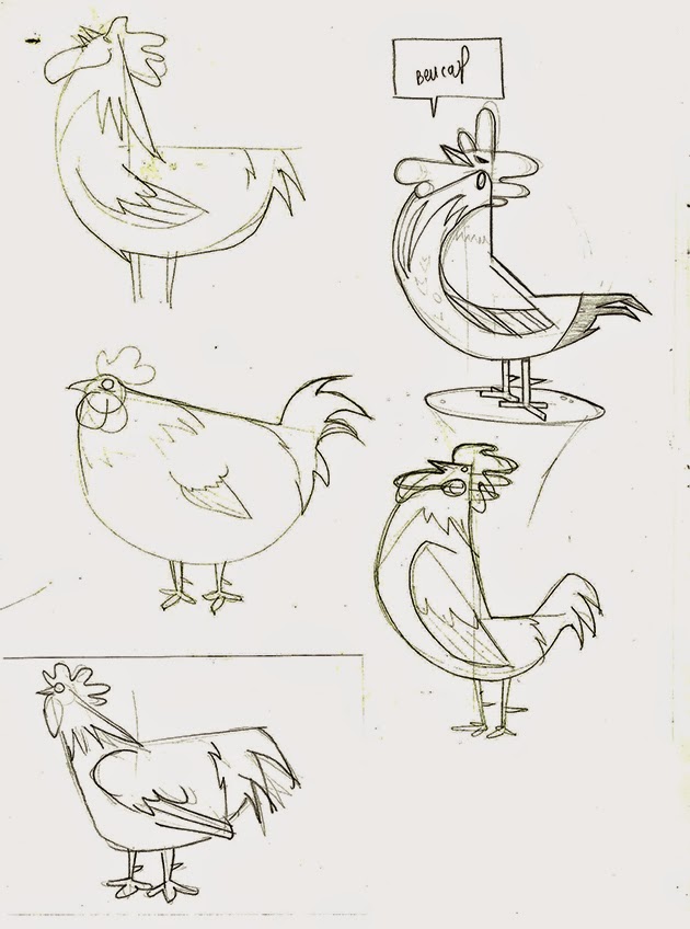
At this point i felt although my concepts were working the way i going to execute them could be different. Matt pointed me in the direction of  'I want my hat back' by Jon Klassen and the way he uses fairly simple shapes in the way he creates his animal characters, which i was thinking should be something i should try out, as currently i was looking to produce the final artwork in the same process i usually would. Making it simple and bold was how i'd originally set out, but had gradually made things more and more complicated,as per.  


Bear, who wants his hat back. I think? 
I didn't get around to read it.Bit wordy for me.


So back to the drawing board, a bit of a gamble to make a U-turn so near the brief deadline, granted. As most of the class were fearing having to 'go vector' to create their postcards, i wasn't feeling the pressure with that aspect as i knew i could knock out my finals with no real technical problems - the pressure i feel is making final decisions about what designs to pursue and wether the ideas are even strong enough to use. Another question was "How simple DO i make it..?" Above are some quick experiments using the most basic of shapes, which goes against my regular production process. But was fin challenge to see if i could make a recognisable living creature out of 3 semi circles. 


I did however stick with a concept i came up with in my earlier sketches. Having a rotatable composition, a bit like a playing card i felt would make the viewing more interesting and it would be alternative way of featuring a selected landmark.Also its keeps things uncluttered. Also, as i was simplifying the animals i would also need to find a way of simplifying the city's notable feature so it would still be recognisable.