I picked three names out of hat to produce 4 stamps, 3 postcards and a big bastard a2 poster on, they were; Robert Capa, John Peel and a musical hero of mine Giorgio Moroder. It was a no brainer.
Having a penchant for 80's electronically synthesised music i was familiar with a fair bit of Moroders work, but weirdly enough i don't think i ever really checked what he looked like?But never in my dreams cold i have imagined he could've looked like this!? I mean not now, he's gone 70 years old, but back in the late 70's & 80's he was responsible for some the strongest hair and shades combos I've ever known! He also made a shit tonne of pioneering, chart smashing dance music,and has worked with countless megastars, but that hair…


Initially started doing quick doodles of Giorgio, in various media, just to get a customed to drawing his face and features.His trademark 'tasch & perm he was quite easy to characterise. But i wasn't really looking to do a 'portrait' of him as such. I looked into various comedy portraits that exaggerate peoples features to stupid levels, as i find this style most amusing to me. Vice Reeves' stuff inparticular has always made me laugh when it's popped up on his various tv shows.
Brainstorm of Moroders notable achievements and work.
The 80's film soundtrack era is something that was looking to work with.
Early ideas involved the use of typefaces reflective of the time period
and of the music and musicians he was working with.
Terri Nunn from 80's pop group Berlin, of 'Take my breath away' Fame.
The song won Moroder an Oscar in 1986.
I also briefly thought about incorporating various singers/acts he had produced songs for/with aswell. This was also just a chance for a bit of media experimentaiton. Had recently found a box of my brothers ProMarkers at my parents, so i thought id try them out. They have a watercolour-esque property to them i found, but also with some colours enable block colouring with out leaving those 'direction stroke marks and blobs' (I'm sure there's a technical term for that?)
Could my dreams have come true - a way of achieving flat flawless colour without touching a computer..?!
Using Poscas, photocopies and torn paper i tried out a few things that didn't involve me having to actually draw at all. Influenced by some of Joe Cruz's work and general graphic design and patterns of the 80's. This was all fair enough, but i felt i was taking a massive short cut buy using a copied photo of him, and that this wasn't really exciting me,creatively as it was too similar to Cruz's style of work.It did help me to think about incorporating imagery from the Top Gun movies that he composed the soundtrack for,amongst others. I stuck to a few of his more famous ones, Neverending Story, Flashdance, Scarface which had various iconic characters that i might be able to work into some of my designs.
 |
| Maverick/Moroder fusion |
 |
| Initial stamp design concept |
Possible poster layoust. Being on A2 it would allow me feature a fair
bit on there without fear of it being printed too small to see finer details which i so love.
This one would feature elements from Flash dance at the top, Top Gun and Falkor the Luck Dragon
Moroder timeline pencil layouts
A couple of Vector print outs with one colour sharpie backdrops
I was being torn between a big film soundtrack influenced poster ,(which was in danger of becoming a bit of mish mash of ideas), or a collection of Giorgios most powerful looks throughout the decades, which were a lot simpler looking and in theory a lot more straight forward to execute.These would be quite contrasty black and white 'headshots' and i'd only have to worry about which colours to use in the background.
The 'Headshot' poster layout that came to mind. This would also allow me to get some
type involved which would also help bring a 70s'80's aesthetic to proceedings.

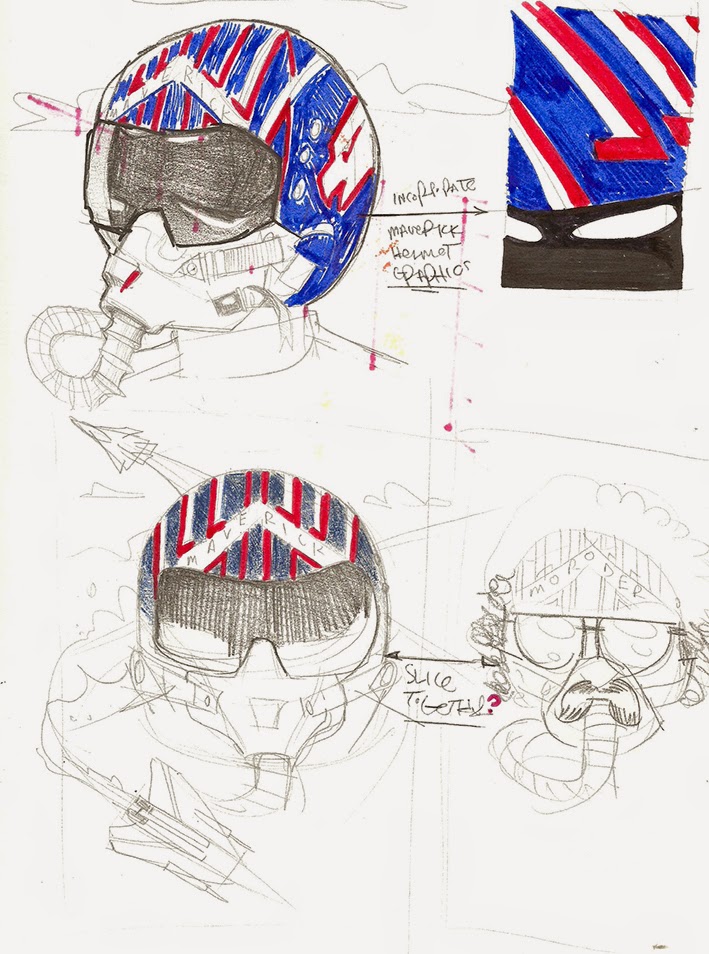
Moroder/Maverick developments

Moroder/Falkor development
With a decision on the A2 poster content made, that meant the film soundtrack based designs were designed with postcard dimensions in mind. I wanted to combine the film elements together with one of the first images a produced of Giorgio, featuring a MiniMoog Synthesiser,(see top) which he is renowned for using to make his disco hits. Now i still wanted to include a fair bit on them and knew fair well that at 105x148mm you weren't going to be able to make out pedantic details with as much ease, if at all, so i made sure that the development sketches i did were roughly actual size, so i could get n ideas of how much detail i could get away with.
Vectorised Moroder mugshots '73 - '15
Basic initial layout.
POSTER
Final Poster
After plenty of on-screen tweaking and colour experiments i finally settled on this version. In continuation with the retro 80's theme i opted for a blue to pink colour fade, and used my resource skills to find a copy of his signature, which i worked my magic on and had some fun with the quote lettering.
For the final print i even used a super glossy paper to complete the visual trip back in time.I found the gloss was the only paper that was doing the bright vivid colours justice.
How ever, as you can see, theres been some sort of RGB/CMYK mixup and I've been left with two shades of black, which wasn't visible on the screen in the print room and i haven't been able to get my head around how this has happened, and after all the hours put in, has
left me a pretty deflated. Mostly pissed off at myself as I've had enough experience and should know what's gone wrong with it!
Example of the different shades of black
STAMPS
The Final Top Gun Call sign stamps.
I hadn't done a lot of development on these mainly because i had the idea in my mind from quite early on, and i knew it was going to be 100% vector doing lots of scamps for these wouldn't have been much use - for once these were something that was easier to design on-screen.I'm happy with how they look,striking and bold and work at a small scale which is the brief i set myself, but looking back I'm not really that proud to call these my work. I mean,sure, i played about with the composition and created the vectors from scratch, but they're based on the existing designs already featured in the Top Gun film, so feels like I've just slightly reworked someones elses work. But i stuck by my (top) guns and didn't over complicate things, and avoided whacking a 'tasch and glasses on there to make it more identifiable.
POSTCARDS
Final Moroder/Maverick postcard
Heres the big disappointment of the project, the unfinished film postcards. Really annoyed at myself for this, not just because i failed to meet the deadline but also because continued to work in my normal slow methodical,pedantic ways, ( the Top Gun dog tags have 'Gooses' actual information used in the film,which no-one can see because its too small)spending hours & hours & hours in front of computer screen which by the end has made me loose all enthusiasm for what i was doing and I'm not even happy with the final outcome. I was even aware how miserable it was making me whist i was clicking, and clicking away.Granted there are people in th world with worse problems.It's a shame because during the development stages i was really having fun with it.
I look at this and think:
• theres too much going on here for these dimensions, (which i already knew would happen but did anyway)
• It must be possible to achieve this in less time?
• Why don't i have the confidence to be able to complete this all by hand then scan in and render in Photoshop, rather than feel the need to spend years in Illustrator making it flawless, but when it comes to print you can't even see the small details i'd been sweating over?
•It looks too 'nice'. Nothing more.
Due to me underestimating my super slower than normal production output this has lead to the other postcards not existing.
On the whole I've enjoyed this brief and the subject matter, but when it comes to the final product I'm still as confused and frustrated as ever about wether I'm supposed to be making images that i like or images that i think other people would like?
The issues with my final print were also a bit gutting, just wasn't happy with how they come out, but i'll look into how to solve the 'two-shades of black' mystery as other than that I'm quite proud of the mugshot poster, even if it has taken way longer than it should've done.
I'll feel different in the morning.I'm still having fun, honest!


