Pages

Friday, 27 November 2015

About the Author - Harsh lessons & Meltdown

After feeling pretty positive about what i needed to do and the direction i was heading (on Tuesday) i've learnt a very hard and humbling production lesson that's taught me the value of thorough development designs & has made me have to rethink the way I'm going about making my final images (now Friday).

The lesson being; Make sure you've NAILED the final composition before you start doing ANY final inks or imagery!  

Being pretty determined to go about the majority of this project in an analogue way, i got carried away with wanting to get good at inking my linework with Quink & brushes and i was too keen/hasty to crack on with the final print ready piece. I've also taken way too much consideration into the animation aspect of the illustrations and basically given myself too many options,(painting each element separately then bringing them together in Photoshop,see stages below)) rather than just making the drawings and working the animation around those. This is all a constant reminder of why i love doing it digitally so much - you don't end up speeding hours inking only to find the compositions look wrong and you have to start again. If i'd done my linework in Illustrator a bit of rejigging some resizing and i would've been sorted. Now I'm probably looking at a load of nicely inked elements that my not even be used.Good practice though, and i did enjoy it.
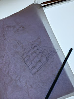


Lesson learnt. I went back to the drawing board (to a point) and made sure nothing got scanned in or inked before the final look of the damn thing has been green- lit. Ive decided this composition will be the one i do the majority of my development, re-working, style changes, umming & ahhhring on - that way once I've settled on how i want it to look, then in 'theory' i should be able to bust out the other 3 print designs a fair bit quicker - and i'll bloody need to at this rate if I'm going to make my 'get to print' deadline of Dec 12th. 


• Main thinking points/Headaches •

•  Am i making things too complicated? Have i made my production process way too long?
• Am i just producing the same looking work as i was before i came to uni?
• How much should i strip away some of the fine details?
• Experimenting with lots of halftones to push the 2 colour restraints as far a possible to make something a bit more interesting to look at. Good for experience as well.
• Do i simplify so much that i abandon the analogue approach and take it all into illustrator and work with my beloved vectors, but retain the textures and bitmaps..? 
• Do i just bin-off the idea of screen printing totally - i can't trust my own ability to pull acceptable quality prints and not ruining the good quality paper. Do i print digital, on top quality paper, but still use the screen printing/colour separation method so it  would still look screen printed?
• Need to do a bit of paper research.


Development up to the point of this latest working practice meltdown is documented
 below in this digital look book that i done did made on issuu.


Thursday, 26 November 2015

Process & Production - poster research & inspiration

Before our peer crit i was in the process of picking out some examples of screen printed posters to try and help me think of a way of simplifying my current author imagery, and possibly get some ideas on other interesting printing effects using just a few colours. I found a bunch of great looking printed posters in these two poster books, which got me really thinking about my options and print possibilities. Works by Dan McCarthy, Dan Stiles, Travis Bone, Jay Vollmar, Strawberryluna, Tara McPherson, Thomas Scott, Zeloot in particular came to my attention.


Theres always a danger that after finding all this inspirational print design work i'll just end up thinking about things too much and i'll try to rethink my entire working process. Some of these designs are so simple but striking, a big part of me wants to just make big shapes in well though out colours & compositions - but the pedant & anal retentiveness in me soon takes over.


Wednesday, 25 November 2015

Process & Production - Studio Brief 3: Project Proposal

P R I N T E D    P I C U T R E     P R O D U C T I O N


 I INTEND TO PRODUCE…  

A series of 4, 2 colour, A3 screen printed images based on my interpretations of selected pieces of writing and descriptions from the Haruki Murakami novel 'Hard Boiled Wonderland & The end of the World', and also reoccurring themes that run through out Murakami's books.
The colours (at the moment) will be Black on all all 4 prints with 4 different colours on each print. (e.g.: black/orange, black/pink, black/blue, black/metalic grey) Will depend on the final look and content of each finished image.


 THE CONTENT WILL FOCUS ON (identify 3 specific themes, texts or concepts)   

1. Surrealism - not being worried about things looking as they should

2. My distorted depictions of characters or events from the book.

3. A 'golden beast'/ unicorn skull features in both parts of the story, so will be featured somewhere in all of the series of prints, some less prominently than in others.


 I WILL BE AIMING TO COMMUNICATE (identify 3 specific messages, ideas, moods etc)   

1. Otherworldness -  the prints will feature a collection of weird looking elements and compositions. 

2. Confusion - a feeling felt by for the majority of the story by both of the two lead 'narrator' characters.

3. Deterioration - The prints will all have a certain amount of distressed textures and paint effects on them, certainly around the edges, which is a sort of metaphor the the world starting to fall apart from the outside.


 TO AUDIENCE OF

1. People unfamiliar with Murakmi's work.

2. People unfamiliar with Murakami's work

3. Anyone appreciates visual metaphors with a touch of surrealism about them.   


---------------------------------------------------------------------------------------------------------------------------------


M O V I N G    P I C U T R E     P R O D U C T I O N

Now, as i haven't yet produced any imagery that I've settled on &  want to pursue into the final production stages, getting started on the animation sting stage of the project has been done purely in my head & storyboard of how i imagine i want it to look and move. 
Also,looking at lots existing examples (on vimeo etc),and browsing through a few of the Year 6 efforts from last year has helped me visualise why can be achieved. 

Feeling comfortable with the Photoshop/Illustrator connections to After Effects i'll be tackling this once the printing side of things are done & dusted. As i think leaving the screen printing until near the deadline would put more pressure on me rather than having to suss out any issues concerned with my animated work. If i aim to have the printing (or the majority) done before i leave for home over xmas (I'm not going home straight away, so will hopefully have a nice quiet week in the printing studio to capitalise on?!).


 I INTEND TO PRODUCE…  

A 15 second animated sting, using Adobe After Effects based on my interpretations of writing and characters featured in the Haruki Murakami novel  'Hard Boiled Wonderland & The end of the World', other reoccurring themes from Murakami's work.

It will focus more on the panning, zooming, rotating rather than "animating" what I've drawn as such. Subtle movements will be included as the sting takes a 'journey/adventure' around the elements i've drawn  from all 4 screen printed pieces. 
Now, i don't want my visions to become too grand, as i realise I've very little experience with actually using After Effects, but if get my 'nerd-on' and do plenty of private study time using online tutorials then i may work out how to get some smashed glass or cracking,crumbling earth type effects going on. But again, i don't want to get too carried away with what's desirable and what's realistically achievable at this stage. As long as i keep a consistent feel between this and the printed work i produce then that'l be a success. 

However, "you musn't be afraid to dream a little bigger darling "...


 THE CONTENT WILL FOCUS ON (identify 3 specific themes, texts or concepts)   

1. Hidden meanings.

2. As with the prints (as the sting is just an amalgamation of those), Surrealism.

3. Mystery - ie: what the hell is going on here?! A feeling that often came to mind when reading this book.


 I WILL BE AIMING TO COMMUNICATE (identify 3 specific messages, ideas, moods etc)   

1. Adventure - as the 'camera' moves from illustration to illustration, giving the viewer little snippets of them all.

2. Confusion - as (to the uninitiated) these pieces are full of (seemingly) random and mashed together people & creatures. Its also something the characters in the novel commonly feel. 

3. 


 TO AUDIENCE OF

1. People unfamiliar with Murakmi's work.

2. People unfamiliar with Murakami's work (this book inpartucular).

3. Anyone appreciates visual metaphors with a touch of surrealism about them. Plus there aren't a whole lot of animations based on this guys work, that I've come across.  


Tuesday, 24 November 2015

About the Author - Project Progress & Peer Crit

I'd been working through the last couple of weeks on the Author project with no real idea if what i was knocking out was a) out of my comfort zone enough b) different enough from what i usually do c) ENOUGH?!

Despite being fairly happy with the first set of imagery that i'd developed and then screen printed the week or so before, i'd gone back to the way i used to develop my work (involving long drawn out reference image trawls) and it felt like i wasn't making pictures that were my own. I'm trying to keep Victo Ngai's advice in my mind and tying to 'screw physics' and not worry about about making things look exactly how they appear in real life. As i had wanted to concentrate on making images with a surrealness about them this should be a given - but i keep slipping into real-world mode, concerned that what I'm drawing may not be recognisable. Im trying to find a happy medium between imagery that is lifelike and fantasy and at the same time trying to find a happy medium between making minimal shape driven illustrations and detailed ,'traditional'  style ones. I guess its all coming down to trying to make myself as  commisionable, appealing  and versatile as possible, which also feels like I'm trying to be a jack of all trades instead of a master of one. Hard decision is knowing what direction to follow what methods to leave behind, because trying to incorporate many of them is scuppering my progress. "I've moved no further than an asthmatic ant carrying some heavy shopping". (E.Blackadder)


 • P E E R   C R I T •


After coming out of the peer crits id found a new sense of optimism about what id done so far, where i was going and what i needed to do.Stepping away from the work and getting some fresh eyes and opinions on what i was producing and advice on problems i was coming up against has proved to be really helpful and gave me a supportive kick up the ass to plough on with what I've been doing so far. It was good to see & hear what other were getting up to and having similar issues with aswell - its one of the main things i miss from Level 4, the fact that we just don't really get so see each others work much anymore as we're in the studio at our own personal times. (i may have mentioned that previously.)


Main points i need to take away with me from today:

• TRUST YOUR INTUITION
• BE WEIRD
• EMBRACE THE MESS & PROCESS

Brief talks with Ben & Teresa in the studio also helped me to reassure me that even though i hadnt' made a stack of full sketchbooks i was heading in a good direction with what id so far done. Stressing that keeping continuity between artwork and animated sting is essential - this is something, if not the main thing I've kept in my mind. In honesty, I've probably been trying work the imagery around the animation stage rather than the other way around, even though i don't currently have any 'finished' artwork to started animating with.

With advice from peers and tutors i can carry on with a bit more confidence in what I'm doing day-to-day, i just need to start sorting the final artwork out if I'm to make my pre-xmas print deadline.


Thursday, 19 November 2015

Study Task 1 - Brief selection

 • Competition Briefs  for consideration/selection


( 3 covers = main task /1 cover = small task)


 WHAT DO THEY WANT? 

Book cover and spine illustration/s (plus copy) for 
Adult fiction, Adult non-fiction and Children's book titles.

 WHEN DO THEY WANT IT? 

March 9th 2016


ENTRY FEE/ PRIZES

 £FREE 
WINNER = £1,000 + 1 month paid work placement.
RUNNER UP = £500
3RD PLACE = 250


 WHAT DO I NEED TO ACHIEVE? 

 - imaginative concept and original interpretation
 - competent execution

-  strong use of typography 
-  appeal to a contemporary readership
-  show a good understanding of the marketplace
- have a point of difference from the many other book covers it is competing against
- be able to sit on the shelves of a supermarket as easily as it sits on those of more traditional bookshops


 WHO IS THE AUDIENCE HE

Adults.Children. Fictitious Adults. Fictitious Children. Bookstore and library goers.
The majority of the world.

POTENTIAL PROBLEMS

- coming up with an original interpretation of the brief and something different to whats already been done on the past.

- Not being a book reading fan, i'd have to read some of the material to get a feel of the subject matter.I also would have to research into the market place

- If want to make this a 'main' responsive brief then i would have to create a cover for all of the titles. I'm only really interested in producing work for 'A Clockwork Orange' in the Adult Fiction category. 

- Having been set an author -based task already as part of our degree, (and not really enjoying it) i might just want to avoid the whole world of books for a bit?!


>>>>>>>>>>>>>>>>>>>>>>>>>>>>>>>>>>>>>>>>>>>>>>>>>>>>>>>>>>>>>>>>>>>>>>


Illustration Friday (small briefs)


 WHAT DO THEY WANT? 

A weekly (every Friday) submission relating to a given theme. The theme changes every week and you submit your drawings, painting, collage etc etc and it gets posted up on their website along with lots of other artists (i use the term very loosely) efforts within the same subject matter.

 WHEN DO THEY WANT IT? 

Every Friday.


ENTRY FEE/ PRIZES

 £FREE / NONE (unless you count getting your work featured as a prize)


 WHAT DO I NEED TO ACHIEVE? 

 piece/s of artwork in relation to the given subject of that particular week, with absolutely no quality control, by the looks of it.


 WHO IS THE AUDIENCE HE

Anyone and everyone who comes into contact with the Illustration Friday site or social media platforms.

POTENTIAL PROBLEMSHE

- With no real outcomes for your finished work, other than the fact that your work might get browsed upon by 'x' amount of people, theres not a whole lot of incentive to spend any time or effort into making anything of any quality.

- Quite a short turnaround for someone who finds it hard to make decisions about what he wants to create. But would be a good exercise in getting over this problem and becoming a bit more prolific with my output.


- A lot of the work submitted  on there looks very amateurish  Without sounding like a massive snob, i'd have to ask myself if i would want my work to share the same webspace as these hobbyist peasants?(i jest, but not about the amateurishness)


'hobbyist peasant' work from I.F


>>>>>>>>>>>>>>>>>>>>>>>>>>>>>>>>>>>>>>>>>>>>>>>>>>>>>>>>>>>>>>>>>>>>>>>>


 WHAT DO THEY WANT? 

A poster design for the 32nd Chicago Latino Film festival. 

 WHEN DO THEY WANT IT? 

January 6th, 2016.


ENTRY FEE/ PRIZES

 £FREE/ $1,000


 WHAT DO I NEED TO ACHIEVE? 

 - An entry that will be evaluated based on appeal, content and marketability
- A design that must be easily translated to a variety of mediums


 WHO IS THE AUDIENCE 

The selected poster becomes the face of the Festival, as it will be on the cover of half-a-million newsprint programs, invitations, program books, electronic ads, t-shirts, festival trailer and more.

POTENTIAL PROBLEMS

- Looking at some of the past winners, the level of craft doesn't appear to be that high. This could mean that not many people are submitting and that might make it easier to win?!Or that the judges are having a laugh.

- They're asking for submissions to be at 150dpi, which, if they're planning to use it for posters, programs t-shirts and other publications (which they are) isn't going to make it the best quality printing resolution.(i.e.: my final imagery could look like crap on the final product)


That aside, this brief sounds pretty open, and would give me a chance to really get stuck into illustrating something in the way i wanted to - as long i keep some sort of connection to film or chicago or latino culture.It would also be good to get involved in a project that would be seen in whole 'nother continent.


>>>>>>>>>>>>>>>>>>>>>>>>>>>>>>>>>>>>>>>>>>>>>>>>>>>>>>>>>>>>>>>>>>>>>>>>


Secret 7 (1 cover = small. All 7 covers= main)


WHAT DO THEY WANT?  W
H
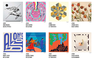
7" vinyl sleeve artwork for selected tracks from 7 of the best-known musicians around.They then press each one 100 times to 7” vinyl and invite creatives from around the world to interpret the tracks in their own style for every 7”. 700 sleeves are exhibited and then sold for £50 apiece. "You don't know who created the sleeve, or even which song it's for, until you have parted with your cash - the secret lies within."

 WHEN DO THEY WANT IT? 

Details still to be released (deadline usually around March)


ENTRY FEE/ PRIZES

 £FREE / Work gets exhibited and seen by looooads of people.

 WHAT DO I NEED TO ACHIEVE? 

 My interpretation of a song (s) chosen by the organisers and put on to 7" record sleeve 
format.


 WHO IS THE AUDIENCE 

Anyone and everyone who visits the exhibition, or website or who purchases one of the limited press vinyls.

POTENTIAL PROBLEMS

- Having come across this event last (too late to produce anything to submit) it did seem to be  favouring the 'famous' practitioners and plugging their work a lot. This made me think that potentially only recognised artists work would be considered.

- was also curious about the level of quality, or how conceptual the work would need to be to make the final 700 sleeves. Looking at the gallery from last year its a real mixed bunch with some of the concepts not being massively obvious. So i don't know what the judging criteria would consist of, hopefully not "have i heard of him?No.Get rid of it"


As i mentioned, this is a brief/event that i was made aware of by Matt (Hodson) last year. I actually started knocking something up for it, but it was pretty late in the day and i was worried that the the execution would have to be 100% flawless to compete. Along with uni deadlines i ran of time to submit a final design but told myself that id definitely have something to give them next year. It would also be something id like to travel down to see, even if i didn't make the cut. (ok, probably not if i didn't make the cut) Would gave to decide wether to focus on one sleeve design or make it a main project by doing all 7 songs.


THOMAS HEDGER- Let Forever Be - Chemcial Brothers

LUIS PINTO - Dead flowers - Rolling stones


>>>>>>>>>>>>>>>>>>>>>>>>>>>>>>>>>>>>>>>>>>>>>>>>>>>>>>>>>>>>>>>>>>>>>>>>


House of Illustration book illustration (main)
W A R  H O R S E


WHAT DO THEY WANT? 

- Three illustrations, each of a different scene from the book
-  Illustrations must be portrait not landscape
- Entrant to also design the binding


 WHEN DO THEY WANT IT? 

January 18th 2016


ENTRY FEE/ PRIZES

 £25 / a highly sought-after commission, worth £5,000, to complete a total of nine illustrations and a binding design for the book.
5 RUNNERS UP = £500


WHAT DO I NEED TO ACHIEVE? 

3 full-page illustrations, either in colour or black and white, each one for a different scene you select. Include some suggested spine type, considering how it will work with your design and ensuring that you have left adequate space for the logo.


 WHO IS THE AUDIENCE HE

Book readers, book buyers. Anyone looking for a new edition of War Horse.

POTENTIAL PROBLEMSHE

- Reading the book in its entirety before March 9th. (which would still give me no time to make an actual work) As i am a terrible reader!  Audiobook would be the likely alternative.

- Keeping it fairly simple, design and colour wise, as the books are usually bound onto cloth making a block printing effect stand out.

I'm leaning towards this brief at the moment, even if i do have to pay to enter - as it would give a reason to read another book, and also i find i can get rolling quicker with projects that allow me to re-intepret existing texts.
Dealing with the type placement is also something i would enjoy tackling.