Pages

Monday, 26 December 2016

12 days of Christmas - Lifting Tower spin off project

As if i didn't have enough on my plate with all things COP and some client-based PPP commissions, i took it upon myself to create a spin-off brief from the lifting tower projection project. Just in case i ran out of things to do over the festive period(!)


As one of my proposed concepts for the lifting tower was developed around the '12 days of christmas' song, i thought i could take all the development sketches that weren't used (for a number of varying reasons) develop them further and fulfil their destiny; posting up the 12 designs (one every other day) in the run up to xmas, the 12th image landing on xmas eve, which is handy (but technically not really the 12th day of xmas, as you would've thought?! ).


This was a good exercise in quick turnaround image development and production. It was also a good chance to play around with my 'simpler' shape based vector characters, as i know i can knock those guys up pretty quickly (they'd had to be) once i've got fully formed compositional scamps to reference from. 


>>>>>DESIGN AND PRODUCTION ISSU<<<<<<<<

I've had a good response to the final outcomes as well - even though i do look at them and think "aggh, is this really me?is this what i do..?"  Sure, they get super cheesy at points, but it's xmas! Not everything in the world can be dark and edgy all the time i guess - my output certainly isn't!

But it's commercial, appeals to a broad audience and is versatile. The design style could easily be applied to children's books, homeware, packaging, animations etc...


Tuesday, 22 November 2016

Peer Crit /feed back session…

Scan feedback sheets>>>>

This gave us a chance to see the various projects everyone had been getting on with in-between the COP writing and practical work.

Having made a strong start to the module, with a number of quick turnaround briefs on the go, which produced quite a substantial amount of work - I'm at the point where i need to make some solid decisions on what i want/need to tackle next. With the Lifting tower project wrapped, along with Drawlloween and Travelling Man, this has left me with gaps to fill amongst my COP practical, which will be taking the driving seat this week. 


>>>>> revised proposal sheet >>>>>>>

The Lainey's Bakehouse project has entered the initial development stages, but i also need to start the research work on the Roald Dahl/YCN brief, as even though I'm familiar with the stories i want to illustrate, i need to refresh myself on some of the more intricate details so i have more material to draw from. With the deadline towards the end of March, I've still got a good amount of time, but I'm sure there'll be other spanners appearing in the works during this time so need to get cracking as soon as i can.


Personally, this was all the session was good for, as the feedback (which was limited, as no one seemed to realise where in the room my work was located) was next to useless. It's always ego boosting to get complimentary words from your peers and i appreciate it from anyone who takes a few minutes out to comment on what I've been doing, but seriously.....


>>>feedback sheet>>>


I kind of hope this was someone having a laugh, but without wanting to sound ungrateful, Level 6 standard constructive feedback this really isn't. Oh well, at least i can sleep well tonight in the knowledge what I'm doing is, NICE. 


Saturday, 19 November 2016

Peer ILO review...

Group session discussing our current Extend Practice work; where we are with it, where we want to go with it, and what our peers think we could be doing to improve or help it.


As ever, interesting to see what others have been doing, or not doing - not something that happens a lot in these times of self project/ time management.

The most 'helpful' point I've taken from the session is the shocking realisation that nothing i do really, technically exists. Jack explained it perfectly; my work ends as a jpg on a blogpost, never to be seen or heard of again - and he's totally right. 

I've always said to myself that I don't see uni 'success' as getting a top grade and then never do anything creative ever again once it's over. Uni success  for me, is about getting myself into a position where I'm better equipped (technically and mentally ) to make it as a creative in the real world - if i got a good grade whilst im at it then thats just an added bonus.(would actually be destroyed if i got a 3rd though) But now it appears all my work is just made for 'the man' marking my blog and ILO's - nobody has access to it outside those realms, and it may as well never have been done?! 

I'm well aware that making prints to sell or even making decisions about what work to print or how to print it is usually where my projects end - too many decisions, "who'd want to buy what? or" who'd be interested in buying that, in what colour way or material?" It all gets a bit much, thinking about all these hypothetical people and their art preferences ,so i just forget about it and get on with making something new. I guess having spent years designing club night flyers/posters and logo's im just used to never seeing the final fruits of my labor in any format other than an attachment on an email. 

But it's really hit home, and i seriously need to correct this - i know i don't need to make everything i do purchasable, but I'll never get a name for myself if there's nowhere (online or in real time) to go and see what I've been doing with my life?! 

....and for christ's sake get some confidence (again, still?!) Even when i'm not consicously self-deprecating about my own work it's clearly coming across when talking to people.


Tuesday, 15 November 2016

Lifting Tower Xmas Projection

After a couple of weeks of further animation development and re-tweaks, plus group discussion on our facebook group page, keeping each other up-to-date of each others progress (or not in some cases) this project was nearing completion.

I've filled my animations out a bit more, making sure there isn't too much 'dead-time' where there's isnt anything moving. People are only going to taking a glimpse of the projection so i wanted to keep it eye-catching, but simple looking. After a project meeting this week where we presented the work we had completed so far, our group is in a pretty healthy place as far making the deadline. 


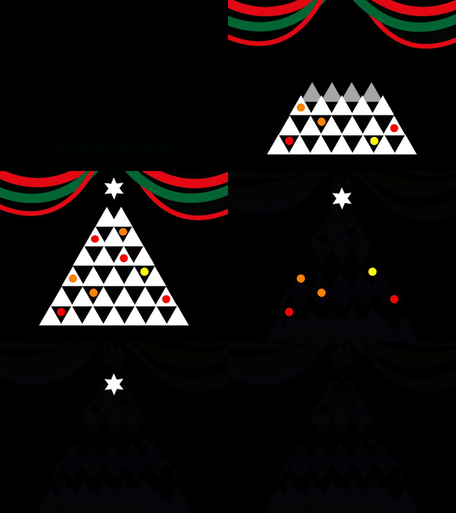
Tri-Tree development


To fill some of the dead space in the corners, and to make it generally a bit more interesting to look at, I've added streamers. I settled for a more straight forward transition in the end; in my mind i would've had them maybe fall down at the end along with the tree, or go baggy. I'm still very much learning the core basics of A.e and with time running on this i didn't have the hours to sit watch tutorials on how to make it do exacty what i want. Frustration with own abilities is beginning to creep in somewhat.


Advent candle development.(below) From sketches to the last experimentation in A.e using masks to create melting effects. The spinning dots on the green disc represent the 24 days leading up to xmas day, but i'm not entirely happy with how they're looking at the moment. 
Will try and develop that element of it, but otherwise I'm quite pleased with how the candles look and move in general. 


I'm starting to really get back into this whole animating lark.i know it's only simple stuff that I'm doing, but for the sort of work i like to produce it's all it really needs. I'm at the tipping point where i'll either walk away from it to refocus on static digital work, or ill be further drawn into the A.e world and will be exploring the countless other effects and techniques. But at the same time I'm not sure i wanted to be sat in front of a computer screen for days on end just to produce a 10 sec bit of moving animation...?


Thursday, 10 November 2016

YCN briefs announced...


Was informed that the YCN design award briefs have gone live, and after casting my eye on them i'm instantly more excited about these than any of the D&ad ones. Looks like the yellow pencil will be evading me!


The one thats most caught my eye, and that i want to  will tackle, is the Roald Dahl brief. Having recently taken part in the Beatrix Potter Re-imagined competition, with a fair bit of success, this is very much in a similar vein. 

from the YCN site:

We invite you to illustrate a series of iconic scenes, featuring at least three iconic characters from Roald Dahl’s inventive, revolting, wicked, or friendly stories in a style of your choosing. None of your illustrations should be boring, safe, or predictable. All styles welcome.

The scenes can be from any of Roald Dahl’s stories for children. You’ll find a list within the project pack as well as a selection of extracts for your inspiration, but you don’t have to stick to these.

You can choose to illustrate between one and three scenes. Within this series, you should illustrate at least one child character, one villain character and one fantastical creature — whether this be a witch, a giant, an insect or an oompa-loompa!

You can select scenes from a mixture of novels, although the illustrations should appear as if part of a coherent series.

The illustrations should also compliment our logo - you’ll find some copies of this in the project pack.

In fact the more i read it, the more ideas start popping into my head about how these could all look. Excited!! Having used a winning formula (almost) with my Potter creation, i'd be able to hit the ground running with this and experiment with compositions & colours only this time featuring Dahl characters. 

Which ones to chose will be the toughest question!


The other brief in close contention is for Greenalls Gin.


From the site:


We would like you to choose quintessential British moments that have lasted through time and are still relevant today and produce a piece of creative that brings this to life in a contemporary way and has Greenall’s at its heart.

You can choose any of our Greenall’s products to be at the centre of your designs, but obviously certain products will suit certain occasions better. For example the quintessential British afternoon tea, which is still in vogue years after its conception, could be a perfect pairing for a cocktail made with our Greenall’s Wild Berry. Another example could be our premixed cans that might be the perfect addition to the infamous Great British Picnic.

Your creative could be applied across any channel. It might feature on a piece of limited edition marketing collateral, such as a coaster, a postcard, a gift with purchase or a neck tag. Or it might be shared as part of our Facebook strategy to recruit new consumers into Greenall’s or engage with our existing fans. Or it might constitute a poster campaign. We are also open to any medium — from print to photography, video, graphic design, animation, illustration etc.


Saturday, 5 November 2016

Tutorial with Ben / Proposal revisions…

Had a good sit down tutorial with Ben, and came out with some really, really positive feedback in regards to where am with my practice and new focus to what'll be doing for the rest of my Extended Practice work. 

Main Points

• The work i've produced for my proposed/completed briefs is impressive (and very commissionable), and my tone of voice can clearly be seen within it, especially with the Drawlloween 2016 project. Looks like i may have landed myself a 'style'?

• I should develop a handful of the 20+ Halloween designs into the screen print stage in order to get back into the print studio with a real purpose. Although it was added that making them into screen prints may not even benefit the work as they looked good enough as a digital print.

• I hadn't really settled on a personal/indulgence/vanity project - until today. I've been knocking out themed mask designs over the summer in sketchbooks, making them into painted, tangible objects purely for the enjoyment of it all - so Ben's urged me to carry this on the whole way through until April. The inclusion of pop culture characters into my mask designs was also something to push on with. I was just concerned that is was a bit too similar to what ive been doing with my COP practical, which also involves colourful,masked characters. Same, but different.

• Don't get bogged and worried about a website or what i should be putting on it. Focus on making a physical body of work that best represents me as a practitioner. 

• My decision making has improved!

• Continuing to get involved with collaborative projects like the Lifting Tower Projection & The LCA 170 mural painting will only help me broaden my skill set and i shouldn't start thinking i should only be focusing on one kind of illustration. Transferrable skills!


• Have more confidence in what i'm making!!!(always the case)

Monday, 31 October 2016

Drawlloween 2016

Before we'd even drawn up our Extended Practice brief proposals & rationales i was underway with Drawlloween 2016 at the start of October.

It's an Instagram-based, drawing-a-day challenge based around Halloween prompt words.


I took this brief on in order to continue my digital-free drawing practice so gave myself some design limitations; 1. NO VECTORING; its a fast turnaround project so wasn't going to allow me to make endless corrections in Illustrator. Also, i wanted to draw them for real and not fall back on my Mac to enhance them. 2: The use of only 3 colours/bitmaps. The colours (rendered with Photoshop) were Black/White/Pumpkin. The designs are geared up to be taken on to the screen print stage, if i chose to, so halftones are dominant in the majority of them in order to make the most use out of my 3 colours. It also helped to make them more of cohesive set of images when it comes to displaying them or getting prints made.


It also gave me a chance to continue my improving practice of exhaustive development drawings - which in turn did contribute to me being beaten my time in terms of getting all 31 days complete, along with other pressing uni tasks. Looking back at it, maybe i did set myself a bit of a mountain to climb, but i've come out of it with quite a body of work, and also a set of designs that i can take on the next level of either screen/digital print. Having made it to Day24, i'm getting the urge to go and complete it, if i can find some spare time, but doing it in November/December would kind of defeat the object of the Halloween challenge.


Selection of development work

All in all, bit disappointed not to have completed it, but happy with the material i produced - and feels good to be investing some time into my pencil & ink work again. Also had the chance to give Cintiq & also Intuos Pro technology a trial run with a couple of the designs - but as much fun as i had with them, it's just not the same as going at it with a pencil. I do like making digital art, but i also enjoy making instant scamps, and i'm not really sure i want the two worlds to merge. It'll either be very digital looking or scanned-in ink work then rendered digitally, rather than digital drawings made to look hand drawn (for the time being).


Final images 1-23


After the positive feedback from Ben and a number of classmates on the project outcomes i'll definitely be taking a handful of them forward to be made as prints, possibly screen prints to get me in the mood again.


2.Demon. 
This guy will most certainly be appearing as a print in the not too distant future.


Wednesday, 26 October 2016

Lifting Tower Xmas Projection - animations tests…

After meeting with the Lifting Tower group, there was a talk about which designs we should focus on and develop for the animation. It was agreed that my '12Days' concept was probably a bit too complex and intricate to make into an effective projection image - but if i could combine the simple graphics from my 2nd concept and apply them to the '12 Days' storyboard then i might be in business.

So i set about simplifying the drawings into simple vector graphics, and doing some test animatics.


As far as a group project goes, i'm not really sure where this one is headed - as the two animators i've been grouped with have already made the graphics they intend to animate (well one of them has) so i cant see where they would need an illustrator.? My animations are pretty developed, as far a tests go, so wouldn't need a lot of tweaking if they got the green light. We've been told that we're not expected to make work that looks similar to our other group members, but they have to transistion smoothy - i just don't see how that can happen if we all have different styles of illustration/animation, that it appears we all individually want to illustrate/animate.


Saturday, 22 October 2016

Travelling Man/Thought Bubble poster…


This came out of the blue and requires a really quick response, but is a great opportunity to get a bit of exposure and to be involved on the ThoughtBubble peripheries. Ideally, I would've like to have spent some time on a new piece, but I've got too much other stuff on my plate and don't want to half-arse it. 

Luckily enough I'd recently brought by RoboCop poster design back from the dead for a small LCA film society exhibit so I only need to tweak the colour scheme so it fits in with the specified palette we've been given. Looking forward to hopefully getting these displayed and maybe even flog a couple to make up the printing costs. 

Original OUIL505 version
'Resurrected' version


'Resurrected' version. White variant.
Travelling man version. Blue/Pink variant


Either way it 'll be rewarding (if it makes the final 16) to have rebuilt the design from scratch to finally get it out in public after looking like it would remain on the scrapheap for all eternity.


Friday, 21 October 2016

Statement of Intent (1st Semester)

I completed my finalised Statement of Intent for the 1st Semester. 

Think I've given myself enough to be getting on with (hope we weren't expected to propose10 briefs?!), without encroaching too much into the COP dissertation and practical work I'll also need to be doing at the same time. I've also made sure that some of them will involve a collaborative element ,whether it be with fellow students, practitioners or clients. I heard the word 'vanity project' mentioned by Patrick (not in reference to my proposal) and I'm a bit concerned that my chosen briefs come across as that? I mean, they all involve subjects that i have an interest in producing work for, but to anyone else they may not serve much purpose..?

There i go again, worrying about what i think other people want to see (or buy), rather than showing them what i want to make.

The D&AD briefs were announced on the same day, but initial thoughts are; I'm not massively taken with any of them right now. I've picked out a few of them to have a closer look at to see if they can't change my mind. Will also await the YCN briefs to be released on Nov1.


Sunday, 16 October 2016

3 Modified Brief task...

• Modified from Existing Briefs •


Brief 1: FEATHUARY 2016    Deadline: March 1st 2017
(Modified from ‘Inktober 2016’)


Rationale: 
Drawing a week, for the whole of February of a bird, based on the word prompt list taken from 'Inktober 2016'. Words will relate to the bird depicted. Could lead to a small publication, individual birds could appear on apparel and stationery. Digital prints will be most suitable over screen print as they'll more than likely need to feature a lot of different colours.

 -------------------------------------------------------------------------------


Brief 2: MARVEL – poster design    Deadline: April 1st 2017
(Modification of the Marvel Universe challenge by Threadless)

To honor our love of all things Marvel, we’re inviting you to design the next iconic superhero poster.  Just as every vanquisher of evil has limitations to their powers, this challenge has boundaries, so pay special attention to the guidelines below.
4 Designs (1 per week) may include only the following characters: Kingpin, Shocker, Green Goblin, Baron Mordo, Crossbones, Bullseye, Red Skull, Kate Bishop, Black Cat, Captain Marvel, She-Hulk, Wasp, Medusa, Doctor Strange, Hawkeye, Falcon, Jessica Jones, Luke Cage, Elektra, Punisher, Daredevil, Black Widow, Black Panther, Winter Soldier, Spider-Man, Spider Woman, Iron Fist, Venom, Carnage.
Keep in Mind:

• Designs should be based on comic characters only; actor likenesses and movie/TV-specific details are not allowed.

• No political or adult content (sex, smoking, drinking, etc.) is allowed.

• Characters outside of the Marvel universe are not allowed. 


 -------------------------------------------------------------------------------


Brief 3: COMFORT ZONE ESCAPISM    Deadline: May 1st 2017
(Modification of a Jack Teagle brief, DigitalArtsOnline)


Create a narrative in 3 images (or through series of images or panels) that tells a story. To generate ideas and thoughts outside of your comfort zone, write a bunch of nouns, adjectives and verbs onto cards and put them into three sets, then randomly pick cards from each and create a narrative from your selection. Final images to be 4 colour, A3 screen printed.

 -------------------------------------------------------------------------------


• MODIFIED BRIEFS • 
(of my own projects)


Brief 1: FEATHUARY 2016    Deadline: March 1st 2017
(Modified from ‘Inktober 2016’)


Rationale: 
Drawing a week, for the whole of February of a bird, based on the word prompt list taken from 'Inktober 2016'. Words will relate to the bird depicted. Could lead to a small publication, individual birds could appear on apparel and stationery. Digital prints will be most suitable over screen print as they'll more than likely need to feature a lot of different colours.


------------------------------------------------------------------------------- 


Brief 2: SWEET YOOTH-DE LOOPS: animated gifs    Deadline: May 2017
(Modification of the monthly Loop De Loop gif challenge)

• 26 looping gifs featuring the redeveloped ‘a-z of confection recollection’ designs.

• It must not contain pornographic material, incite hatred or include defamatory or discriminatory content.

• It must be engaging to watch, both on the web and when screened to a live audience! 

• It has to loop!

• Your submission can be uploaded in either gif or video format (use vimeo).


-------------------------------------------------------------------------------


 Brief 3: 80’s CHILDHOOD TV CEMETRY Deadline: May 2017
(Modification of the Threadless/Quertee T-shirt challenges)


• 4 T-shirt Designs (1 per week) to include reimagined characters from children’s 1980’s TV shows.

• Designs to be mocked up & submitted on Threadless/Quertee, with ltd. edition presentation box)

• Poster versions of the designs to be made available to purchase.