Per chance, prior to my progress tutorial with Ben- myself & Ben had a chat about what i was thinking of doing, and I explained that i'm aiming to base it around Cult Films, namely of the 80's time period, when i was growing up - a subject that he also is pretty nerdy about, which is a rare yet welcoming reaction, considering the age group of my peers, most of them havent even seen Back to the Future! So we sat and compared our lists of top cult/dodgy 80's films, as well as discussing possible directions to take the idea into. Eseentially we had the Progress tutorial there & then, but in my actual tutorial he also suggested looking at the artwork for B-movie posters, also research some Russian & Polish Art - which he said had a tendency to be pretty abstract & striking.Minimal graphic design (past & present) also found its way into there. Also on the research list was 'Fan art', which both we both agreed that i should be wary of, and theres a big difference in fans doing drawings of the films they like and the officially commissioned illustrations.The main difference usually being the the production quality and level of craft. Having looked briefly into Lithoprinting as a process for the final outcome, using restricted colour palettes and a colour pallete relevant to the time period should also be looked into.
Artists featured include: Krzysztof Iwanski, Rosocha Wieslaw, Wasilewski Mieczyslaw & the art of CYRK.
Trawling through Pinterest, Google and the Library i found i load of bold, visually striking poster art from the last century, some very minimal indeed, which i was particularly draw too - it got me thinking about how i could possibly apply some of the 80's film titles i'd grown up watching to these aesthetics and also what sort colour schemes i could play about with. In my mind it's exciting me, but i can't help thinking that i should be making something more adventurous or challenging..?
I'm also thinking that it might just be another one of those ideas that i & i alone would find interesting, and it'l turn into another personal project, with no appeal to anyone else.
Time is going past at an alarming rate, as we all concurred in todays group meeting - in which we sat down and thrashed out a definitive plan of action for each of us to go away and work on over the development week. We'd come back next week to see where we stand, hopefully a bit clearer than we are at the moment! With all the other deadlines, and incoming work, progress on this project hasn't been able to really get going - also due to the fact we had to wait around for responses to the kiddy questionnaires, that have also been a bit slow to hear back about. So much so that we've had to abandon that idea, even though we did receive some good material. It'd be a shame not to use it, so i'm looking into some other way to put drawings over the children's question answers in the future or as part of a personal project in order to keep my newly found After Effects knowledge fresh in my mind.
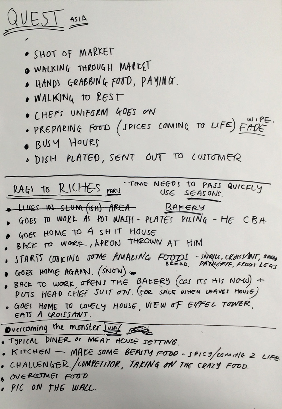
Based on the alternative approaches Joe & myself came up with in our 2 man meeting last week, involving the food cultures from various countries, we (the illustrators) designated ourselves a country each and jotted down a rough narrative for each one so we had a starting point for our storyboards.
As we wanted to draw big, colourful, interesting looking food we chose some of the countries that are well known for their culinary delights, and familiar with the majority of people. We then linked those countries to the 3 story archetypes we'd chosen;
QUEST - China,food markets - Chay Rags to Riches - Paris, bakery - Tilly Overcoming the Monster - America, diners - Ian
For preparation of my own storybaord about American diner food, i scribbled down the characters,themes and objects i would be trying to include. We'd decide on the initial narrative for 'overcoming the monster' which was basically the 'monster' being a mammoth plate of food, served in a traditional U.S diner where food challenges are common place.i just had create some imagery to fit inside 20seconds of animation time that will tell the story of this battle.
I'm really not a fan of sequential drawings and anything that involves me having to drawing the same character over and over (I'm also not very good at it), and that kind of shows from my storyboards, as the main character looks different exert time you see him, so ill need to refine that - but i got the jist of my ideas whittled down into 9 frames.
I sent it off to the group FB page so Joe could see what he might be dealing with, and wether i'd set my sights a bit high. With only just over 3 weeks left til submission i don't want to leave myself ,and more importantly, joe an sun surmountable amount of work to do in such a small amount of time. On a positive note, Joe also sent over his storyboard ideas for all 3 nations, and some of our story frames looked almost identical, which was a good sign that we're both on the same page!
The way I've been creating the sleeve designs so far is to simply draw rough squares in my sketchbook and scamp out the compositions and ideas as they come to me, so i can get a vague idea if things are going to look right or work together within the 7x7 frame. Having set out to make these as illustrative as possible, i'm finding myself actually too scared to commit to hours of sketching and then inking/fine-lining the final artwork incase when it comes to scanning it in and incorporating some digital imagery it looks a mess - and time really is of the essence at this point, so it looks like the final designs are going to have a decidedly digital feel to them. My slowness and indecision when it comes to analogue methodology is dictating the final outies, once again. As with most of my project work i always think that once i've completed the whole process with the first in a series of images, then the following images will be finished a lot quicker, with minimal faffing. I'm hoping that is the case here, but most of the time i finish one, then find I'm already unhappy with the process or results and end up changing it totally! As it's meant to be a 'Secret', I've only post up the development work for the record sleeves, will add the finished submissions when the panel have made their decisions on who they're going to exhibit.
IMAGINE - John Lennon
The initial sketches were based around the lines from the song that i'd plucked out as i thought i could create some imagery around them without making it too obvious or cliché looking. My ideas were first working around the words "Nothing to kill, or die for" - my mind started thinking of various animals that are famous for being hunted/hunting each other, and what it would be like if they had no reason to kill each other, and also no reason to die. Wilderbeast/zebras with Crocs/lions came to mind, and i set about trying to think of some weird looking scenario for them to be in. But it felt like i was trying to be too random, and that i should try to make some sort communication at least. I also took the lines "imagine theres no Heaven" & "no Hell below us.." and took things in a more minimal,shape driven direction. I figured i could compromise with all the digital work if i was to render it with textures and patterns i'd made with my real hands. Was already getting frustrated with myself at the way i was going about the final piece as there is absoulety no illustrated element in these, only designs based on my simple scamps. But at least if I'm doing it this way then there's a chance they'll all be completed in time for the deadline.
More list writing in todays
studio session. This time we went around linking Products,Ranges
& Distribution to some of our given categories for the Applied
illustration module.(Object & Environment, Product & Packaging etc)
Although initially thinking i was going to work with Object & Environment
as the basis of my project, after further consideration i think Product &
Packaging will be better suited to what i'd like to achieve. The two subjects
quite easily merge together anyways.
These are some of the lists
people had drawn up. Was interesting to see just how much stuff you can
associate with each category, and it definitely helped me to come up wit home
initial ideas, as, at the start of the lesson i was still a bit baffled to what
exactly we were being asked to undertake.
Having made the switch to Product & Packaging, i sat down for a bit and made a mindmap of the subject matter that excites and fills me with enthusiasm when its comes to being a brief. Something that I've been finding increasingly difficult in recent times. But theres always a stalwart selection of topics that i'll refer back to to generate some motivation to 'make'.
Mindmap of sole themes that power me & that
would also fit into the Product & Production bracket
After having a quick look at my mindmap, Teresa brought Mondo to my attention. I'd heard the name before, through being a follower of Olly Moss and Matt Taylor amongst others, so had a idea that they were connected to cult film merchandise, now, namely posters. Check out the website for further research, and theres a shit-tonne of awesome work on there, all based on the the sort retro/cult films i enjoy watching,and that I've grown up being aware of. Even though i hadn't seen many of these posters before they were somehow familiar, and i could see how certain artists' style or approach to designing was influencing other artists work that i had come across.
There were so many that caught my eye and made me want to just give up and go back to being a gardener again! I've made somewhat of an effort since i started uni to lay off from doing any more fiddly,detailed line work, in favour of more stripped down shape-based work - but what the majority of these examples have is meticulous,mind-blowing craft going into the linework! Crazy amounts of it. It's making me want to go back and try to incorporate it with the simpler, cleaner shapes that I've grown fond of using, along with a limited colour palette and the graphic design/layout skills i came to uni with . Examples of those awesome bastards are featured below.
(in order of appearance)
KEN TAYLOR • BONEFACE • JOHNNY DOMBROWSKI
AARON HORKEY • RANDY ORTIZ• SONNY DAY
JEFF PROCTOR • OLLY MOSS • MATT TAYLOR
MARTIN ANSIN • JOCK • MIKE MITCHELL • GIANMARCOMAGNANI • SAM WOLFE CONNELLY • JAY SHAW
With not much more response on the children's questionnaire avenue, we needed to come up with an alternative approach to how we were going to solve this brief. Only two of us could make the meeting so myself & Joe sat down and knocked up a big ol' mind map to see if we couldn't spark something off & pass the new info onto the other team members when they were back in Leeds.
We'd already settled on the 3 story archetypes for our animations, we just need to come up with some scenarios to set them in. The mind maps show our rough thinking process that lead us to our new direction. Which was to be based around the food culture in 3 different areas of the globe.
Even at this early stage i can envisage some interesting outcomes, & i'm quite up for bring some colourful to life. I just wonder how well our three different styles of illustration will fit together - it's all part of the team challenge!
After Joe had fired over some initial starting-point questions to ask anyone we knew with friends with young children, i added some more general questions to them, that if we got some good replies could be edited to fit around the 3 archetype storylines we'd chosen. I typed up all the equations and a brief explanation of what the project was about and what we were trying to achieve and send out the feelers on Facebook. As I'm in that age bracket where most people have had a couple of kids by now, i figured i'd be more likely to get a few replies. I had to wait a while for anyone to hit me back with some audio feedback, but i received some nuggets of gold...
>>>>>> audio replies<<<<<<
Listening back to some of the answers i'd been send really made me laugh, and they instantly had me conjuring up images in my head of possible scenarios.i sent over the audio files to the group to see what they thought and if they thought we had anything we could run with. Everyone was loving them and seems like we might have a something to base our ideas around. Tilly also had gotten biome recordings back from a couple of nippers she knows too, which were also very entertaining and usable! But i think we'd need a few more replies to be able to commit to pursuing this angle, and at the moment my connections have been all "yeah sure thing i can help out" but when i send over the brief with what we need things go a bit quiet - but i understand, they're busy parents and undoubtedly have more important things to do. We would also have to figure out a way of converting the thoughts and voices of the children into a 20 second story that related to the brief we'd been given.
Carrying on from our initial research last week, our next task was to choose 5 contemporary Illustrators whose practice inspires me. Their practices also have to be clearly linked to my chosen area of study for research, relating to one of the given areas on the brief and including:
I found a number of interviews, many of them had similar questions about how he got into drawing birds, and about his working process, so i posted up some of his answers.
Why are birds so important? I focused my work on birds a few years ago after I took some time out and went travelling with my girlfriend. I needed to re-address what I was doing and needed to bring the soul back into my work that had got lost by doing too much commercial work and trying to impress the in-crowd. My work has always had a focus on nature but British birds have been cropping up through-out since day one without me really realising. Being a bit of a spotter since a kid they’ve always had a special place in my heart, I have loads of good memories of family and holidays associated with them. I honestly get such a buzz by seeing a new bird or even something really common, seeing a jay can put me in a good mood all day. Also with poring over bird books for years I couldn’t help but humanify and mystify birds that I have never seen. I channelled all this positivity and love into my work and have been having a great journey ever since.
What is your process when you draw? I’ll have a look through my favourite bird books and maybe have a look at Google Image just to know I’m getting the basic markings in the right place. I think about the bird’s nature and character and decide how he is going to look and get to it. But really when I draw a bird I try to do it as quick as possible so I can capture a character within it.
When do you remember them first becoming important to you?
My earliest memory is hiding in my mam and dad’s bed as a jackdaw flew around the room. It had somehow got down the chimney, shit everywhere and then made it’s way up stairs to scare the living daylights out of me and my sister. When I was about 4 or 5 we moved to an old mill that was really a small farm, and I got kind of obsessed with nature from then really. But my first real recollection of birds becoming a big part in my life was when some swallows nested just above our front door. I clearly remember being blown away by them, the power and just sheer magic of them in flight, their song which I could never forget and the muddy nest that they made. Sometimes my dad would set up a step ladder and we’d have a look at the chicks. Very special memories.
Why did you decide to write your own quirky descriptions to accompany the illustrations? The book originated from my Bird of the Week contribution to the Caught By The River blog. I originally just wanted to contribute to CBTR because I loved it so much, such a lovely and inspiring site and originally I was just going to paint a bird that I loved or had spotted that week. So when I painted the Bluetit (my first) I thought I had got a lot of character in him but I didn’t think I had got across all my love for him so I wrote a sentence or two. As the contributions continued my writing grew longer and more confident and the book naturally took form from that.
How did you hook up with caught by the river and then with Ebury? Jeff Barrett from Heavenly Records and CBTR got in touch initially through a mutual friend of ours, Paul Tomlinson. He was after a new logo designing for CBTR and he was really into a logo I had done for a site me and Tomo had set up called The Wooden Branch. Which is basically a site for people who love trees to put up pictures and explanations of their favourite ones from around the world, it’s a lovely idea but didn’t take off… nice logo though if I say so myself. Anyway I worked with Jeff on a few things and then continued with the Bird of the Weekcontribution to the blog. After a only a few birds Jeff saw the potential of it turning into a book; they had already had a book out called A Collection of Words on Water and there were a few others in the pipeline. Initial interest was good and it was with a big publishers for a year with them farting about with it before they dropped it. Which is when Ebury Press picked it up and the whole process has been a complete joy ever since.
When was it that you first discovered your love for illustration?
I’d gone through most of my education before I even really knew what illustration was. I’d got onto a daft course in Ipswich to study animation and a load of other things. It was an art degree for slackers who didn’t know what they wanted to do, so perfect really. After trying loads of things and getting stuck into animation I slowly realised that I was not that kind of calm, painstaking perfectionist that animators tended to be and that that slow, hair-pulling, stop motion technique had turned me into an alcoholic. So I started to look elsewhere and came across illustration that just sounded like you could do whatever you wanted. I had really enjoyed designing the characters when I was doing animation so I took that over into it. I also did loads of spray-painted painting, this was in '96 so I hadn’t learned how to paint at this point so the less said about this the better. A few years after leaving college I started getting editorial work for magazines, i couldn’t believe I was getting paid to create my own little worlds. I loved it from then. It has been an on and off affair though. Hating it so much at times that I’ve packed it in, but she tempts me back the harlett!
What is your working process like? For example do you plan or is it entirely experimental?
When painting birds I will study and sketch them first in my trusty Readers Digest Field Guide To British Birds or my Collins or a lot of the time on Google Image. I make sure I understand the shape and character and reduce it to its simplest markings. So even if it’s head and eyes are far too big and I’ve taken liberties with the colours, everything will be in it’s right place so people can’t complain too much. I love using watercolours as it's permanent and you have to make instant decisions. Those mistakes and experiments quickly turn into styles, purpose and confidence.
So everything does start out as experimentation in the very beginning. Like everything in life I suppose.
Below is the 1st year uni project i did which unknown to me at the time follows a very similar theme to Sewell's favourite feathered sneakers project from 2013. Although on paper the theme seems the same, the thinking behind them were different. He drew his favourite shoes that remind him of birds, whereas i matched up trainers to a list of birds that were coloured coded to each other. Though with me being an absolute nobody, i was a but gutted to see the similarities and did feel like id be seen as a rip-off merchant. I though surely it mustve been done before out two efforts, but i have come across anyone who had the same idea. That is except me, 5 years earlier.
AirMax '90 Infrared & Bullfinch, 2009.
This design had disappeared into obscurity, to be seen by virtually no-one. I recall doing a one-off piece featuring a bullfinch and an Air Max '90 Infrared back in 2009/10, as a personal project which i never saw through. I did it as this is my all-time favourite sneaker,(and i love bullfinches too) and this was during a time before all the big & loud trainers from the 90's were getting the re-releases they get today. This would become the inpiration for me to dust the concept off and develop it years later, but shhhhh, don't tell anyone,
Patrick Nagel (November 25, 1945 – February 4, 1984) was an American artist. He created popular illustrations on board, paper, and canvas, most of which emphasize the simple grace and beauty of the female form, in a distinctive style descended from Art Deco. He is best known for his illustrations for Playboy magazine and the pop group Duran Duran, for whom he designed the cover of the best selling album Rio. Nagel would start with a photograph and work down, always simplifying and removing elements which he felt were unnecessary. The resulting image would look flat, but emphasized those elements which he felt were most important.
Nagel's figures generally have black hair, bright white skin, full-lipped mouths, and the distinctive Nagel eyes, which are often squared off in the later works. Because of the intense stylization and reduction of facial features into clean lines, generally the figures resemble each other, though Nagel worked with many models, including Playboy Playmates. In 1984, at the age of 38, Nagel participated in a 15-minute celebrity "Aerobathon" to raise funds for the American Heart Association. Afterwards, he was found dead in his car, and doctors determined by autopsy that he had suffered a heart attack
Jeremy Dan Fish, born in Albany New York, 1974.With a degree in painting and a focus in screenprinting Jeremy's education and work experience has lead to a career as a fine artist, and a commercial illustrator. Finding a balance between exhibiting his work both across the US, and internationally in galleries and museums. while maintaining a presence designing skateboards, t-shirts, viynl toys, album covers, periodical illustrations, murals, and sneakers. The artwork is mainly about storytelling and communication, told through a library of characters and symbols. With an emphasis on finding a balance with the imagery somewhere between all things cute and creepy. Jeremy is based in North Beach aka little italy, and has lived in San Francisco for the last 20 years.
Mr penfold hails from cambridge, england, and currently lives in bristol. he works as an artist and designer and has exhibited across the world.
After leaving school he started working in a professional collaborative printmaking studio making work for and with artists of international repute. over the last 8 years he has developed a distinctive way of working and a range of imagery that is as striking as it is unmistakable.
Penfold has been formed by a number of influences from skateboard graphics to classical and formal abstraction, developing a distinctive and recognizable palette and formulating a set of conditions that he applies to his work.
He works in a variety of fields and mediums including painting, sculpture, graphic design and screen printing. his work can be found all over the uk, usa, australia & europe.