Pages

Tuesday, 28 October 2014

Photoshop Session 2

In session two we continued to experiment with the basic photoshop editing tools,(lasso,marquee,healing brush, magic wand etc) along with levels,hue & saturation, also layer opacities and filters to create different looking versions of our ink drawings. This week i moved onto an image of a little lad with a humungous super soaker.


Original scanned version


Bumped the black LEVELS (cmdL) and took out the highlights so I would lose 
the texture and noise of the paper background leaving a nice plain white finish.


A selection of experiments using brushes, masks, fades and
texture to give it a bit more depth.


Monday, 27 October 2014


Note to self…


Visual Skills Brief TWO - ' A day in in the Life '


INITIAL ROUGHS & FEEDBACK

After getting to grips with the article subject matter and producing a number of roughs  i received feedback, criticism & general pointers from three lovely gentlemen on what  i should develop for my final 3 editorial images. Hearing the views of other students is always interesting & useful as my idea of a good working concept isn't always the view of others, as was the case here, partly.


Main article highlights:

• Facial recognition a bit wonky
• …its own disturbing results
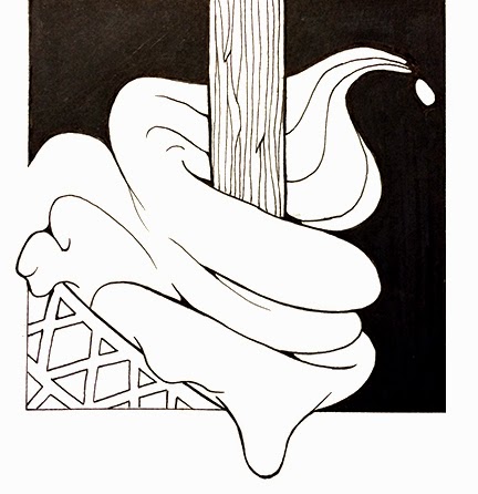
• skin flaps, giant evil-clown nose
• Golf clubs for eyes
• Creating a freak show version of yourself
• Giant bubbles, swallow up pollution
• Wearable technology that automatically adjusts to home temperature
• Hair helmets
• Robot servants 


Below are a selection of the more successful ideas to come out of the evaluation session. Recently I've been so caught up in only being able to work in black and white that it totally slipped my mind that the roughs could be in colour swell as the final piece, so i rendered a few afterwards in orange to get a visual connection to the phone company who has created this Future Self app.


 After the first week on this brief i'd say the only real problem I've had with it is the fact I'm not making my 'roughs' rough enough,which in turn limited the amount of possible design ideas i managed to present. I guess i like to give a client a reasonably clear idea of what I'm planning for the final piece, rather handing them a scribble that could change dramatically & look totally different in the by the end? The article was a bit tricky to turn into visuals to start with but after a few reads through, and the more sketches i did the more the ideas appeared.
I wouldn't say I'm enjoying having to draw the same object over and over again yet, but I'm getting my head around the fact that roughs, indeed, only have to be rough, and not something that needs a lot of time & effort put into. IT'S ALL ABOUT THE IDEAS!!

Working within the dimensions isn't something I've had any problems with so far, i tend to start with a rough box when i start my roughs any
way, and always have the final composition in my mind from the 'off'.
After my group feedback session, i half agreed with them about what the final concepts should be - but may need to overrule them on some of it, otherwise these will be the images i will be working on in the 2nd week.


200X 200 FINAL

(What my peer group thought, but may replace it with idea below)


PORTRAIT FINAL


LANDSCAPE FINAL


Sunday, 26 October 2014

Studio Brief One - INITIALLY

DEADLINE DAY

After a hectic week of trying to get all my A-Z done & dusted it was time to show & tell. I had mixed feelings about the final outcome. I felt I'd executed it to the best of my abilities and think it's visually interesting, which I'd always aimed for - but looking at other students efforts felt maybe should've had a stronger or clearer concept? Also maybe a title might've been a bit helpful,but thought 'naaaaah' i shouldn't be 'sign-posting' what the work is supposed to be, and instead let people try and work it out for themselves.


Night shift


We all made feedback sheets and stuck them up for people to add their comments 
and thoughts on visuals (left) and ideas (right) On the whole pretty encouraging.

Saturday, 25 October 2014

Visual Skills Brief TWO - 'A Day in the Life'


The next Vis Skills brief is to produce three editorial illustrations that visually communicate my response to an online news article i've been given.Examples of this that caught my eye are below - i've only come across Noma Bar's work since I've been at LCA, but i instantly fell in love with his style, and use of negative space and basically how bloody clever his concepts are!


Marc Aspinall

Paul Blow

Noma Bar


The article is called 'The value of your Future Self' by Anna North for the NewYork Times.
In short, it's about a new face recognition phone app by Orange, which takes your picture, 'ages' you by 20 years (makes your hair grey and gives you some wrinkles) and then lets you cha and ask questions to yourself in, 2034.Real Buck Rogers shit!

I read through the arcticle a few times and pulled out sentences and notes that i thought i could work with and transform into some imagery. These were mostly based around the fact that its a phone app, made by Orange, that transports you into the future. She mentioned HAIR HELMETS (see vid below) aswell, so i'm trying my hardest to squeeze one in there somewhere if i can get it into context. Might be a bit confusing though?!

The illustrations need to be 2 colours plus stock, and fit into the following dimensions;
1 response at 200mm x 200mm
1 response at 105mm x 200mm (portrait) 
1 response at 290mm x 105mm (landscape)

The three illustrations should be distinct in their content but work as a set or series and be visually 
consistent.Also, we're allowed to use digital tools to complete this task, which usually i would've jumped at, but i may keep it as analogue as possible to continue my 'reunion' to hand-drawn work .we'll see.


Visual Language - Cowboys & Indians


 From a list of possible visual subjects i have decided to spend the next six weeks researching and responding with my hands & mind to COWBOYS & INDIANS.


Other options were;

1980s New York 
Olympic games 
Farmers and farming 
Tokyo & its technology
Fun fairs & Theme Parks 
Classic Horror Movies 
Tour de France & vintage bicycles
Punk, Ska & Northern Soul
Deep sea diving 
Haute Couture Fashion
Highlands of Scotland & its wildlife

I was initially drawn towards Horror Movies & 1980's New York as i've got  fair bit of knowledge and love for both of them, but i thought it'd be more interesting for me to look into something i wasn't too familiar with already. Having Cowboys AND Indians gave me a wider range of subject matter to explore; you've got the masks, headdresses, cave paintings and weaponry from the native americans and then you have guns, horses,strong hat selection and rhinestone cowboy suits which Liberacé wouldn't have looked out of place wearing.I LOVE a tassel!


I wasn't too sure how many books about Cowboys and/or Indians i'd be able to find but the library came up trumps again, including an absolute beauty entirely about cowboy hats! Essential reading.Plus others on masks and wild western clobber. G'waan Cliint!


Wednesday, 22 October 2014

Studio Brief One - INITIALLY

WEEK TWO

The class got into small groups to review and crit each others development of our A-Z poster project. The brief was to have had 260 (give or take) sketches of possible themes - i was painfully under that number of sketches at this point as id had a: spent too long doing my sketches and b: had still been struggling to think of enough interesting themes of my life. I had also already got quite a firm idea of how i wanted it to look, so was finding it hard to churn out loads and loads of rough designs for something i was never going to use.
So i presented my thin but well thought out sketchbook, which i would still add to, but also had a good starting point for my final poster.


SELF-EVALUATION

I feel a mixture of disappointment that i haven't produce a great volume of design possibilities but also quite positive that the subject i've chosen to produce for my final piece is a strong concept and will be visually stimulating.My sketchbook could've/should've been a lot more organised, i just hadn't realised that i would be showing it to others in the class and was only really set out in a way that i could understand.

After getting feedback it was suggested that i try and fuse the two themes of films and sweets of my childhood together. Although a good enough idea, i wouldn't have the time to tackle anything as complex as that. The idea of keeping things minimal and contrasty was also praised so i intend to carry on along those lines. Striking, bold, uncomplicated, and a piece of work that would hopefully make people want to look at.

I plan to generate the final images in a grid formation and as clean and tidy as possible, most probably using black fine liners and markers. I realise some of the letters may need some sort of shading so i may introduce a light ink wash for some greys, but am quite keen to keep things as crisp as possible so may keep it strictly block black and white.I now just need to finalise my final 26 images, maybe have a practice run and to start mapping out my A1 page.


Mapped out layout for final A1 poster


Photoshop Sessions

Part one of three Photoshop sessions in which we have been given the task of producing 5 different versions of one of our inked reference drawings that we produced in our Visual Language lesson. The sessions are mainly to get us to use some basic PS tools and techniques to clean up or tweak our hand drawn/inked/penned work and prepare them for print or for digital colouring. As a Photoshop veteran i am already well versed in these techniques, but you can't know everything and it's always handy to learn a cheeky new shortcut that you never knew about before! 

As it had thick lines and a bit of tone, I chose to have a play around with the image of some rag that i'd painted the week before.


Orignal scanned version

Using the LEVELS tool (cmd & L) i took out the texture of the paper for a cleaner look
and made the blacks 'pop-out' a bit more, whilst also keeping the grey mid tones visible. 


If you continue to play with the LEVELS further then you eventually lose
any mid-tones and you're left with just the startk black line work


Having a good old muck about with simple HUE & SATURATION effects and fades.
Also, using the lasso and magic wand tools i tried out a basic 'painted' version with no black lines


Studio Brief One - INITIALLY

This two week brief was to produce an A1, 26 image, monochrome A-Z typology poster of ourselves,based on ideas and themes developed during our studio sessions. The first mission was to come up with 10 possible themes &  produce 26 rough designs for each theme ,260 images in total.Which, is a lot. Especially when i was struggling to come up with 10 themes relating to myself that i thought would work as poster, or that i could think of a possible image for each letter of the alphabet for!


WEEK ONE:

Initial ideas included Countries I've yet to explore (all of them), Childhood lunchbox, Album covers, WWF wrestling legends, Computer games from my youth, and Birds. Not wanting to go too personal but to give people something they could also maybe relate to aswell when looking at the poster i started to work on the theme of films/tv/computer games of my youth, which i realised was loooong time before most the class were even born..!


I established quite early on in my concept sketches that i really didn't want to simply draw 26 detailed, accurate illustrations of people, characters or objects - I wanted to strip the 'subjects' down to almost computer icon or logo-like simplicity, not only to make the poster more visually engaging, but also to cope with the time constraints placed upon us.


A & B
Child's Play & Day of the Dead


Elephant Man & E.T

Friday the 13th - The Fly - Highlander - Halloween


After getting the main gist of how this theme would look in the final poster, i moved on to the theme of 'sweet youth', which is a collection of confectionary that you could've (and still could) found me with my paws in when i was still in short trousers. Again, simplifying them as much as possible, keeping only the recognisable shapes or patterns.