Pages

Sunday, 14 May 2017

OUIL603 - Summative Statement

I'm well known for being very (sometimes overly) critical of my general existence - so as I find myself at the end of the uni road, i have mixed feelings on how I've done.

There's not been enough hours in the day! I don't think I could've engaged with the module much more than I have done - throwing myself at numerous competition briefs and client commissions and order to gain as much experience in many different design fields, with as many professionals as possible during my final months. Yet I'm still questioning; did i actually do enough?!  Personal goals achieved have included; finally drawing BIG, winning a competition, finding regular paid design work, having a table at my first print fair, being lined up for my first little solo exhibition and having a series of posters go on sale in high street print shops.So I guess I must've done something right?

I left a lot of my analog experimentation behind when i started Level 6, which I was a bit gutted about - but for me, this year I needed to focus on making a body of work that would form a solid, quality portfolio to leave uni with and one that I'd have confidence in showing people. This wasn't going to happen by me making bodged screen prints or painted cardboard cut-out masks. My practice is a digital specialist, so I have to play to my strengths.

My willingness to also get involved with briefs away from digital art production has lead me to make a solid working contact in muralist Pete Barber - who's been hiring me to design & layout his murals so he can go and paint them. With offers to assist him on site with a couple of big painting jobs in the near future, I'm really excited at the possibility of gaining more on-the-job mural experience from a master.

As far as my solo practice goes; until i finally take time out from making work to actually go and promote the work, contacting agencies/companies then i won't know whether my creative future will be powered by my own steam, or aided by an agency. I'm confident that i can produce high-quality work to deadlines, but just whereabouts my style would fit in within the industry is more of a mystery right now.

I'll always regret not being hands-on enough with my practice and I hope I'm not standing in the same spot as i was when i started the degree in terms of the work i make. Looking around the studio to see everyone painting or sketching away always makes m wish I'd taken more risks or cared a bit less about making wobbly looking work. Alas, some people are painters, some are screen printers, others are mad doodlers; i, am a Mac drone. I make super clean, super bold digital pictures, and I'm pretty bloody good at it. I just need to believe it more and shout about it louder!

OUIL603 - End of Module Evaluation

End of Module Student Evaluation

BA(hons) Illustration
Module Code: extended Practice OUIL603

Name: Ian Fulcher
Student ID:257204


Learning Outcome
Evidenced where?
Blog, Sketchbook, Roughs Final Illustrations, development sheets etc.  (No more than 75 words)
Your grade                  
Using words:
> poor, satisfactory, good, very good, excellent
6A3
Understand and demonstrate coherent and detailed subject knowledge and professional competences, some of which will be informed by recent research in the discipline. Knowledge and Understanding - RESEARCH
Extensive sketchbook research, development work and test prints. Thorough documentation on my blog.
Excellent
6B3
Articulate and synthesise their knowledge and understanding attributes and skills in effective ways in the contexts of creative practice, employment, further study, research and self fulfilment. (Cognitive Skills - EVALUATION & REFLECTION
Constant reflection, self analysis and re-evaluating through out my blog. One to one tutor sessions to discuss my progress, also documented on my blog.
Excellent
6C3
Develop appropriate methods of professional presentation combining visual, verbal and written techniques.. Practical & Professional Skills - VISUAL QUALITY)

All of my issu presentation boards are a made to a high, professional standard and are consistent through the whole module- with careful consideration going into the layout of type and imagery every time.Product mock-ups are also a frequent sight.
Excellent
6C4
Demonstrate their ability to synthesise analytical and intuitive approaches with a high level of process and professional skill. Practical & Professional Skills - VISUAL QUALITY)

Physical prints will be part of my submission as evidence, along with my sketchbook. This also includes size and layout test prints.
Excellent


Analyse information and experiences,formulate
independent judgements
and articulate reasoned arguments
through review and evaluation.
(Key Transferable Skills: EVALUATION)

As always, my OUIL603 Blog, summative evaluation and Final Project report.
Very good


Having spent the majority of summer working on self-initiated projects and competition briefs in order to hit the ground running with this module I was already raring to go and keen to get involved with as many tasks as time would allow me to and to NOT STOP! I only had 9 months left, I needed to make the most of it, as the party would soon be over. I'd already set myself the targets of building my experience with animating, live mural painting and working with professionals -  and I soon found opportunities to reach those targets.

Having been part of mural painting teams during the summer and winter I wanted to see if I could fly solo entering a number of mural competitions and even winning one. Having to paint my design in real-life was a challenge in itself, but also there were learning curves in how to use projection equipment and time-lapse camera technology, both of which I’m pretty foreign to. Budgeting for art materials, and dealing face to face with clients was also something I became more familiar with - it was a great experience all round, especially as they were so happy with my work - but I realise it's not always that plain sailing.

This lead to ongoing design work with muralist Pete Barber, who I’d worked with during the summer. There's definite potential for this partnership to continue beyond uni, as he’s in pretty constant demand and needs someone to design the murals he goes and paints. He's also offered me the chance to assist him on site at a couple go future mural jobs in London and Wales.So fingers crossed!

In the less successful section would be my contribution to the Out of Order Exhibition. I’d put a ton of time and effort into designing and distributing the physical promo material for the event, and online promo. Sadly when it came to actually making work for the show, I wish I hadn’t bothered, as I didn’t really do myself any favours, opting for a concept wth a weird personal back story, that was never going to make a connection with anyone viewing it. It was becoming more apparent that I'm much better suited to client given briefs than my own self-initiated work. So I targeted briefs with restrictions and clear purposes/outcomes/ functions.

This included some collaborative animation work with Level 6 animation students - for the Wellington st lifting tower Xmas projection project. This gave me a great chance to have my animated work projected onto a huge surface and seen by many during the busy Xmas period. Although happy with my output, I never did get around to revising the field of animation after that.

This was partly down to a decision I had to make,; if I was struggling to decide on the methods in which I should produce my work (i.e.: screening printing, animating, painting, laser cut etc..) I just simply ask myself “is this going to benefit my work..?”

In most cases using analog production process to create my digital looking designs was not going to benefit my work. So there has been a distinct lack of handmade artwork made by myself this year. Which is a shame, but as I needed to focus on building my physical and digital portfolio I needed to fill it with my best work - and digital is what I do best. I can't really lie to myself anymore.

But the self-doubts and being over-critical of myself continued but it was good to speak to tutors (and classmates) as much as possible, to get their opinions and advice.Although getting too many opinions doesn’t always help - as mixed responses led to a fair bit of uncertainty when it came to how my final major project should look. But when it comes down to it, you just have to stick to your guns and go with what keeps you excited about making pictures, rather than always thinking about what other people want to see. So that’s what I did.

My Final Major project (an illustrated, educational book about the birds my dad and I spotted in Canada) was initially intended to be a much grander affair - with animations and layered, painted laser cuts flying about the place  - the actual outcome is a far more modest offering - most of the project being proposed and digitally mocked up as opposed to me submitting tangible items.

In that sense I reach the end of this module with a slight sense of failure and that I could've done much more, and nothing i do is very innovative. When I look around and see the work others have produced I certainly feel I’ve played too safe, and maybe a bit boring - and I should’ve left my comfort zone a bit further. Again though - my primary focus was on having a solid, high-quality portfolio full of work that I’m proud of and confident to go and show clients - and not a load of experimental showpiece work that is totally unlike any work I usually make. On that hand, I can feel a fair bit of success - and looking back I don’t think I could’ve squeezed a whole lot more in without compromising the quality of my output. 

Saturday, 13 May 2017

OUIL603 - Project Report


OUIL603 - OrnitholoSEE - FMP project boards & book preview

FINAL MAJOR PROJECT:


DEADLINE: 15.5.17


Book Preview

OUIL603 - PeteBarber/IanF project boards


Collaboration design work 
with modern mural artist Pete Barber 

DEADLINE: MARCH 2017


OUIL603 - 'out of order' project boards

'OUT OF ORDER' 
LCA EXHIBITION - PROJECT BAORDS

DEADLINE: 24.2.17

OUIL603 - Adidas Performance project boards

Adidas Performance
Fitness studio mural design competition

DEADLINE: 22.2.17

OUIL603 - We are Boutique - project boards


We Are Boutique
Mural design competition

DEADLINE: 10.2.17

OUIL603 - 12 Days of Christmas - Project boards

12 DAYS OF CHRISTMAS
SPIN-OFF POSTCARD PROJECT

DEADLINE: 24.12.16


OUIL603 - Lumen Lifting Tower Projection - project boards

WELLINGTON ST.  LIFTING TOWER
COLLABORATIVE XMAS PROJECTION PROJECT

DEADLINE: 11.11.16

OUIL603 - Drawlloween - Project Boards

Drawlloween 2016
Development/artwork/product

DEADLINE: 1.11.16


OUIL603 - Travelling Man - Project boards

ROBOCOP 30 
FOR TRAVELLING MAN,LEEDS.

DEADLINE: 31.10.17


OUIL603 - Statement of Intent - Final Revision


Wednesday, 10 May 2017

FMP - OrnitholoSEE - wrapping it up...

As far as submitting in time for the end of the module, its' time to wrap things up with the bird book. What with having to spend the best part of a week solidly making issuu presentation boards and doing all the 'admin' for OUIL603, any production of new birds for the book came to a halt, leaving me with final, cut-price tally of 14, fully-fledged bird images with accompanying writing. a books' worth, sure,but it doesn't feel enough - however here it be, in all it's a virtual book glory.


A lifetime away from the original 40 that i proposed - although i think we've all established that that was 'pie in the sky' thinking. With 6 more already in production the full 20 birds will be ready to go into the physical book come the end of the degree show, which will give me a bit more time to iron out any possible issues with content or layout. Even though i know it wasn't essential to make the physical specimen for submission, i do feel like I've come up a bit short, and if i hadn't been struggling so hard to make a simple design decision on the early stages i would've given myself enough time to get this printed for real.


Here's the book all ready to go on my Blurb dashboard.


Still, it'll give me something to work towards in the degree show - otherwise i'm sure i would've let the wheels fall off in the huge void that will be left in my life my having no more uni work to do.


In between all the constant blog posting, i did find a bit of time make some fun little extra bells and whistles for the book and it's spin-off printed products. 

18x18

20x25

All part of the proposal process. I also made a couple of test print of page sizes, so i could see how the text sizes were working out and also so i could make a decision on the book size. It was a toss up between 18x18 ( which suited the 'squarer' compositions, or standard portrait 20x25 - which i think is the winner. Most of the images I've done are geared to be a3/ a4/ 80x10, or any portrait ratio, plus i don't want to have to shrink the pictures down too much. Big and bold!


Belly band for the a5 print bundle with i.d card,
 if you can't imagine how that might work in real-life?


Branded belly band colour test prints.


Matching dust jacket design for the book


Tuesday, 9 May 2017

FMP - revised SOI


Anyone expecting all the whistles and bells proposed in my initial FMP proposal might be sadly disappointed - as they never really materialised, due to my underestimating of how much i could realistically get done within this timeframe, amongst the coursework for other modules - also sleeping, eating and life in general. 

Also, it came down to asking myself; "is making painted wooden laser cuts, and animations going to benefit the core imagery of the project?" and the answer would be no, it wouldn't have done. The project is about birds, how they look, what they do and how to educate people about some of them. So the focus turned to the quality of the drawn imagery and not so much on how much physical paraphernalia i could also make out of it and throw at people.

Turns out 'writing a book' takes up a fair bit of time on its own, without trying to be an animator and wood craftsman aswell. 

I have slightly revised my FMP project proposal/rationale/reference sections accordingly (see below).

OrnitholoSEE - book branding/logo...

As i needed to also design a cover/dust jacket for the book i took the opportunity to develop a quick bit of branding for the OrnitholoSEE series - just a simple little emblem that would sit nicely on the cover.

As future books could be about birds from other countries, the type of bird could change in relation to the given country. The logo would keep a similar look, to keep it cohesive with the original Canadian edition.see the UK verison, with a Robin.


Tuesday, 2 May 2017

Dismantipples - the project that never quite was...(yet)

This was one of the original project ideas i had during my extended practice prep work in the summer. 

I like drawing food & drink. I don't do it much and I wanted to make a collection of 
designs based around food or drink, done in my signature style in order to eventually, possibly pitch it to food/ drinks/ advertising companies, bars/restaurants or  design agencies.

Dismantipple origins

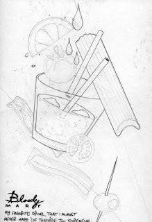
Although i did a fair bit of development on the 1st edition, Bloody Mary; even shifting a few digital prints of it,displaying it at the North Leeds Food Festival and more recently getting it Riso printed as a piece of promo material (which i'm over the moon with the results) - i never keet the wheels rolling with it.

A3 Digital version

A4 Risograph versions

As sad as it sounds, there honestly isn't a day that i wake up and don't think "aghh i should really start a new cocktail design" - but it kept getting pushed further and further to the back of the pile of projects, briefs and commissions, so much so that i'm not sure it will fully see the light of day.

Untill now....

With the final hand in on the 15th, and a degree show display proposal to sort out, there's a window of opportunity for a scaled down framed series of maybe 3 new Dismantipples to finally make an appearance?

With so many bars in the area i'm sure there would be a market for the designs beyond the degree show, plus the Bloody Mary riso prints have gone down really well. So i'll be making an effort to kick start this project as soon as i'm no longer bogged down in blogs and project boards.

Tuesday, 25 April 2017

Influx of live Mural briefs...

I've noticed there has been a good handful of mural design callouts that i've been seeing in my inbox recently from the uni - and normally i'd be jumping at some of them, but i'm wondering where exactly i'm i supposed to fit the time to make a decent effort of them? I'd love to just dump my FMP and participate, but for the good of my degree i've got to stick to my guns and see my bird book out. 

Another factor thats puts me off is that more often that not the companies commissioning the work arent giving us specific guidines as far as concpet goes - it's just a case of; do what ever you want to fill the space, and we'll pick whatever one looks nicest. Which is fine, but it just feels like i'd be spending my time on a total stab the dark - great if you end up winning, but not a whole to show for your efforts if you're not selected.


That said -the latest one for the hoardings at the new LCA building my inbox has got my attention;


Again, we've not been restricted by a specific concept or any limitations, as long as it can replicated using vinyl- but i kind of wish we had been restricted, as the design could pretty much be anything. the nature of vinyl would suit simple shapes, which is right down my street - but whether i can take the time to come up with some designs before the deadline without totally neglecting my FMP is another matter.

But i would like to have a go at leaving my mark on the uni (literally) for the people of leeds to behold long after i am gone, or for 12 months anyway.

I will have to assess the situation (quickly).


**UPDATE**
This didn't happen. Bit annoyed at myself, but FMP comes first.


OrnitholoSEE - losing/regaining perspective...

As the slog continues, i've totally lost all perspective with this project, and having a chat to classmates has woken me up a bit to what's actually expected of us in our submissions.

I've been beating myself in pursuit of trying to make the Blurb print deadline, so i can have a physical book finished, printed and delivered ready to hand it in with my development work.

But i don't need to?! It can be entirely proposed if i want - as long as i have mock-ups & proof of the work actually existing, completed and being in a position to be put into a book, then that's what i'll be marked on.

I've been so wrapped up in making a physical conclusion that this didn't occur to me - but now i've been reminded of the fact, i suddenly feel a whole load of weight of my shoulders, and that the imagery for this book is a bit more achievable that i thought yesterday.

Not so say i'll be taking my foot off the gas - i've still got a considerable amount left to do before i can reach the point where i can say i'll be happy with what i'm turning in, but re-gaining perspective has also given me an extra week back that i had intended to have all the images & text done by in order to send to print. I may even get away with not having to trim down the final bird tally any further than the revised 20.


ORIGINAL LINEUP


REVSISED LINEUP


I'll still have a number of physical loose 8x10 prints ready for submission, as they were also proposed in my initial statement of intent.


Tuesday, 18 April 2017

FMP - BLURB progress...


As i gradually begin to chalk up more and more finished bird images, and accompanying words i been looking into which custom book creating company to use. My parents have had holiday photo books made by Photobox before, and the quality is great, but i'm getting on with Blurb's 'create your own' interface (BookWright) a lot easier, plus the selection of book format is a lot wider so i'll be going with Blurb when it comes to getting the physical copy made up.


I'm leaning towards a 20x25 portrait format, with a dust cover. Have yet to make any decisions on the paper type, but they all look pretty Pro to be honest, and very affordable - i may even get a few done eventually, so i can keep one in my portfolio.

I cant wait to be able to sign this whole thing off by having it my hands, in a real book, like a real person! The 'tangible conclusion' is what's driving me on now, as i'm fast running out of productive steam right now - but i'm still going to have to knock out 2 birds a day (fully complete with type) for the next couple of weeks if i'm going to meet my target!


Sweet sweet Photobox discounts.


>>>>>>>>>>>>>>>>>>>>>>>>>>>>>>>>>>>>>>>>>>>>>>>>>>>>>>>>>>>>>>>>


So i don't get myself in a pickle when it comes the undoubted last minute compiling of all the artwork and sorting all the typesetting on Blurb's BookWright self publishing tool; i've been laying out my pages as i complete them, so i can get to grips with it all. I mean, it's not massively tricky to get my head around, but it'll be one less thing to stress about.


I was scratching my head a bit about how the text should be aligned -after having a quick chat with Ben and i showed where i was up to and he pointed out that it should definitely be justified, as currently my type was wonky at the ends, and a bit unsightly. I thought it might be a bit of a ball-ache to get it all 'squared-off' but the justify tool on BookWright sorts it all out quick sharp! So now i have nice neat blocks of type on one page, and the image page opposite.


The tone in which i 'narrate'  the book is light-hearted and pretty much how i would talk about the birds in real life. I'd like to think my sense of humour comes across when reading the short paragraphs, and also some of the bird love i have with it. I've been a long time fan of Matt Sewell's bird books/drawings (below) and he's always been the benchmark i've been aiming for.Although with my graphic style im not sure i've got same sort of appeal.


Reading his books and the way he describes birds is pretty similar to how mine is going - you can tell he's got a real passion for the subject in his writing, and a quirky sense of humour. Even the layout is similar, but then again i'm not sure how many more innovative ways you can effectively lay out a bird picture book? 


At least my images look absolutely nothing like his, so i've not totally ripped him off!

Monday, 17 April 2017

FMP- OrnitholoSEE re-evaluation

I'd probably hit a low point with this project, but a new dawn & new day and i'm not as miserable about it all as i originally sounded. 

I put it down to to frustrations with what i was making VS what i initially planned to make, the (fast disappearing) amount of time left to do it - coupled with the fact that it feels like i'm spending every waking hour in front my mac, making slow progress when i really want to make something physical & a bit more instantaneous. I've made my bed, so i guess ill have to lie in it.

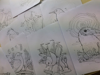
After an assessment of how much work left to do against the time frame to do it i got myself into a more positive mind set and went into beast-mode; spending the weekend solidly sketching and refining the linework of the 13 remaining birds, achieving my goal of 20 birds, all ready for scanning and on to the vectoring stage. I made more progress in two days than i have done in 4 weeks. It's funny what a looming deadline and the very real fear of failure can do to the motivation.


I also put the new enthusiasm down to the fact i stopped thinking about every tiny detail of the content so much, and whether it meant anything to anyone or if it was 'personal' enough - and just did it how i wanted to do it! 


Being able to spend a chunk of time drawing without being in front my computer was also much needed - and appreciated. Due to my bank holiday efforts I've put myself in a bit of a healthier position in regards to making the printing deadline for a Blurb or Photobox publicaiton.

I will still need to design accompanying cover image/logo,text and intro pics, so i'm not patting myself on the back too much yet.

Sunday, 16 April 2017

FMP - Bored now...

so very bored.....

This FMP was supposed to be a self-indulgent project about something that we had a special interest or even love for - but I've somehow turned it into a monotonous, drawn-out affair in which i have lost almost all enthusiasm and motivation to do - and am almost resenting, because whilst I'm painfully slogging each bird image out, I've got a load of other quick turnaround ideas going around in my head that i would much rather be doing. I'm so frustrating. I though i was the sort of artist that would be good at making series' of images based on a similar theme. Turns out, not so much.


I'm bored of getting up every day and drawing the same thing, in less and less interesting ways. It's almost made me grow tired of looking at birds (obviously not, because birds are awesome) but the whole production process is wearing me down.


It's too late in the day to make a last-ditch switch to another project as i don't want to end up with two hadl finished submisisons - but after already facing the fact that I've had to half my proposed image count (40 down to 20) I'm also going to have to accept my initial statement of intent; with the planned animations and painted laser cut birds just isn't going to happen now. I'm going to have to produce 2 new birds every day for the next 2 weeks if even i stand a chance of having a book ready to send off to a printers to be professionally printed and bound. ( if i opt for the print dungeon i have a week or so longer) And thats not factoring in days i'll be away or working on my  PPP presentation.


Deadline breakdown:

• Submission- May 15th
• Days i'll be away from Leeds - April 28-May 3rd 
• Last date for professional printing/binding (7-11 business days) - May 4th
• Amount of production days left (predicted, if i do NOTHING else) - 12
• Birds left to produce - 13 (plus cover designs and page layout)

basically, I'M  PROPER F**KED.

So what started out as a project which would give me a chance to combine a mixture of hand-made, digital and animated elements is going to be a plain old collection of digital prints in a book (if I'm lucky) - that, because of the personal elements included in the pictures (as it was supposed to be a personal project) have no meaning to anyone else on the planet ( apart from my immediate family)


Brillant(!)


You can see why my motivation is rock bottom at this point. Spending day and night making pictures for a book that no-one will relate to, or even see will do that i guess? 


My final practical project of my degree has turned into an unadventurous, irrelevant damp squib.


I need to pull something special out for the Degree show, for my own peace of mind. I can't go out like this?!!


Friday, 14 April 2017

More mural work with Pete Barber..

Was given a couple more mural designs to knock out for Pete so he could go and paint them during the Easter Break.


Staines Preparatory School, Staines


Project Boards


original design i was given to work from.

Re-worked and re-composed design.


>>>>>>>>>>>>>>>>>>>>>>>>>>>>>>>>>>>>>>>>


'British' Bird mural - Tibshelf Junior School.


Final Project Boards


This design features a selection of patriotic (to GB) birds, although not all of them are found on our shores - it's a strange concept, and it was never fully ( or partially) explained to me. I also had to design a character based on the schools former lollipop man, who had recently died, leaving the school some money - which was used to have the mural painted. Again. i wasnt provided with any details on what he looked like, and despite a thorough search online, i couldnt find any evidence on him - so  i just had to go with the classic,elderly gent approach. He might not even have been old..or white?! 


I was send a load of 'scribblings' by the youngsters  from the school and set the challenge of completely transforming them into something nicer to look at, but using the pupil's drawings a starting point. Pete then selected a number of them an arranged them how he saw fit and sprayed them on the corrugated storage unit.


Drawings birds is fast becoming a running theme this year, but with this project i was keeping a hand drawn look to them. Once i'd done some minor development on them i coloured them and converted them into PNG's so Pete could drag and drop them over each other in order to sort the composition out. 


Turns out he got me to do way more characters than were ever going to be used, so most of them didn't make the final cut - but this was done so he had plenty to chose from. Bit annoying, as i could've spend half the time i did on them - but i got paid, and he did a really good job on them, especially on the tricky bumpy surface. They look just like my designs! Just a shame he didn't take any more photos of the final piece.