Pages

Monday, 28 December 2015

'Nocturneyes' print - Develpoment


I spent some of the xmas period trying to bring this one to life. Based on short sentence from the book which reads "my eyes are like nocturnal creatures…" It's quite a literal response so far, but it gave me a chance to carry on trying to develop the simple drawing style from the previous print designs.


Photoshop mock composition

A much as i like the idea of drawing a load of weird looking night critters, at the moment it just feels like I'm just drawing a load of weird looking night critters climbing out of somones eyes for the sake of it.Theres not a whole of lot of original elements I'm bringing to the composition. Despite doing a fair bit of rough sketching things aren't clicking. Also, as I've resorted to making simplified shape based imagery its hard to do that and keep the animals half-recognisable. I'm going a bit cold on this idea, and if I'm honest its not my strongest concept, just needed an excuse to draw a Bear-Cat. Don't we all?

Tuesday, 22 December 2015

Illustration Friday #4

Illustration Friday:
S O A R


After a just a few weeks of IF submissions, it's painfully clear that to gain any sort of 'recognition' for your work on this site you have to submit the cutest, softest bags of cute, soft crap imaginable and I'm not quite ready to jump on that particular bandwagon, just yet…

With motivation for completing these weekly friday deadline (thursday afternoon more like) tasks running a bit low and with more more pressing work matters to deal with, i didn't feel enthused to make any new imagery.I was able to re-work a relevant image that i had used for my visual communication module last year. The image was of a vulture and was all to do with current, and how the turkey vulture (and others) use hot warm air currents/ thermals to soar for aggggges without having to flap their wings. It originally had colour and media limitations, no digital allowed so thought i could re-work it to how i would've done it given a free reign on media.

Again, wasn't going to spend a huge amount of time on this one, but managed to give the piece a whole different mood with the addition of textures/distress brushes but mainly just by changing the colour pallete, and eliminating virtually all of the white.


Original, handmade fineliner & card cut-out piece


Final submitted version- 'Red Scent', with factoid added to break up all the red,a bit.


Tuesday, 15 December 2015

Process & Production - The turkey saga continues...

After sleeping on it, i went back to the pile of yesterdays screenprints thinking that maybe they weren't as bad as i remembered. They were. So i turned to the digital print dungeon on order to make a blemish free version, and also to see how it compared to the screen printed image.

I'm not sure how i feel about the results.

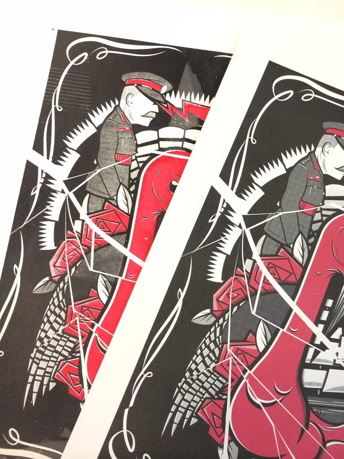
The 'best' Turkey screen print (left) vs digital print, 
both on Snowden 300gsm Cartridge paper.


 DIGITAL VERSION:
+ Obviously everything has printed out exactly where is out to be, with no streaks, blobs, patches, inconsistencies in ink coverage. No surprises there really.

+ Haltones are replicating the accurate illusion of grey shades that i had planned.

+ Allignment spot on. Again, its been done by a printer, that part of its job.

+ None of the hassle of the whole strip/dry/coat/dry/expose/wash/dry/print/clean/dry process, with the very real possibility of poor, un-useable final outcomes. 

+ Less time consuming.

- Colours, even though i had made the image in CMYK colour mode, came out dull, and the black came out almost a dark, dark grey. Can work out why this would have happened, as the image on screen looked bright & bold. Was getting prints done at the same time as Jack, who's blacks also came paler than than they looked on screen. We both used the same paper, but can't imagine that could be a factor..?


ANALOGUE VERSION:

+ Compared to the digital print out, the colours look so much more vibrant.

+ I started to appreciate the blemishes and imperfections, as it gave it a bit more character than the flat digital print. Though there are way too many blemishes, and massive imperfections on these to get away with selling them. I'm still not sure they're good enough to submit neither. Marks on the screen from previous use is frustrating also.

+ it's spirit crushing when it goes wrong, which is lots, but when it does go your way (which is rarely at the moment) you do feel a bigger sense of achievement opposed to knocking up a bit of work and getting 20 identical versions of it printed out by a machine. 

- There are too many things that can randomly go wrong, and so many things to remember to prevent those things happening. Admittedly, I'm a novice at this still game so can't be too hard on myself for not knowing how to prevent them all...but i am!

- The amount of time the whole process takes so long, which for the most part i enjoy. It wouldn't feel so long if it produced decent fruit all the time, but at the moment I'm just making manky bananas, and no-one's interested in manky bananas.

- They do seem to more appealing than digital prints, which i totally disagree with - but it does appear to be the way things are for many people when looking to purchase work.


I'm contradicting myself a bit here probably, but basically I'm saying i'd forget all about  digital printing if i got absolutely shiiit-hot at screen printing. But thats not likely in just a few years dabbling with it, and maybe the sort of work I make is just better suited to being replicated digitally?


Illustration Friday #3

Illustration Friday:
 U N I C O R N

After seeing the subject for this weeks drawing, i immediately thought of all the over used and cliched pictures of fat, cute horses with horns stuck on them, farting/puking rainbows..and looking at the earlybird entries, thats exactly what i got! Luckily my Process & Production work has been dealing with a story that features unicorns so i'd already done plenty of research on them, so knocking up something that didn't feature a rainbow was a relieving possibility! I didn't really want to use something that was already in my sketchbook, but went back to my findings and investigated further into various unicorn depictions from different cultures, namely the Ming, Jin & Qin Dynasties (see below). A bit out of the box, but hopefully a bit more original than the just going for the obvious formula. As long as i didn't make anything with a bloody rainbow in it then i'd be happy.

As it was my last week before leaving for xmas and with the amount of work i've still got to do in order to be ready for print when i get back i didn't spend too long making lots & lots of scamps, i just drew and drew, and rubbed out and drew over the same scamp unit l i had a rough idea of how i wanted it to look. I used the different reference images of  'Qilins' (chinese unicorns) to create my own depiction of one.


The tiny foundation scamp
Large refined scamp


Finished rough pencil work 
Then it was just a matter of scanning, blowing up, redrawing, the redrawing the final pencil lifework (in red pencil) then inking over the top with brush pens. Then large res scan and render in Photoshop, withstanding the lure of the vector this time around.


Scanned rough pencil linework,
ready for 'neat' red pencil linework


Mr Newbert had kindly given me one of his squeezy pentel brush pens so i though i'd put it to use, keep the digital production to colouring and texturing only, hopefully saving a lot of tweaking on illustrator.


Final inks, thin lines aided with a fineliner

Photoshop rendering, keeping the colour palleted as simple as possible. 
There was some wasted space on the left which i felt could do with filling to balance the 
composition more.But wasn't really sure what with


Played about with the symbol of the Ming Dynasty in various forms. 

Also started to add textures to give things bit of depth.


More subtle layered texture additions. Also a small bit of type as an explanation to what it is - as to the uniformed, this could look like I've got the subject matter wrong

All ready for submission, even earlier than last week! I'm surprising myself.


+ Enjoyed working predominantly with the brush pens. Took away the option of making endless corrections.Felt a bigger sense of achievement once i'd finished it.

+ Learnt how to draw scales, albeit not massively accurately.

+ Enjoyed having a structured production-line style process, i knew where i wanted to go and what i needed to do to get there. 

+ Not so much indecision about production  method. It was: rough line work - tight linework - final linework - ink over linework - scan - render - submit. NEXT! 

------------------------------------------------------------------------------------------------------------------------------


- Not a whole to going on. Find it hard to create 'landscapes' for my drawings to live in,with out becoming cluttered or irrelevant.

- Character pose a bit static, even though it's a statue.


Monday, 14 December 2015

Screenprint Turkey times

I had been scratching my head about who or what to fill the space behind the roses and turkey head with. I'd had been playing about with the idea of the I.W Harper man being there, shooting/levitating a unicorn skull with laser beams out of his eyes whilst holding a Nike sports holdall, as mentioned in the book. (the bag, not the laser beams) But it just wasn't working for some reason. I don't think the I.W Harper character is interesting enough for one, although his hat tipping pose did fit in quite well with the rest of the composition. I took him out and had a bit of research for a similar shape i could replace him with, but doing pretty much the same laser beam business. Whilst researching into Haig whisky (another reference from the book) turns out that it was founded by the Scottish Haig family, who's members included 'Butcher of the Somme' Field Marshall Douglas Haig. So had a dig around for any possible images of him i could reference. Found a classic war portrait of him, made his head about 5 times bigger to make him more 'caricature-like' and slotted him in. Thinking forward to the animation side of things, Doug'll be quite fun to bring to life, i can make his tasch wiggle as he lets rip with the eye lasers! 


Messed around for a fair while applying different sized halftones, didn't want them all to be the same size, want to give things different shades of grey.Thought it was finalised (above left) but had the last minute idea of breaking up some of the big areas of solid black by making the image appear cracked, as happens in the book - when some 'heavies' smash up the narrator character's collection of imported whiskys.


-----------------------------------------------------------------------------------------------------------------------

F R I D A Y

First layer of colour has gone well. Found the perfect shade of rich dark red already made up in the leftovers pots which was a bit of good luck, added more medium to it just to make sure. Always check them before making my own colours as you do tend to get some interesting shades amongst them all. Plus, i hate the waste!


Registration marks haven't come out on the exposures too well, as only did them in soft pencil, so lining them up could be a pain?! I Chose a mix of Snowden and Somerset satin papers for a bit of extra quality. Made sure i did a good few testers on cartridge paper before using the special stuff. The first few came out pretty wooly and streaky, so just had take a step back and access what i may be doing wrong. Got some tips from Lydon and Mike too which helped a lot. Just had to push down harder,and in the centre of the squeegee.I soon managed to get into the flow and was knocking out good looking prints. Just hope my squeegee tekkers can be transferred on to my black layers, as i always have issues with getting black to pull evenly. Also, looking at my positives I'm a bit worried about the tinniness of the bitmapping on some of it. Not entirely sure it wont just some out as a big black blob?


------------------------------------------------------------------------------------------------------------------------------

M O N D A Y

Had to come back after the weekend to add my blasck layer, and wish i hadn't bothered. The results are  an absolute disaster and is only compounded by the fact that i have to sit here and blog about just how terrible my day at the office has been .


Even the newsprint version looked ropey.


This isn't me being a 'perfectionist', this is a normal person totally pissed off at putting so much work into one deign and the final product looking -12 below average. I mean, i'm supposed to be making prints that i could sell, but there's no way i'd ever think about asking for money for any of these. I'd struggle to give them away. There's honestly not a single print I'm anywhere near being satisfied with, I'm not sure i even want to submit any of these for the end of the module? Really don't know what i was doing wrong, as i was trying every possible method to correct. Ive had problems pulling black paint before so i made sure there was way more medium in my mix than paint.Maybe I'm actually too damn weak to get enough pressure on the squeegee? 


I really don't want to do anymore screen printing using black, but to work as a series of images black is the predominant colour. Pretty tired of wasting my time and money and energy on a method that I'm not good enough to execute to the levels that I'm demanding from myself. I don't really care about the whole ' handmade' aesthetic too much - if it looks good then i doesn't matter how its been produced (to a point). It needs to look how i want it to look, even if that means i have to print them out digitally, which i'm tempted to do right now as the same problems are only going to happen again on all my other prints and I'm not prepared to waste all that time designing and developing the imagery, prepping the screens & cleaning the screens, only to have a bunch of prints that'll be going straight in the bin,which is what all these will be - bar one for the final submission.


The 'best' of a bad bunch,which isn't saying much. 
Still can't submit this.


NEGATIVES

- Possibly made the bitmaps dots too small - a lot of it is too hard to make out and has just come out virtually black instead of a shade of black

- forgot to tape over the top registration marks on the screen.

- Overdone the medium towards the end so black isn't printing out as opaque.

- Something's going wrong with my print pulling technique. Don't know what, as i tried everything, i couldn't physically put any more pressure on the squeegee?!

- All a massive deflating waste of human time and energy (and good quality paper). Nothing to show from all the work i put into getting it the final colour print stage.

- The screen i was also using had some stripy marking/damage which i didn't notice and is clearly visible on the final prints.

- Look so amateurish. Couldn't sell any of these, and wouldbt insult anyone by asking for money for them.

- won't be able to sleep knowing what a balls-up I've made of these, and will ultimately have to go through the whole process from scratch again in order to make something half decent for submission.


POSITIVES

+ there are none. (if i have to find one, then i guess the alignment actually looked ok?)

+ i have plenty of roughs to wrap up my good prints with. (If any 'good' ones materialise)


Thursday, 10 December 2015

Illustration Friday #2 -WET

ILLUSTRATION FRIDAY:
W E T

These weekly tasks are supposedly meant to be speeding up my production turn around times, and although the openess of the IF briefs should be a help,  but I'm finding that you can have too many options, and as a man with crippling decision making problems and self doubt I'm finding it hard to settle on a particular design, and also when to call it a day and say "its bloody finished, leave it!" 

Quick brainstorm of things
associated with WET
Rough scamps. I had a minimal colour,graphical,
 'cut-out' design in my mind.


More developed scamps. Wanted some sort of 'looking down' viewpoint.

Final pencil drawing before scan and vector up. 
Wanted to keep it as shape driven has possible.
No concept as such,mainly trying to make some simple 
shapes look more interesting 


Further developments below: tweaking, endless tweaking at the Illustrator stage. Soon felt the initial design idea wasnt coming together as i'd envisaged, so things naturally veered back towards chunky linework based characters. The addition of textures to make things look less flat came once in Photoshop, using my bank of scanned textures that I've been making as i go along, which was the most fun, and straight forward bit about this whole brief.No pics of that stage as PS decided not to save the unflattened version and is now gone forever.


Final submitted version, and i hate the little green sod.


POSITIVE points
+ You can pretty much do whatever you want, as long as it has some vague connection to the given word of the week.

+ week deadline should speed up my production time, and cut down the amount of gaffing with the final product.

+ Found the scamping of ideas came quite freely for a change.Was getting lots down, even though ultimately i didn't use any of them.

+ It's more about having fun with these,(in theory) something that I'm not getting from making my pictures at the moment,mainly because I'm overthinking things so much.

+ It gives you an opportunity to perhaps experiment more, produce something in a way you wouldn't usually. The final outcome shouldn't matter so much. 

+ Started and FINISHED a final piece of work within a week (on & off) which is a minor miracle looking at my track record. Feels good to have over a day left before the deadline, I should they it more often! (the deadline time clearly isn't GMT as when i looked half six on friday night they'd already had people submitting a new topic. pheeyew)


NEGATIVE points
- I'm used to such loose briefs, so you can literally knock out anything as long as you can find connection to the chosen subject an your image.Too much choice, for me anyway.

- The final piece is so far removed from what i'd initially planned i don't know if this was down to me not having enough skill to see out my original ideas, or if this is just how all my work is going to look..?

- Not sure theres enough of a concept in the final image to make it interesting enough, or to communicate with anyone.

- Final image not as dynamic as i'd set out to make. Original concepts had a more interesting angle/viewpoint.


- Found myself coming up with further ideas whilst on screen.Weather this is  negative thing or not I'm not too sure. It got the brief completed and was quicker than if i'd tried drawing then scanning then tracing my scans. But i do realise that designing on screen can lead to instant but infinite alterations. I think its the instantness of illustrator that keeps me going back to it for my final pieces.Also, no fear of commitment, you can always go back. (story of my life!)

- After probably spending way too long farting about with this, and not being that pleased with the end result, and then having a scroll through my instagram feed and seeing work by james jean (below) it made me think, "look at this amazing work he's doing - and i'm here, looking at this idiot cartoon cactus that i've just eeked out". What am i doing?" 

I guess maybe this is exactly the sort of work, in exactly the style that I'm supposed to be making, and i should get used to it..?Do i want to be successful making work I'm not fussed about or respected by peers & fellow practitioners for the quality of my craft?


James Jean 'sketch'


PS: apparently there IS a 'WINNER' every week?! This changes everything.


Tuesday, 8 December 2015

About the Author peer crits

Had a peer crit double douse today, which i don't think was massively necessary as i think i'd be more interested in seeing peoples final finished work hanging up rather than sketchbooks, roughs, mock-ups or initial screen print attempts. Was suggested by Ben that i maybe do my final print in the form of a lino cut, in an attempt to make me stop worrying about creating technically perfect looking screen prints? I can see where he was coming from, and maybe i couldve considered this option a bit more seriously, but at this late stage i think I'm probably going to have to commit to the screen print option, as i was. My imagery has a fair bit going on in them, and i just don't think i could simplify them enough to make them work as a lino cut. Having seen what Georgie's been knocking out with her amazing lino cuts it has inspired me to give it a proper go myself at some point, if i ever find a way to strip back the amount of detail (some digitally created) I'm using in my work.

Didn't get a huge amount of useful peer feedback on how to move forward with the project - a couple of comments about one of my earlier designs (eyes & beard) and how i needed to make it look "less like eggs and chips". I was consciously trying to make this piece a bit more surreal and not so obviously a beard and eyes, but it seems the public just isn't getting it? So will go back and have a rethink, as it's one of the four final images id like to screen print. The more i look at it now, the more i see french fries. Good to have an outsiders perspective on it, even if it does ultimately mean i've got to massively alter the image.


"Eggs & Chips"


Tuesday, 1 December 2015

Instagone...

A wonderful, but very brief thing happened to me today. 
My phone/wifi has been playing up so haven't been able to depress myself by having Instagram trawls to see what my artist heroes are up to. Instead i sat down and for once just knocked out work without giving a single shit how it compared to anyone else's work or even if it was eve going to be seen or used for anything. It felt good. I was enjoying 'making' (albeit on a Mac) for the first time in a long while.

I celebrated, by going home and sharing my joy on Instagram. There's no saving me.


New design direction w.i.p

Previous hand drawn development phase


It has however taken my author print designs in a different direction, appearance-wise. 
With the screen printing process and animation in mind I was wanting to simply the elements of my compositions, to make them a bit less, fussy i guess. Also, the way i'd been putting together my drawings to make one big composition was taking way too much time. This new approach, although obviously slicker and digitally generated, i feel will speed up my output, give me more flexibility with my composition changes & improve the quality of my end results across both printed and animated formats. Ill still be pushing the 2-colour rule as much as possible by including well considered areas of halftone, so ill be testing myself to make my digital creations with analogue methods. Something which i'm sure I've told myself i shouldn't try to do so much anymore!