


Messed around for a fair while applying different sized halftones, didn't want them all to be the same size, want to give things different shades of grey.Thought it was finalised (above left) but had the last minute idea of breaking up some of the big areas of solid black by making the image appear cracked, as happens in the book - when some 'heavies' smash up the narrator character's collection of imported whiskys.
-----------------------------------------------------------------------------------------------------------------------
F R I D A Y
First layer of colour has gone well. Found the perfect shade of rich dark red already made up in the leftovers pots which was a bit of good luck, added more medium to it just to make sure. Always check them before making my own colours as you do tend to get some interesting shades amongst them all. Plus, i hate the waste!


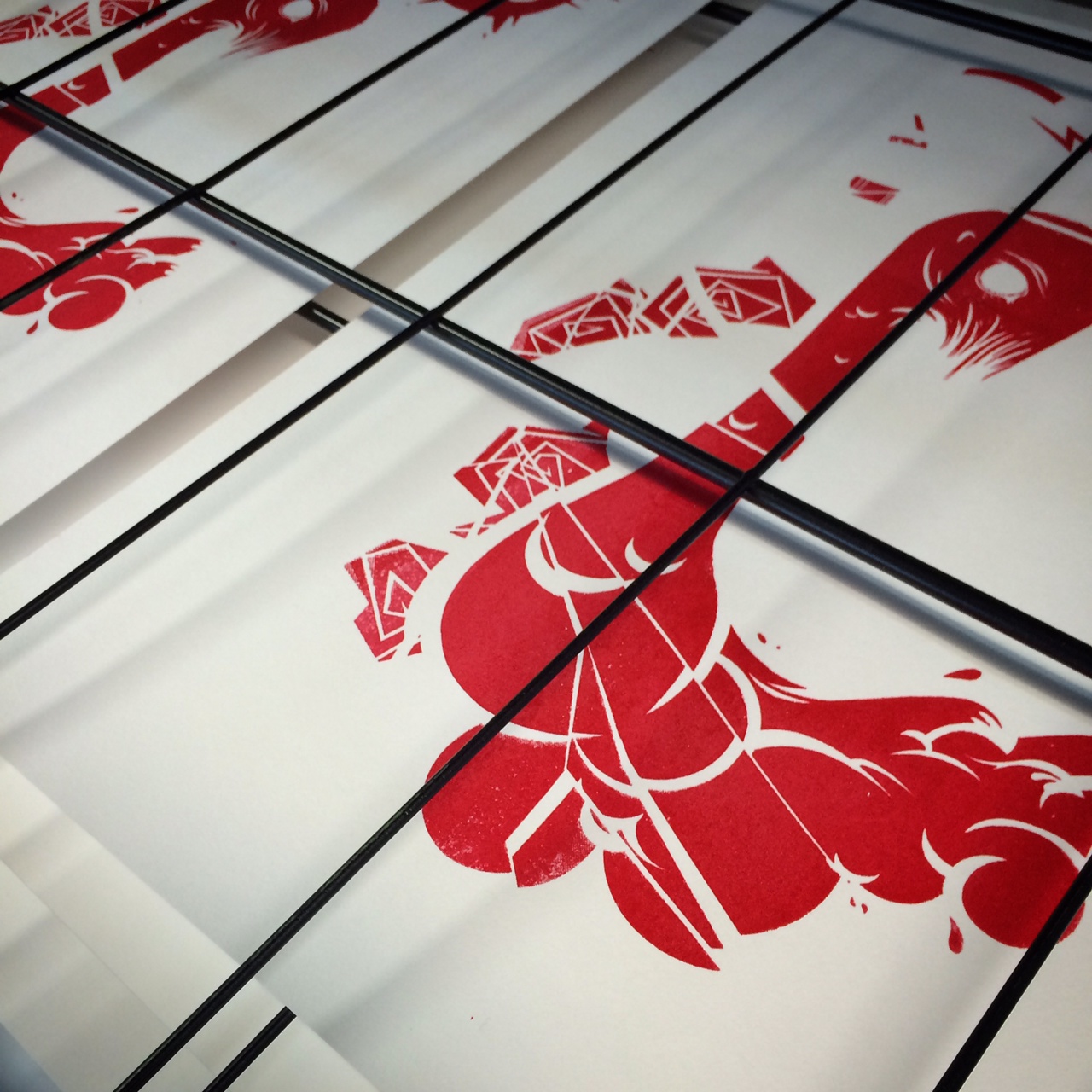
Registration marks haven't come out on the exposures too well, as only did them in soft pencil, so lining them up could be a pain?! I Chose a mix of Snowden and Somerset satin papers for a bit of extra quality. Made sure i did a good few testers on cartridge paper before using the special stuff. The first few came out pretty wooly and streaky, so just had take a step back and access what i may be doing wrong. Got some tips from Lydon and Mike too which helped a lot. Just had to push down harder,and in the centre of the squeegee.I soon managed to get into the flow and was knocking out good looking prints. Just hope my squeegee tekkers can be transferred on to my black layers, as i always have issues with getting black to pull evenly. Also, looking at my positives I'm a bit worried about the tinniness of the bitmapping on some of it. Not entirely sure it wont just some out as a big black blob?

------------------------------------------------------------------------------------------------------------------------------
M O N D A Y
Had to come back after the weekend to add my blasck layer, and wish i hadn't bothered. The results are an absolute disaster and is only compounded by the fact that i have to sit here and blog about just how terrible my day at the office has been .

Even the newsprint version looked ropey.
This isn't me being a 'perfectionist', this is a normal person totally pissed off at putting so much work into one deign and the final product looking -12 below average. I mean, i'm supposed to be making prints that i could sell, but there's no way i'd ever think about asking for money for any of these. I'd struggle to give them away. There's honestly not a single print I'm anywhere near being satisfied with, I'm not sure i even want to submit any of these for the end of the module? Really don't know what i was doing wrong, as i was trying every possible method to correct. Ive had problems pulling black paint before so i made sure there was way more medium in my mix than paint.Maybe I'm actually too damn weak to get enough pressure on the squeegee?


I really don't want to do anymore screen printing using black, but to work as a series of images black is the predominant colour. Pretty tired of wasting my time and money and energy on a method that I'm not good enough to execute to the levels that I'm demanding from myself. I don't really care about the whole ' handmade' aesthetic too much - if it looks good then i doesn't matter how its been produced (to a point). It needs to look how i want it to look, even if that means i have to print them out digitally, which i'm tempted to do right now as the same problems are only going to happen again on all my other prints and I'm not prepared to waste all that time designing and developing the imagery, prepping the screens & cleaning the screens, only to have a bunch of prints that'll be going straight in the bin,which is what all these will be - bar one for the final submission.


The 'best' of a bad bunch,which isn't saying much.
Still can't submit this.
NEGATIVES
- Possibly made the bitmaps dots too small - a lot of it is too hard to make out and has just come out virtually black instead of a shade of black
- forgot to tape over the top registration marks on the screen.
- Overdone the medium towards the end so black isn't printing out as opaque.
- Something's going wrong with my print pulling technique. Don't know what, as i tried everything, i couldn't physically put any more pressure on the squeegee?!
- All a massive deflating waste of human time and energy (and good quality paper). Nothing to show from all the work i put into getting it the final colour print stage.
- The screen i was also using had some stripy marking/damage which i didn't notice and is clearly visible on the final prints.
- Look so amateurish. Couldn't sell any of these, and wouldbt insult anyone by asking for money for them.
- won't be able to sleep knowing what a balls-up I've made of these, and will ultimately have to go through the whole process from scratch again in order to make something half decent for submission.
POSITIVES
+ there are none. (if i have to find one, then i guess the alignment actually looked ok?)
+ i have plenty of roughs to wrap up my good prints with. (If any 'good' ones materialise)
No comments:
Post a Comment