Pages

Tuesday, 25 April 2017

Influx of live Mural briefs...

I've noticed there has been a good handful of mural design callouts that i've been seeing in my inbox recently from the uni - and normally i'd be jumping at some of them, but i'm wondering where exactly i'm i supposed to fit the time to make a decent effort of them? I'd love to just dump my FMP and participate, but for the good of my degree i've got to stick to my guns and see my bird book out. 

Another factor thats puts me off is that more often that not the companies commissioning the work arent giving us specific guidines as far as concpet goes - it's just a case of; do what ever you want to fill the space, and we'll pick whatever one looks nicest. Which is fine, but it just feels like i'd be spending my time on a total stab the dark - great if you end up winning, but not a whole to show for your efforts if you're not selected.


That said -the latest one for the hoardings at the new LCA building my inbox has got my attention;


Again, we've not been restricted by a specific concept or any limitations, as long as it can replicated using vinyl- but i kind of wish we had been restricted, as the design could pretty much be anything. the nature of vinyl would suit simple shapes, which is right down my street - but whether i can take the time to come up with some designs before the deadline without totally neglecting my FMP is another matter.

But i would like to have a go at leaving my mark on the uni (literally) for the people of leeds to behold long after i am gone, or for 12 months anyway.

I will have to assess the situation (quickly).


**UPDATE**
This didn't happen. Bit annoyed at myself, but FMP comes first.


OrnitholoSEE - losing/regaining perspective...

As the slog continues, i've totally lost all perspective with this project, and having a chat to classmates has woken me up a bit to what's actually expected of us in our submissions.

I've been beating myself in pursuit of trying to make the Blurb print deadline, so i can have a physical book finished, printed and delivered ready to hand it in with my development work.

But i don't need to?! It can be entirely proposed if i want - as long as i have mock-ups & proof of the work actually existing, completed and being in a position to be put into a book, then that's what i'll be marked on.

I've been so wrapped up in making a physical conclusion that this didn't occur to me - but now i've been reminded of the fact, i suddenly feel a whole load of weight of my shoulders, and that the imagery for this book is a bit more achievable that i thought yesterday.

Not so say i'll be taking my foot off the gas - i've still got a considerable amount left to do before i can reach the point where i can say i'll be happy with what i'm turning in, but re-gaining perspective has also given me an extra week back that i had intended to have all the images & text done by in order to send to print. I may even get away with not having to trim down the final bird tally any further than the revised 20.


ORIGINAL LINEUP


REVSISED LINEUP


I'll still have a number of physical loose 8x10 prints ready for submission, as they were also proposed in my initial statement of intent.


Tuesday, 18 April 2017

FMP - BLURB progress...


As i gradually begin to chalk up more and more finished bird images, and accompanying words i been looking into which custom book creating company to use. My parents have had holiday photo books made by Photobox before, and the quality is great, but i'm getting on with Blurb's 'create your own' interface (BookWright) a lot easier, plus the selection of book format is a lot wider so i'll be going with Blurb when it comes to getting the physical copy made up.


I'm leaning towards a 20x25 portrait format, with a dust cover. Have yet to make any decisions on the paper type, but they all look pretty Pro to be honest, and very affordable - i may even get a few done eventually, so i can keep one in my portfolio.

I cant wait to be able to sign this whole thing off by having it my hands, in a real book, like a real person! The 'tangible conclusion' is what's driving me on now, as i'm fast running out of productive steam right now - but i'm still going to have to knock out 2 birds a day (fully complete with type) for the next couple of weeks if i'm going to meet my target!


Sweet sweet Photobox discounts.


>>>>>>>>>>>>>>>>>>>>>>>>>>>>>>>>>>>>>>>>>>>>>>>>>>>>>>>>>>>>>>>>


So i don't get myself in a pickle when it comes the undoubted last minute compiling of all the artwork and sorting all the typesetting on Blurb's BookWright self publishing tool; i've been laying out my pages as i complete them, so i can get to grips with it all. I mean, it's not massively tricky to get my head around, but it'll be one less thing to stress about.


I was scratching my head a bit about how the text should be aligned -after having a quick chat with Ben and i showed where i was up to and he pointed out that it should definitely be justified, as currently my type was wonky at the ends, and a bit unsightly. I thought it might be a bit of a ball-ache to get it all 'squared-off' but the justify tool on BookWright sorts it all out quick sharp! So now i have nice neat blocks of type on one page, and the image page opposite.


The tone in which i 'narrate'  the book is light-hearted and pretty much how i would talk about the birds in real life. I'd like to think my sense of humour comes across when reading the short paragraphs, and also some of the bird love i have with it. I've been a long time fan of Matt Sewell's bird books/drawings (below) and he's always been the benchmark i've been aiming for.Although with my graphic style im not sure i've got same sort of appeal.


Reading his books and the way he describes birds is pretty similar to how mine is going - you can tell he's got a real passion for the subject in his writing, and a quirky sense of humour. Even the layout is similar, but then again i'm not sure how many more innovative ways you can effectively lay out a bird picture book? 


At least my images look absolutely nothing like his, so i've not totally ripped him off!

Monday, 17 April 2017

FMP- OrnitholoSEE re-evaluation

I'd probably hit a low point with this project, but a new dawn & new day and i'm not as miserable about it all as i originally sounded. 

I put it down to to frustrations with what i was making VS what i initially planned to make, the (fast disappearing) amount of time left to do it - coupled with the fact that it feels like i'm spending every waking hour in front my mac, making slow progress when i really want to make something physical & a bit more instantaneous. I've made my bed, so i guess ill have to lie in it.

After an assessment of how much work left to do against the time frame to do it i got myself into a more positive mind set and went into beast-mode; spending the weekend solidly sketching and refining the linework of the 13 remaining birds, achieving my goal of 20 birds, all ready for scanning and on to the vectoring stage. I made more progress in two days than i have done in 4 weeks. It's funny what a looming deadline and the very real fear of failure can do to the motivation.


I also put the new enthusiasm down to the fact i stopped thinking about every tiny detail of the content so much, and whether it meant anything to anyone or if it was 'personal' enough - and just did it how i wanted to do it! 


Being able to spend a chunk of time drawing without being in front my computer was also much needed - and appreciated. Due to my bank holiday efforts I've put myself in a bit of a healthier position in regards to making the printing deadline for a Blurb or Photobox publicaiton.

I will still need to design accompanying cover image/logo,text and intro pics, so i'm not patting myself on the back too much yet.

Sunday, 16 April 2017

FMP - Bored now...

so very bored.....

This FMP was supposed to be a self-indulgent project about something that we had a special interest or even love for - but I've somehow turned it into a monotonous, drawn-out affair in which i have lost almost all enthusiasm and motivation to do - and am almost resenting, because whilst I'm painfully slogging each bird image out, I've got a load of other quick turnaround ideas going around in my head that i would much rather be doing. I'm so frustrating. I though i was the sort of artist that would be good at making series' of images based on a similar theme. Turns out, not so much.


I'm bored of getting up every day and drawing the same thing, in less and less interesting ways. It's almost made me grow tired of looking at birds (obviously not, because birds are awesome) but the whole production process is wearing me down.


It's too late in the day to make a last-ditch switch to another project as i don't want to end up with two hadl finished submisisons - but after already facing the fact that I've had to half my proposed image count (40 down to 20) I'm also going to have to accept my initial statement of intent; with the planned animations and painted laser cut birds just isn't going to happen now. I'm going to have to produce 2 new birds every day for the next 2 weeks if even i stand a chance of having a book ready to send off to a printers to be professionally printed and bound. ( if i opt for the print dungeon i have a week or so longer) And thats not factoring in days i'll be away or working on my  PPP presentation.


Deadline breakdown:

• Submission- May 15th
• Days i'll be away from Leeds - April 28-May 3rd 
• Last date for professional printing/binding (7-11 business days) - May 4th
• Amount of production days left (predicted, if i do NOTHING else) - 12
• Birds left to produce - 13 (plus cover designs and page layout)

basically, I'M  PROPER F**KED.

So what started out as a project which would give me a chance to combine a mixture of hand-made, digital and animated elements is going to be a plain old collection of digital prints in a book (if I'm lucky) - that, because of the personal elements included in the pictures (as it was supposed to be a personal project) have no meaning to anyone else on the planet ( apart from my immediate family)


Brillant(!)


You can see why my motivation is rock bottom at this point. Spending day and night making pictures for a book that no-one will relate to, or even see will do that i guess? 


My final practical project of my degree has turned into an unadventurous, irrelevant damp squib.


I need to pull something special out for the Degree show, for my own peace of mind. I can't go out like this?!!


Friday, 14 April 2017

More mural work with Pete Barber..

Was given a couple more mural designs to knock out for Pete so he could go and paint them during the Easter Break.


Staines Preparatory School, Staines


Project Boards


original design i was given to work from.

Re-worked and re-composed design.


>>>>>>>>>>>>>>>>>>>>>>>>>>>>>>>>>>>>>>>>


'British' Bird mural - Tibshelf Junior School.


Final Project Boards


This design features a selection of patriotic (to GB) birds, although not all of them are found on our shores - it's a strange concept, and it was never fully ( or partially) explained to me. I also had to design a character based on the schools former lollipop man, who had recently died, leaving the school some money - which was used to have the mural painted. Again. i wasnt provided with any details on what he looked like, and despite a thorough search online, i couldnt find any evidence on him - so  i just had to go with the classic,elderly gent approach. He might not even have been old..or white?! 


I was send a load of 'scribblings' by the youngsters  from the school and set the challenge of completely transforming them into something nicer to look at, but using the pupil's drawings a starting point. Pete then selected a number of them an arranged them how he saw fit and sprayed them on the corrugated storage unit.


Drawings birds is fast becoming a running theme this year, but with this project i was keeping a hand drawn look to them. Once i'd done some minor development on them i coloured them and converted them into PNG's so Pete could drag and drop them over each other in order to sort the composition out. 


Turns out he got me to do way more characters than were ever going to be used, so most of them didn't make the final cut - but this was done so he had plenty to chose from. Bit annoying, as i could've spend half the time i did on them - but i got paid, and he did a really good job on them, especially on the tricky bumpy surface. They look just like my designs! Just a shame he didn't take any more photos of the final piece.


Thursday, 13 April 2017

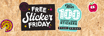
Awesome Merch: Free Sticker Friday...


Came across this as i was checking out my Awesome Merch orders. Sounds like a fun project as i'm always making quick quirky little vector elements that could be taken and used as stand alone designs. Will give me a change to air more of my character based designs as well. Nothing lost! Plus i get a bunch of them send to me if i'm chosen!

My first attempt comes from a bunch of animal heads that i'm currently using as part of Bird Book. They're all items found in a Bald Eagles food group. 


Completely random but i thought they'd work well as custom cut-out stickers, and quite collectable. We'll see, but its stuff like this that i have the most fin doing - its taken a long drawn process to get to the results, theres no huge brainy concept behind and i'm not trying to change the way people live their lives. Its just for a bit of eye candy. plus people people love animal heads right..?!


* The minute i finish submitting and have a scan of Instagram i come across as sticker design by Ekiem that's not a million miles away from what I've just done!


Aggh i cant win - i'll never escape looking like a rip-off merchant! How does anyone else manage it?!! Or am i worrying about it too much, and in reality - no one really cares that much.


Wednesday, 12 April 2017

Risoprint venture...


A couple of months back, during one of my one-to-one tutorials with Ben, we were discussing my frustrations with screen printing and he suggested that maybe i look into Riso printing. 

It's taken a while to get around to sort out (and even longer to decide on a design to print, of course) but i felt i needed something to add to my PPP3 promo pack that wasn't so 'disposable' - as i get the feeling the promo leaflet and postcards will/would be discarded quite quickly.

Also it woudl give me a chace to finally see if my work suits the Riso treatment, and if would consider doing more in the future.

I had a bit of a shop around at some of the Riso printing services in Leeds and out of town, Hato, Risotto, Ditto and also Footprint - who were reccomened to me by James McBeath.

I went with Footprint in the end and they've been a pleasure to deal with, answering all the quesitons i had about paper weights and colour separations/registration etc.

Deign wise i opted to go with my 'Dismantippled Bloody Mary' design, as i initially designed it to one day be screen printed - that doesn't look likely now, but it's two-colour colour scheme with some big half tones (synonymous with the style i've carved out for myself) should suit the similar printing process involved with Risographs. 


It was a toss up between this and my Von Count-apart design - both designed with screen print principles,(i have actually managed screen-printed this design, with mixed results) and its also two colour, so easier to register. I just felt this time round it would be better to use a design that was solely my creation. Von Count might be more popular but i cant really take credit fir creating him. 


Either way, we'll see what happens, looking forward to seeing the results - ill have some left over if i want to try and sell a few, but looks like this will be another (uncertain) investment into getting my name and work out there and into peoples hands.

Sunday, 9 April 2017

FMP - OrnitholoSEE production process...

With a decision finally being made as to which style i will be producing the bird images in, the production line mentality needs to kick in. With my process in place, from now on there is nothing except; EXECUTE > REPEAT > EXECUTE > REPEAT...from now until i finish!


Actually theres a little bit more to it than just executing and repeating, it's more like;

Reference pics/research birds > sketch > refine > scan >  vector > colour > research bird facts/add my own thoughts > file it, ready for book layout > NEXT...


The OrnitholoSEE production line process


That's all there is to it. Just have to do this 15 or so more times and i'm laughing.

Saturday, 1 April 2017

Mural design work for Pete Barber...

Been keep inundated with mural designs to knock up for Pete - some with more scope to out my own stamp on that others, as is expected - here's a few i've been working on over the past couple of weeks to help me take a break from the arduous task that has become my FMP...


BRIEF: Was given some starting points by Pete; which included their (awful) logo, ninjas, silhouettes, people jumping, japanese-style brushstrokes. Also the mural would be painted on to newly painted green walls, so i tried to incorporate that into the colour scheme. 


Designs and mockup

As i created the silhouettes and and basic trampoline shapes for the first few designs i certainly did feel something inside of me die a bit, so gave myself a shake and incorporated some IanF styles for the last version. Pete always tries to assure me that the majority of the time, people aren't looking for a masterpiece with any huge, clever concept behind it - it just has to look eye-cacthing. On paper, this is a principle that should be right at home with me!?


RESULT: Turns out this was a classic example of a client not having a clue what they want, throwing around phrases like 'we want to be slick' and it needs to to have the 'wow factor', yet wanting it designed yesterday! He couldn't give us a real idea of what he deemed as having the 'wow factor' so we abandoned the project. You win some, you lose some - i get the feeling Pete was more than happy to lose this one, plus he still wanted to pay for my time - which i felt a bit guilty about.

>>>>>>>>>>>>>>>>>>>>>>>>>>>>>>>>>>>>>>>>>>>>>>>>>>>>>>>>>


BRIEF: Race Track storage unit - Burton.

"Your mission if you choose to accept it!!?? this storage container at a kids play farm in Burton. I have done several things for them before!
This is a pedal car track that they are improving. It now has a container on it to store cars etc.. They want me to paint it so it looks good!

I suggested a bit of a vintage yet funky old school F1 style thing with big old "Castrol, Shell oil etc signs.. I have sent them this visual as an idea for colours.and style and am waiting to hear back.. 

Any way please can you compose all 4 sides for me?"


Pete's initial design mockup - before he was told about the 
Yellow and Orange colours scheme he had to incorporate


Initial draft design

With this sort of designing i need to remind myself ;that as much as i'd like to, and that it goes against my whole work ethic - i don't need to be producing super polished, high quality resolution vector designs from scratch (not all the time anyways) .I just need to make something that looks good and that Pete can use as a clear reference to paint from. For the initial pass i used a mixture of vector and found imagery to get the jist of where i was heading with it.

"That's great - colours are good - I think keep it simple and graphic I'm not sure we need the vintage race car- that's my fault because I used one in. The thing I should you- pehaps it it was less realistic - I just don't think we need to be that vintage-
Any way spot on, just keep everything big and graphic all round- you can repeat some elements and worry about making it all vectors unless the image isn't clear enough to project."


Final designs and mocks

As Pete will be having to paint onto a corrugated metal surface the bolder and simpler the better for this one. Not tonnes of original illustrated imagery needed here, was mostly a case of manipulating what i had, making them all sit nicely together in the same colour palete.

I'm slowly learning to be less precious about the quick turnaround work. It still has to look good and do it's job, but at the same time i'm not going to be spending all night and day making them 'perfect', and Pete certainly doesnt want me doing that - as he's paying for my time.

>>>>>>>>>>>>>>>>>>>>>>>>>>>>>>>>>>>>>>>>>>>>>>>>>>>>>>>>> 

**UPDATE**


Pete's not one for taking many pics of the murals he does, but he send a long distance shot of the painted car storage unit - and it looks spot on and just the design i supplied. What a clever man! Just needs to work on his photography.

You can just make it out if you squint