Pages

Sunday, 30 November 2014

Visual Narrative - 'One Week Book'

Print day, and I was really looking forward to finally seeing what was involved with all this screen printing business, and the final outcome. Not sure i caught all of the 'exact' terminology- there was a lot of interesting stuff to soak up but not a great deal of time!


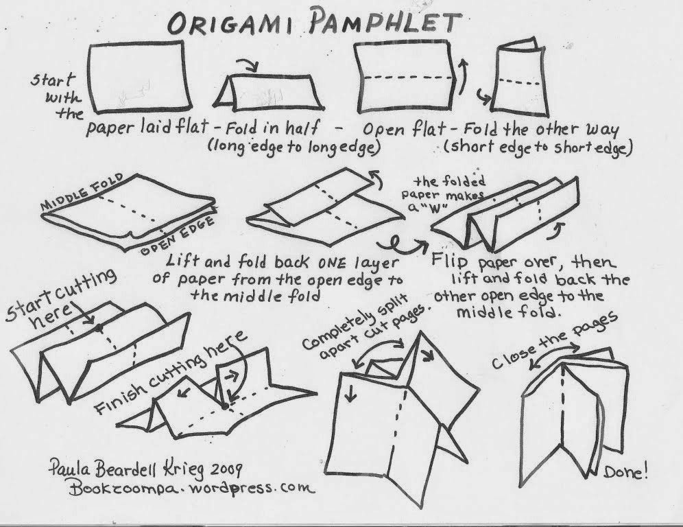
First thing was to expose our designs to our printing screen, which had been prepped with emoltion a couple of weeks earlier.With the exposure level set to 11 (different paper types have different levels) we shut the kodatrace design sheets in the vacuum seal for a few minutes Exposing the screen means that anything black on the design would block the UV light getting to the screen,and in any clear (or 'white') areas where the light could get through would then go hard, ready to wash off.


Using a hose and a sponge we washed the screen removing the light sensitive emulsion from the 'white' areas of the book design, a bit too vigarously which lead to some of the black areas to come off and ruin part of the image.Luckily we'd prepared another screen previously, so we had that as a back-up. So we exposed that one and washed it a bit more gently and left it in the drying room for 30mins or so.


While that was drying we finalised and mixed our two colours to be used on our prints. Rather than a shade of Teal that we'd initially worked with we changed to a bottle green, in keeping with the pub theme, and also with the Heineken style design Georgie had designed for the cover page the book. To compliment the green we made up a very dark brown, which also reflected the interior of the old "rustic" smelling pubs we visited.


Screen dry, we had time to apply some more emulsion to various areas in which it had flaked off. This is easy enough to do with a small brush.


Some of the group have a bit more screen printing experience than the rest of us so they took the lead, it needs to be quite a fast moving process otherwise it can effect the outcome of the prints (ink can dry out on the screen). I was happy to assist where i could as its completely new to me, i also wanted to learn as well as produce some sharp-looking final prints.

Applying a good amount of equal pressure whilst 'squeegeeing' the ink across the screen is important, as too light will make the print look faded and patchy. However this can produce some interesting, unique results. But on this occasion, this wasn't a desired effect.

Something we'd all overlooked was the fact that we hadn't included registration marks on our final screen - meaning that lining up our images on the print bed was a bit trickier than it should've been. We overcame any major disasters by using masking tape as markers in the corner of the paper.


After some careful scoring, we had our final hotdog book 'Happy Hour'.As my first piece of screen printing at any level I'm really happy with the results.I spent a lot of time considering textures/tones as opposed to simply using block colour and possible problems with colour/pattern clashes- so it paid off. All of our group members image styles work well together and they have also used linework and patterns to make the final piece interesting to look at.

A drawback with taking so much time planning every possible outcome is that i felt i could've contributed to another page of the book maybe. Although i did offer my services and was more than happy to stay later at uni to knock out another design, Georgie took the bull buy the horns and had taken care of it. She makes a really good ' project manager/ team leader' no matter how much she insists that she's isn't good at that sort of thing! 

Overall, i still feel i need to be producing loads more initial ideas,and get more inspired by my given or chosen subject somehow- but it's proving a hard obstacle to overcome at the moment. Just hope i get a chance to pursue screen printing within future course/personal projects.


Thursday, 27 November 2014

Photography Studio & DSLR Inductions

It appears there is a whole massive area of the college that i never knew exsisted - the 'camera zone'. A whole armoury of cameras & equipment, old and new, digital and 'windey-up' are avaibalbe to hire out and use for whatever means we see fit. I'm an entry level photographer at best, only really used to using my iPhone so there was a lot of info gettin thrown at us in a very short space of time, much of it went over my head, but we got given an info sheet explaining the main principles to using a DSLR which I've look through since,plus i've checked out youtube tutorials, of real-life people doing & talking about the basics, as written words don't always find their way into my brain bag..! 


As we only had an hour with the camera i thought rather than sitting down and trying to work out the ins & outs from the info sheet, i would just do some trial and error, random settings random results in the same positions and try to get to grips with how it all works by tinkering with the settings. Which was a bit infuriating as i couldn't get my head around why my photos were coming out black when they were taken in broad bloody day light?! Trial and error and more errors below.


Turns out there's 3 main principles when its comes to using your big fat DSLR (Digital Single Lens Reflex) camera.


Standard DSLR camera menu interface


APERTURE (Av mode) or 'F-stop'  - this is to do with the dilation of the lens, and how much light  is being let in,basically works like the pupil in your eyes. A low setting (F2) means the lens will be letting in lots of light. A low F-stop  will also isolate your subject from the background which is known as narrowing the depth of field (see below). A high setting (F11) means the amount of light will be a lot less and will blend the subject into the background.


ISO  - Controls how much light the camera will use. If it’s a bright sunny day and you’re taking pictures outside, set your ISO to 100. If you’re trying to take a picture inside without a flash, and need more light, try setting your ISO to 800 or higher,this will make your images grainy however. Examples of experimenting with this and white balance can be seen below.


SHUTTER SPEED (Tv mode) - this is the length of time that the shutter is open for,and how fast the camera shots the picture. A slow shutter speed will exaggerate movement within your shot and cause light trails.(see below) For a photo of a person you'd should aim for a fast shutter speed and low ISO to eliminate blur and noise.(e.g.: 1/25 shutter speed, 100 iso)


Thursday, 20 November 2014

Visual Narrative - 'One Week Book'

Our brief was to produce an A6, 2 colour, screen printed 'hot dog' book based on research collected and recorded from a specific location.


Hot dog book instructions


As part of a group of 5  i was sent to observe the sights and smells (and they do smell) of two old, traditional 'locals' pubs that are both situated along the 'Otley Run' frequented by many a fancy-dressed student pisstard and regular long-time punters. The Pack Horse & The Fenton

We were all very happy with the locations as they had potential for a real mix of clientele, but was a bit of a hold-up as ,of course, the pubs don't open til midday! So we tried looking into some of the history of the two establishments,and rake up some facts that might aid us along the way until the pub doors opened.


I got busy with my camera and took some shots of various objects and items that caught my eye, and things that i thought i might be able to work with further down the line.


I also did some quick sketchbook work of various points of interest within the two pubs. There weren't an awful lot (any) people to draw, as it was 12pm on a Monday morning, so we decided to return in the evening for a drink and a sketch hoping there would be a few more people about to observe and talk to…


...as it turns out, there wasn't. Monday being just after the weekend is bound to be a bit quiet i suppose. We met up at the Fenton and carried on the observations and idea bouncing. Personally I'm not one for sitting in a pubic place and drawing the people going about their business, its not an environment I'm that comfortable in, and most of the time the subject has usually moved or walked off by the time I've got anything substantial down! We all ended up having to draw things from our imagination as, apart from a group of blokes playing poker there wasn't a whole lot going on to write/draw home about.So this left me with very few sketches and not a lot of direction.


(left) A brief summary of what we saw/heard/learnt/experienced. (right) Some rough initial themes to work with.


As we only had a very limited time to work on this project and get the final designs ready for print we designated ourselves a theme each within the subject of 'pub scenes', and i was allocated 'old man', which basically refers to the local, old-timer, drinking on his own.Other themes involved blow jobs,vomit,class A's, and filthy toilets. So i think i got away quite likely.


My designs for 'old man' were based around the theme of an old, lonely guy, drinking his money & life away,to forget about his problems or possibly to escape the monotomy of everyday life.


We'd decided on brown to be one of the screen printed colours, with a teal or greeny/blue, (the colour of a fiver) as the 2nd colour, but this would be decided on the day of printing


At this point i admitted defeat and "simplified" my design, as i could see this was going to be too complicated, plus trying to work out the colour separations in my head rather than being able to use a computer to make mocks (which would've taken considerably less time than drawing out the exact same design a million times by hand) was beginning to melt my mind.

When i say simplified, i mean more detailed, but easier to colour separate, obviously(!)


I kept the sad old guy, but added a money whirlpool and an empty pint glass in front of him,with the spillage forming a skull, to signify him drinking himself to an early(ish) grave.


I didn't want to you use too much block colour, so experimented with various shading techniques to give the image a bit of texture. Above is a photo of the two negatives layed over each other to get an idea of how things should turn out. Ambitious, sure. Complicated maybe, but I've considered every last detail and possible problem.believe me, but i think i can pull this one off…! To the print room.