
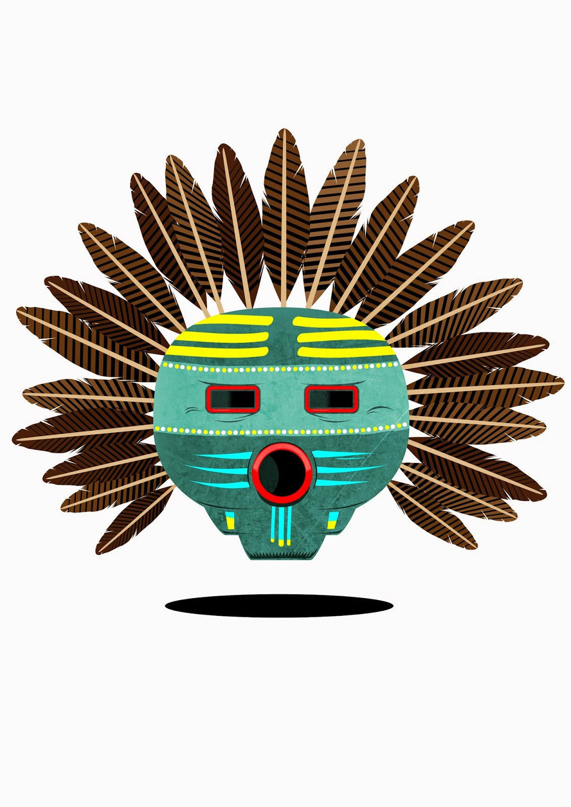
The First task had no restraints on colour or media (except digital). I produced a collection of images from the books id found & other web research about Cowboys & Native Americans. Theres a huge amount to draw upon on this subject & would've like to have drawn a whole more of it (and i will probably come back to it in my personal sketchbooks), but time waits for no man so i just have to try and get down as much as possible using as many diferenct techniques as i dare, including pastel - which, i'm not gonna lie, i have a mild hatred for. Everything about it. It's just way too primitive (messy) for pretty much anything i would want to achieve. Credit to anyone who can manage to get some half decent results out of it!
Sketch Book Presentation Examples


Initially, after being given the brief, i was expecting myself to produce a load of mind-blowing images featuring cowboys and indians, totem poles, horses, masks etc…but in reality i struggled to make the 12 image minimum. I don't know if it was because i had too much of range to work with that i couldn't decide what i wanted to draw, or wether i was too conscious of the outcomes looking below the standard i set myself? Either way, i was bit disappointed with my output quantity and lack of media experimentation. On the plus side, i drew a jazzy cowboy boot, which took about 2 mins - compared to the pencil drawings i did which took considerably longer & i was less happy with.
LINE:
3x4 human figures related to my subject,in a dynamic pose. Just monochrome for this one, and not worrying about tone and light.


Issues with these ones:
• I could've found some more dynamic poses.Two 'cow-people' with their hats in the air is NOT hugely dynamic!
• Used less lines and thicker lines
• Bigger line making media, chunky brushes.More varied media in general.
• I should've drawn faces on. Don't why i didn't to be honest - think i was mainly focused on the body positions and didn't think having facial feats would make much of a difference.Well, on the static poses it would've made difference.You live and learn.
LINE, TONE, MARK & PATTERN:
3x4 figures or objects related to my subject, created with marks and patterns but keeping a good quality of line.


I (eventually)started to get a bit looser and less uptight with my linework on these, and care less about making everything so neat. Also played about with different media - red & black ink with brushes, posca paint pens of varying width. I found the simpler the lines and marks were the more satisfied it made me - mainly because it was taking me half the time to produce so i could move onto the next page. Speed and spontaneity,or massive of lack of it, being a long standing problem of mine. I was having more fun with these, but still not knocking out tonnes of work due to (still) over-thinking what to draw.
SHAPE:
12 drawings in unlimited media or method. Interpret and explore character. Doesn't have to be representational, and could be pure shape.


So far we'd only been able to use analogue media for these tasks, but now with the option to 'go digital' i was all geared up to produce 12 shiny vector based images. However after i'd done the first one (which took forever due to me designing most of it on screen) i thought
'this isn't testing me', and plus i could see myself getting bored of using the same technique, no matter how visually pleasing they'd end up. So i ditched the mac and got out the card & scissors. Again, i found myself having more fun when i was just knocking out stuff with no real expectations in my mind. I was happy with the mistakes and unevenness!
No comments:
Post a Comment