
Hot dog book instructions
As part of a group of 5 i was sent to observe the sights and smells (and they do smell) of two old, traditional 'locals' pubs that are both situated along the 'Otley Run' frequented by many a fancy-dressed student pisstard and regular long-time punters. The Pack Horse & The Fenton
We were all very happy with the locations as they had potential for a real mix of clientele, but was a bit of a hold-up as ,of course, the pubs don't open til midday! So we tried looking into some of the history of the two establishments,and rake up some facts that might aid us along the way until the pub doors opened.
I got busy with my camera and took some shots of various objects and items that caught my eye, and things that i thought i might be able to work with further down the line.


I also did some quick sketchbook work of various points of interest within the two pubs. There weren't an awful lot (any) people to draw, as it was 12pm on a Monday morning, so we decided to return in the evening for a drink and a sketch hoping there would be a few more people about to observe and talk to…


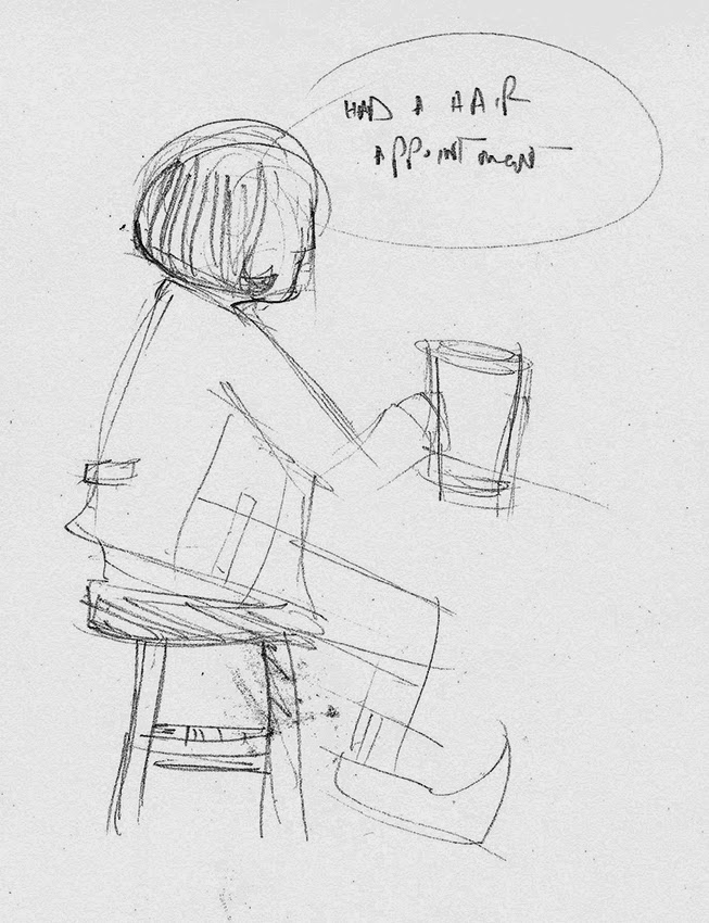
...as it turns out, there wasn't. Monday being just after the weekend is bound to be a bit quiet i suppose. We met up at the Fenton and carried on the observations and idea bouncing. Personally I'm not one for sitting in a pubic place and drawing the people going about their business, its not an environment I'm that comfortable in, and most of the time the subject has usually moved or walked off by the time I've got anything substantial down! We all ended up having to draw things from our imagination as, apart from a group of blokes playing poker there wasn't a whole lot going on to write/draw home about.So this left me with very few sketches and not a lot of direction.


(left) A brief summary of what we saw/heard/learnt/experienced. (right) Some rough initial themes to work with.

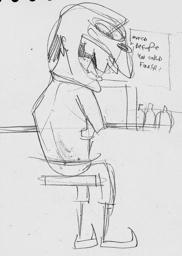
As we only had a very limited time to work on this project and get the final designs ready for print we designated ourselves a theme each within the subject of 'pub scenes', and i was allocated 'old man', which basically refers to the local, old-timer, drinking on his own.Other themes involved blow jobs,vomit,class A's, and filthy toilets. So i think i got away quite likely.

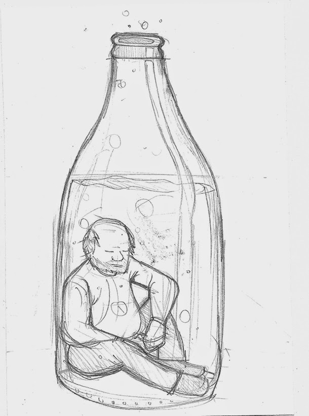
My designs for 'old man' were based around the theme of an old, lonely guy, drinking his money & life away,to forget about his problems or possibly to escape the monotomy of everyday life.


We'd decided on brown to be one of the screen printed colours, with a teal or greeny/blue, (the colour of a fiver) as the 2nd colour, but this would be decided on the day of printing
At this point i admitted defeat and "simplified" my design, as i could see this was going to be too complicated, plus trying to work out the colour separations in my head rather than being able to use a computer to make mocks (which would've taken considerably less time than drawing out the exact same design a million times by hand) was beginning to melt my mind.
When i say simplified, i mean more detailed, but easier to colour separate, obviously(!)

I kept the sad old guy, but added a money whirlpool and an empty pint glass in front of him,with the spillage forming a skull, to signify him drinking himself to an early(ish) grave.


I didn't want to you use too much block colour, so experimented with various shading techniques to give the image a bit of texture. Above is a photo of the two negatives layed over each other to get an idea of how things should turn out. Ambitious, sure. Complicated maybe, but I've considered every last detail and possible problem.believe me, but i think i can pull this one off…! To the print room.
No comments:
Post a Comment