 |
| BLACK seperation layer |
 |
| COLOUR separation layer |
With my previous print ('whisky business' aka 'turkey times') i'd probably have to admit at making the halftone dots a bit too small and they hadn't transferred that well when it came to screen printing, and i came to the conclusion that it was because i'd prepared the image for print at full size(a3) whilst on-screen, so i was probably over compensating on the size and not wanting the dots to be too big when it came to printing my positives. I found that prepping the image for print at a4 meant that even if the dots were a bit on the small size on screen, when it came to blowing it all up to a3 to make my positives, then any halftones fonts that may have been on the small size originally would now be twice the size. A bit nerdy, and probably not very well explained, but basically do everything half the size it needs to be!
 |
| On-screen print mock-up |
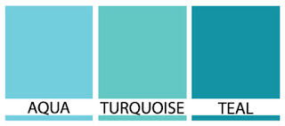
The 2nd colour for this print is probably the only thing i was flexible about. I'm no master paint mixer by any stretch, but i wanted to aim for some sort of greeny-blue or bluey-green. Again, i wasn't too fussy about about the specifics, just along as didn't look like swimming pool water or sewage, then id be happy.
The Aqua-Turquoise-Teal spectrum i was aiming to land inside.
After a bit of blending i settled on a sort of halfway house between turquoise and teal.Maybe not a 'pingy' as i'd liked, but certainly didn't look like sewage.
'Turqueal' colour paint mixed and ready to go.


My screens were exposed the previous afternoon, and even they looked good! What could possibly go wrong?


No comments:
Post a Comment